PROJECT OVERVIEW
Enjoying a water sports session should not be stressful. This is why knowing the weather conditions along with other forecasts, such as traffic and sports competitions, is important because it allows people to plan ahead to make the most of the day. However, this type of app often fails to provide a simple and intuitive reading of complex data. The aim of Vela is to provide easily understandable forecasts for all water sports enthusiasts.
Vela is the first complete project that led me to the development of a final high-fidelity prototype. It is also the project with which I made a thorough analysis of the principles of Design Thinking, applying them from start to finish.
ROLE
UX Designer
DURATION
7 months
TOOLS
Pen and paper
Adobe XD
Adobe Photoshop
Lucidchart
Optimalsort
Usability Hub

UNDERSTANDING THE PROBLEM
To apply the first phase of the Design Thinking Process, I did the necessary research to identify and understand my potential users' problem. Only by understanding the problem can I work on a solution. Initially I focused on discovering what potential problems I could answer with the Vela project. Then I reviewed the possible problems by defining a problem statement that could also be translated into business and user objectives. Next, I explored all possible solutions that might meet the business and user objectives.
The result of this process led me to define the following problem statement:
The result of this process led me to define the following problem statement:
"Water sports enthusiasts should pay attention to specific dangers and obstacles that can prevent full enjoyment of an outdoor sports session. These are primarily caused by weather conditions and the inability to reach or practice at the location of interest due to excessive traffic or the presence of competitive water sports competitions".
This is the solution statement:
"Considering that water sports enthusiasts can suffer from equally important dangers and obstacles I believe that the app should offer the possibility to control mainly three aspects. First, the weather conditions. Secondly, the expected traffic density at the location of interest and finally, the possibility of verifying the presence of competitive races at the user's destination".
COMPETITIVE ANALYSIS
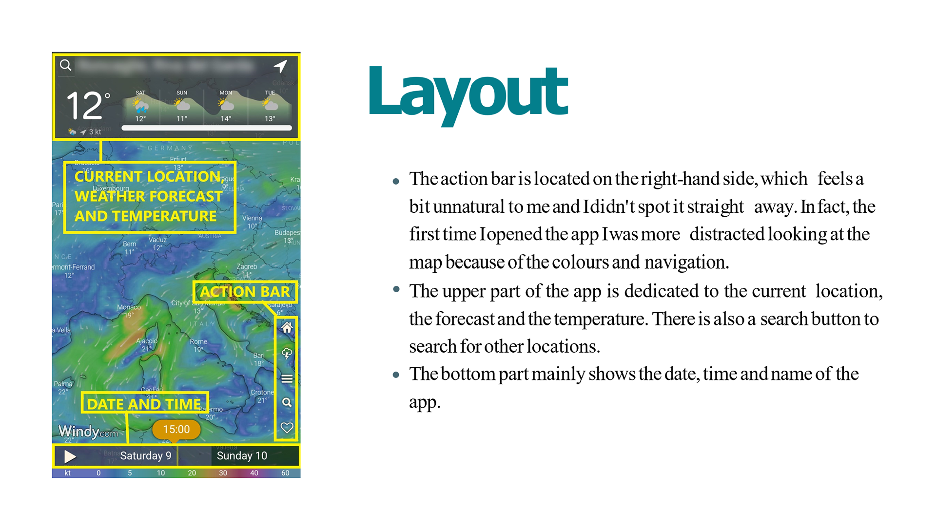
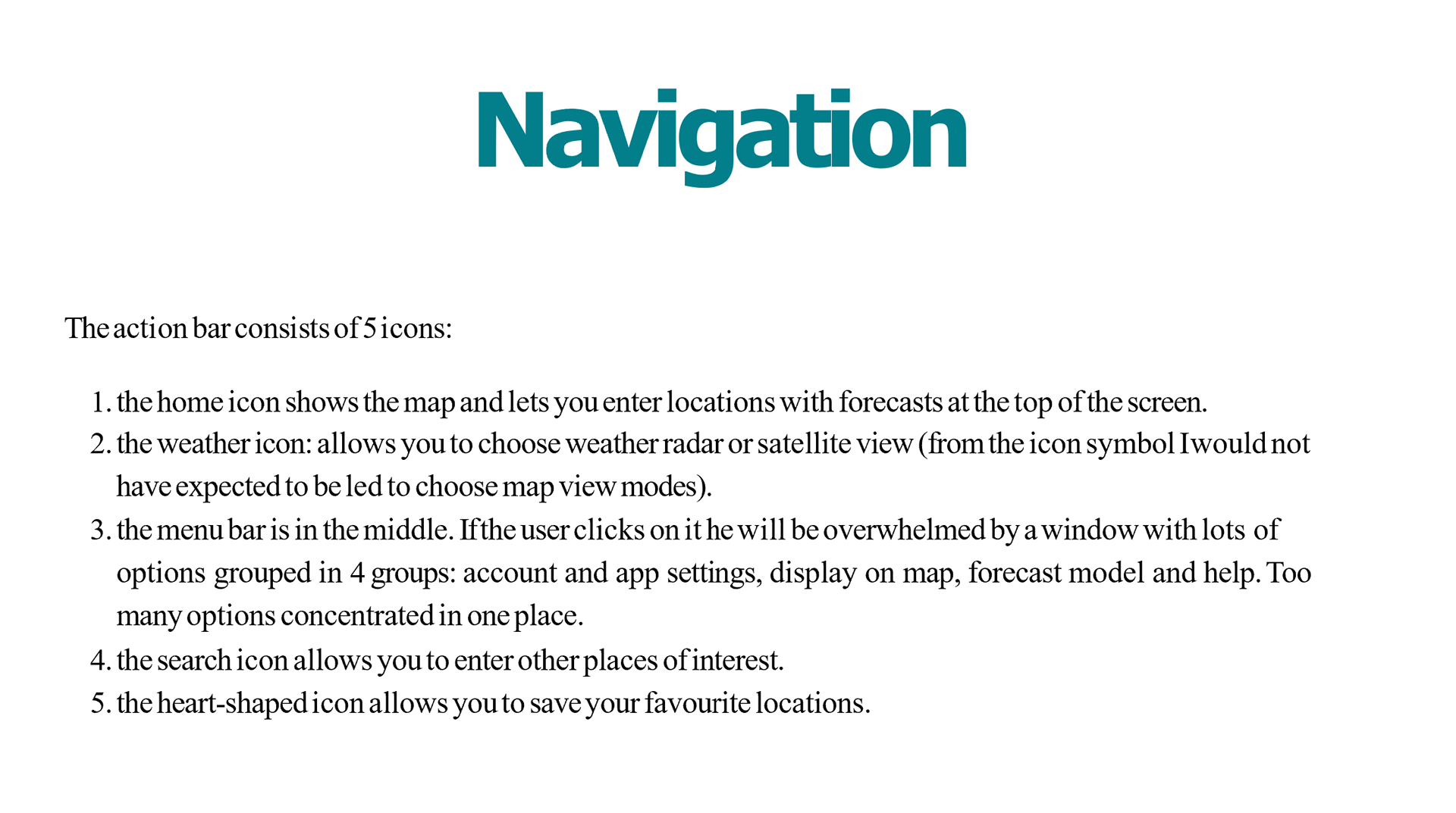
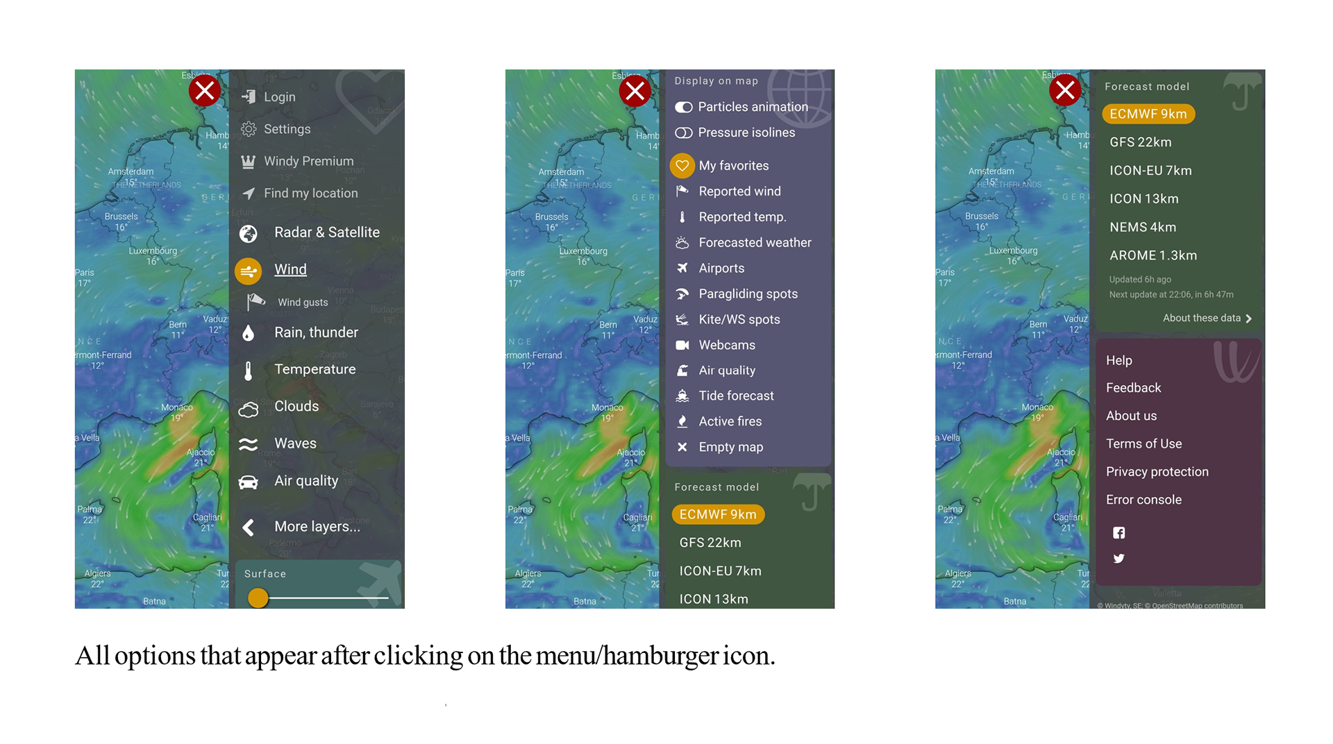
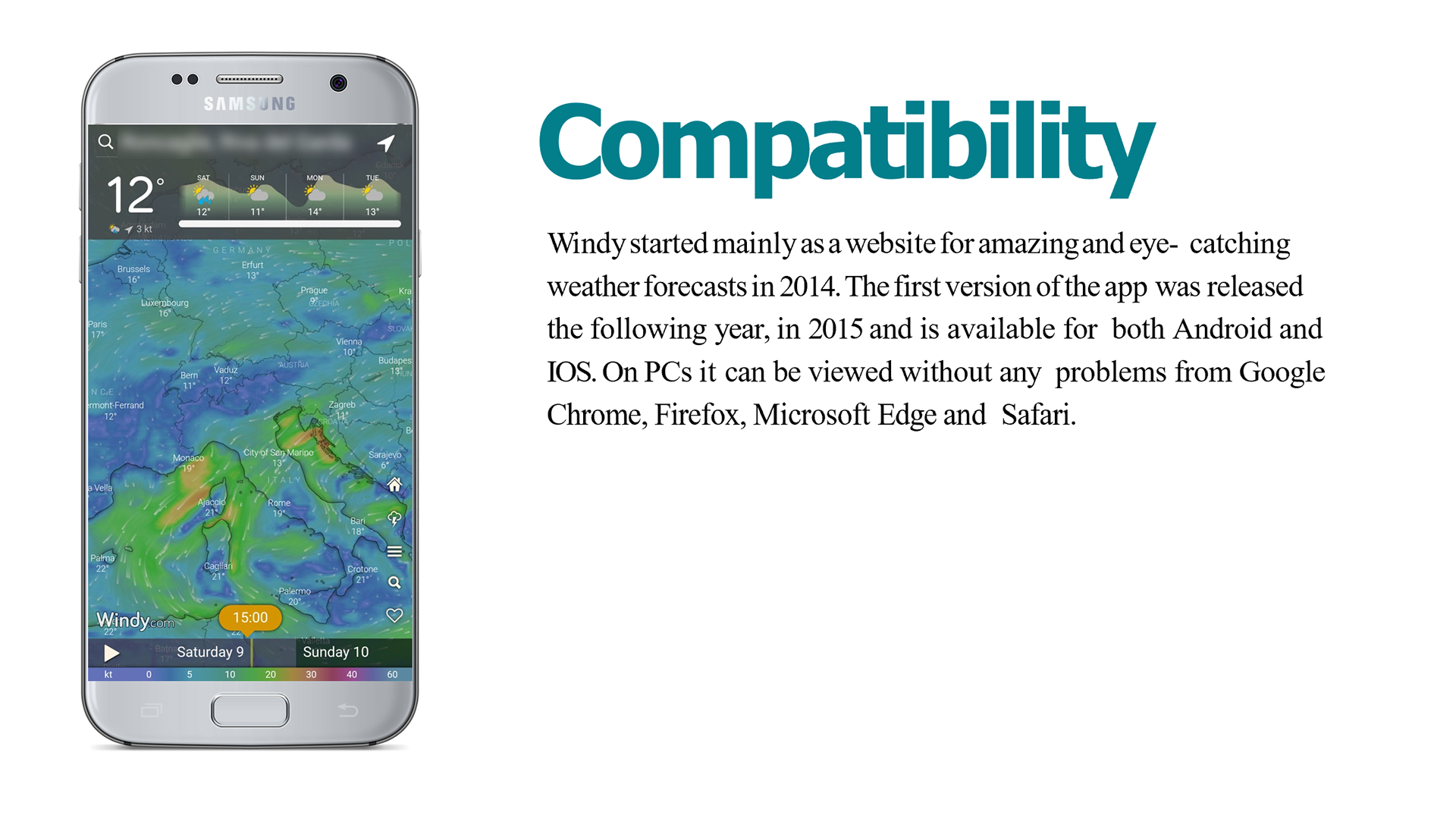
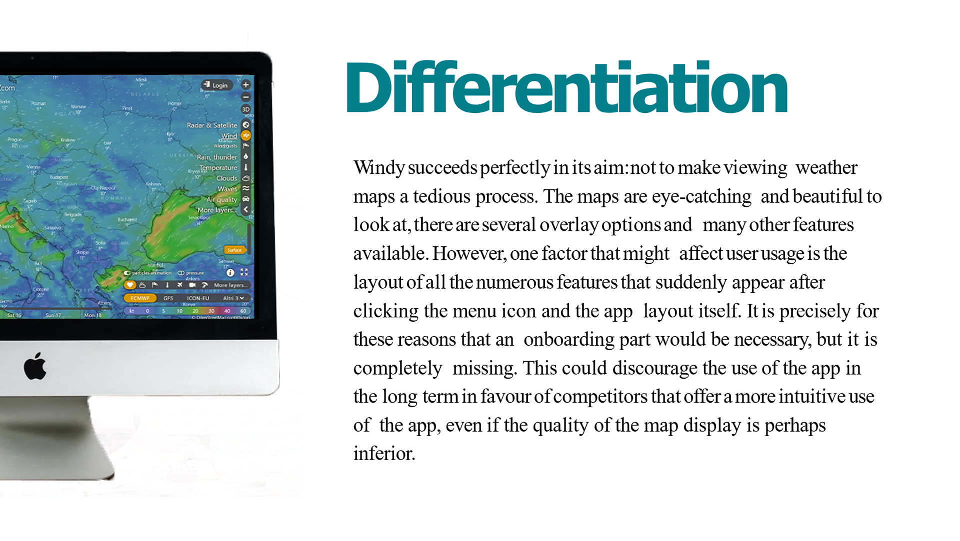
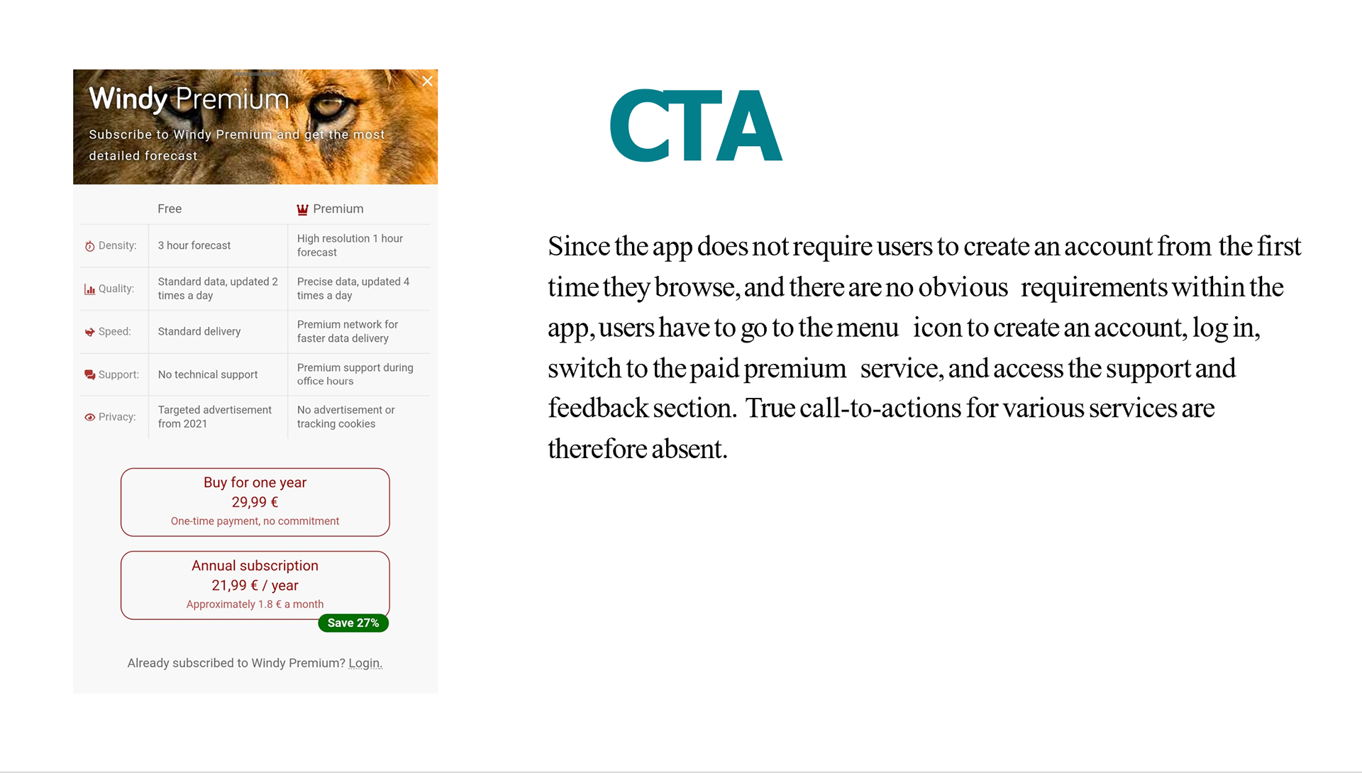
Performing a competitor analysis was an important step to see what problems competitors are trying to solve and how they do so as well as how they apply design to their projects. At this stage I have identified two main competitors: Windy and MSW Surf Forecast. Of these I created a marketing profile and SWOT analysis. For Windy, I also performed a UX analysis focusing on six aspects: usability, layout, navigation structure, compatibility, differentiation, and CTAs.
USER RESEARCH & USER PERSONAS
At this stage it was crucial to observe potential users to determine their needs and goals. In order to do so I decided to carry out qualitative research through user interviews. In particular, I wanted to understand:
1) what are the most common problems that water sports enthusiasts encounter.
2) how they organise a sports session in advance
3) what could potentially scare them while in the water.
2) how they organise a sports session in advance
3) what could potentially scare them while in the water.
I prepared a script and identified twelfe questions that I felt needed to be asked of the respondents to find enough information to answer the three research questions. I interviewed five people in person and the results allowed me to draw several conclusions:
These people hate crowding in the places they want to practice and would be grateful to know in advance if there are water sports competitions or traffic. The weather plays such a big role that they are willing to change their destination according to the forecast without necessarily having to give up their session. Finally, the aspect they are most concerned about is sudden changes in the weather to the point where they may not be able to get out of the water in time.
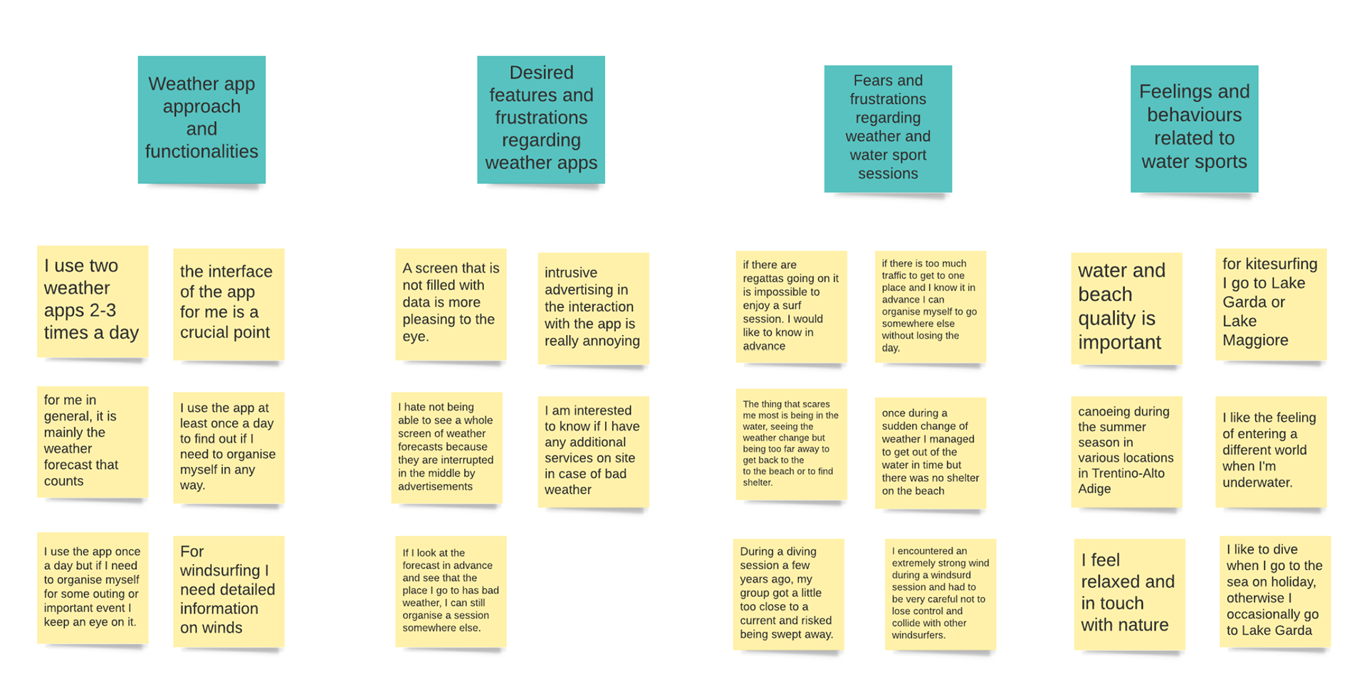
All the information I collected during the interviews formed the basis for the creation of an affinity map. In organising the data collected, I focused mainly on four macro aspects: the behaviour, habits, needs and frustrations of the people interviewed in relation to weather apps and water sports.
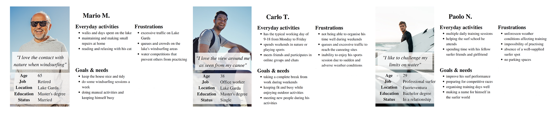
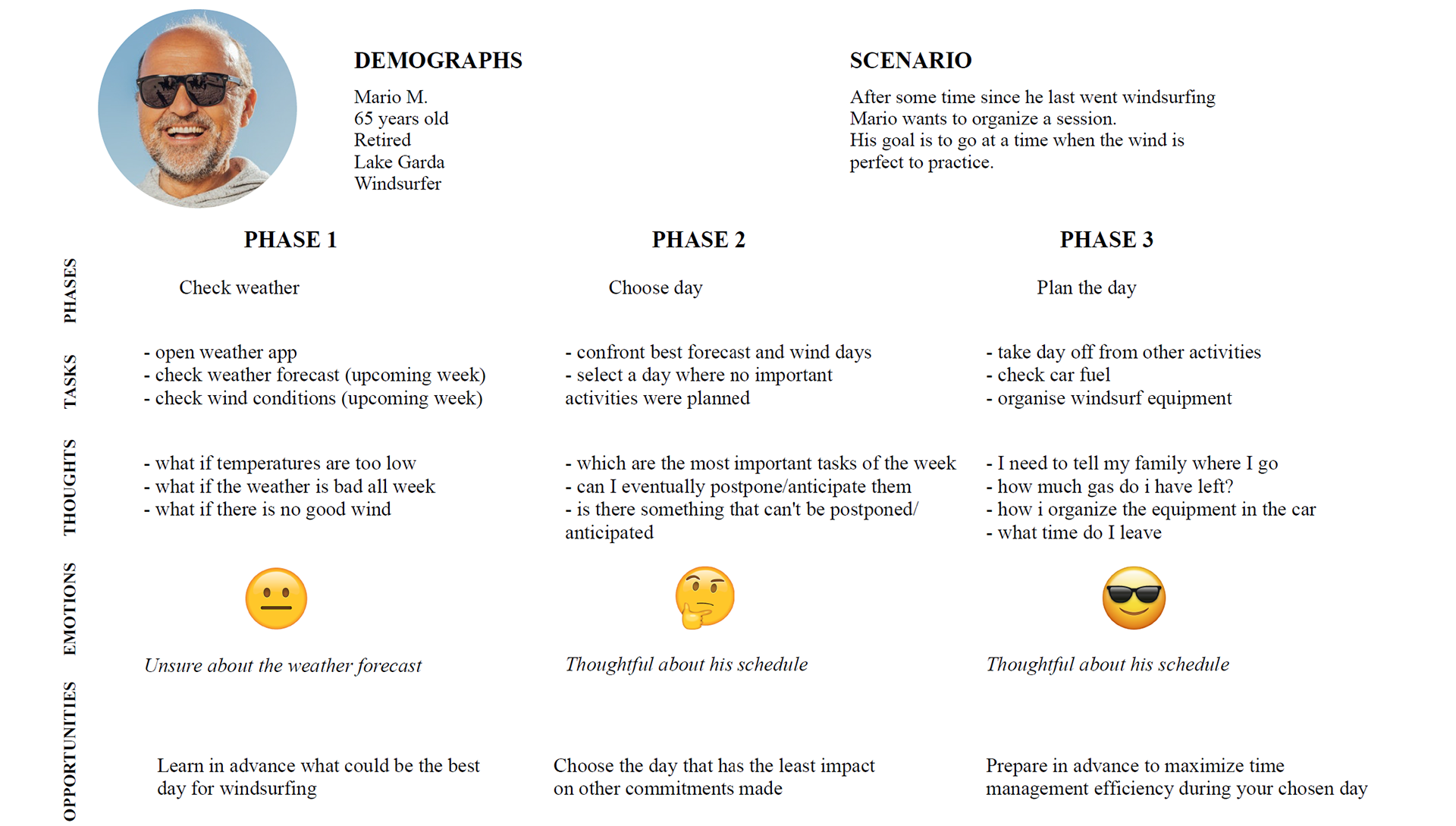
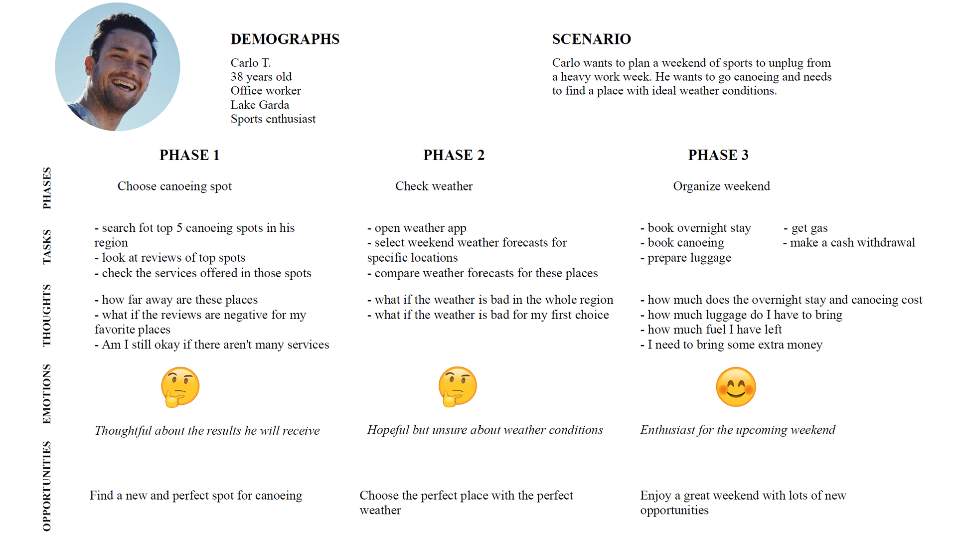
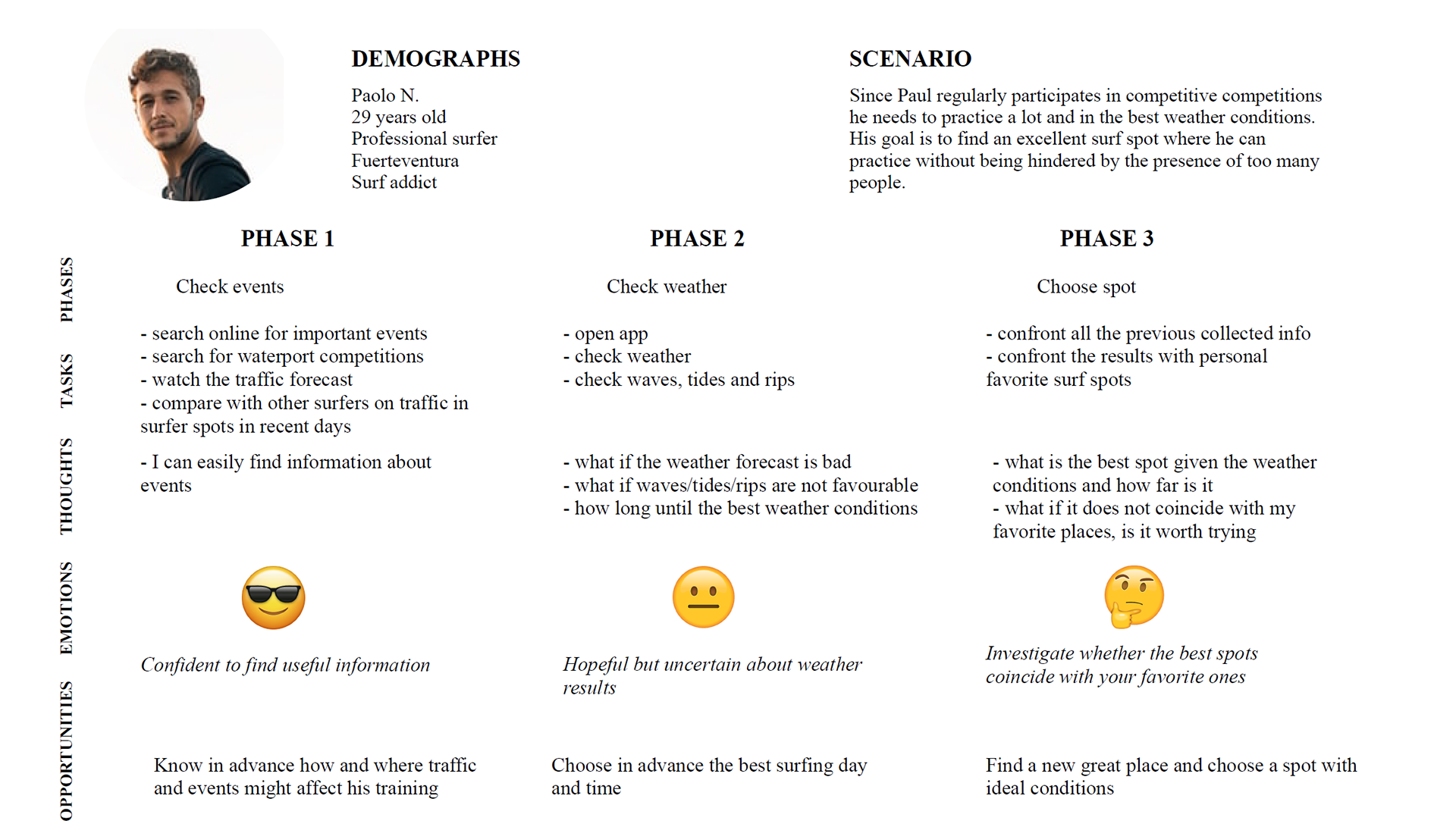
After the in-depth analysis of the interview results I continued with the elaboration of three well-defined design personas:
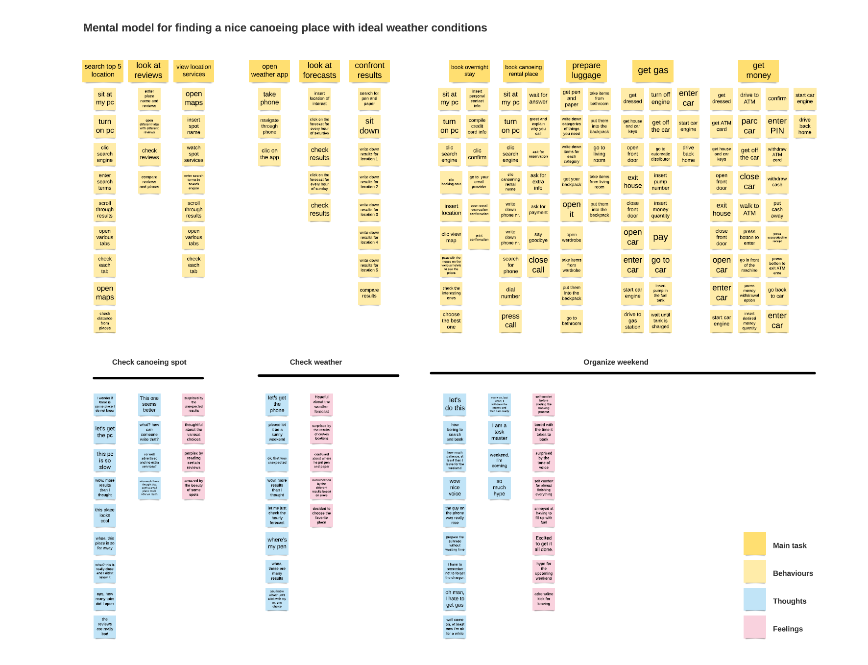
Having defined the design personas, it was important for me to understand and visualise the process a user goes through to achieve their goal through user journeys. I set up a scenario for each design persona and then focused on the different phases, the tasks they perform for each phase, the thoughts and emotions they experience as well as identifying opportunities that could arise from each phase.
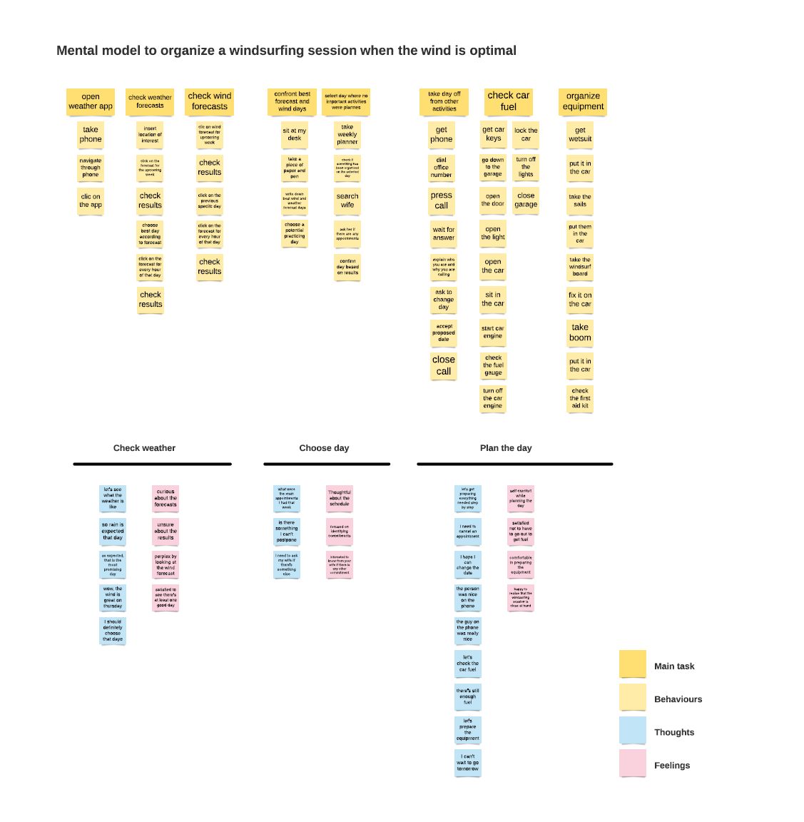
To further empathise with my design personas, I also created two mental models. This process helped me to understand how the Vela project can fit into the behaviours, thoughts and emotions of my potential users.
WIREFRAMING AND PROTOTYPING
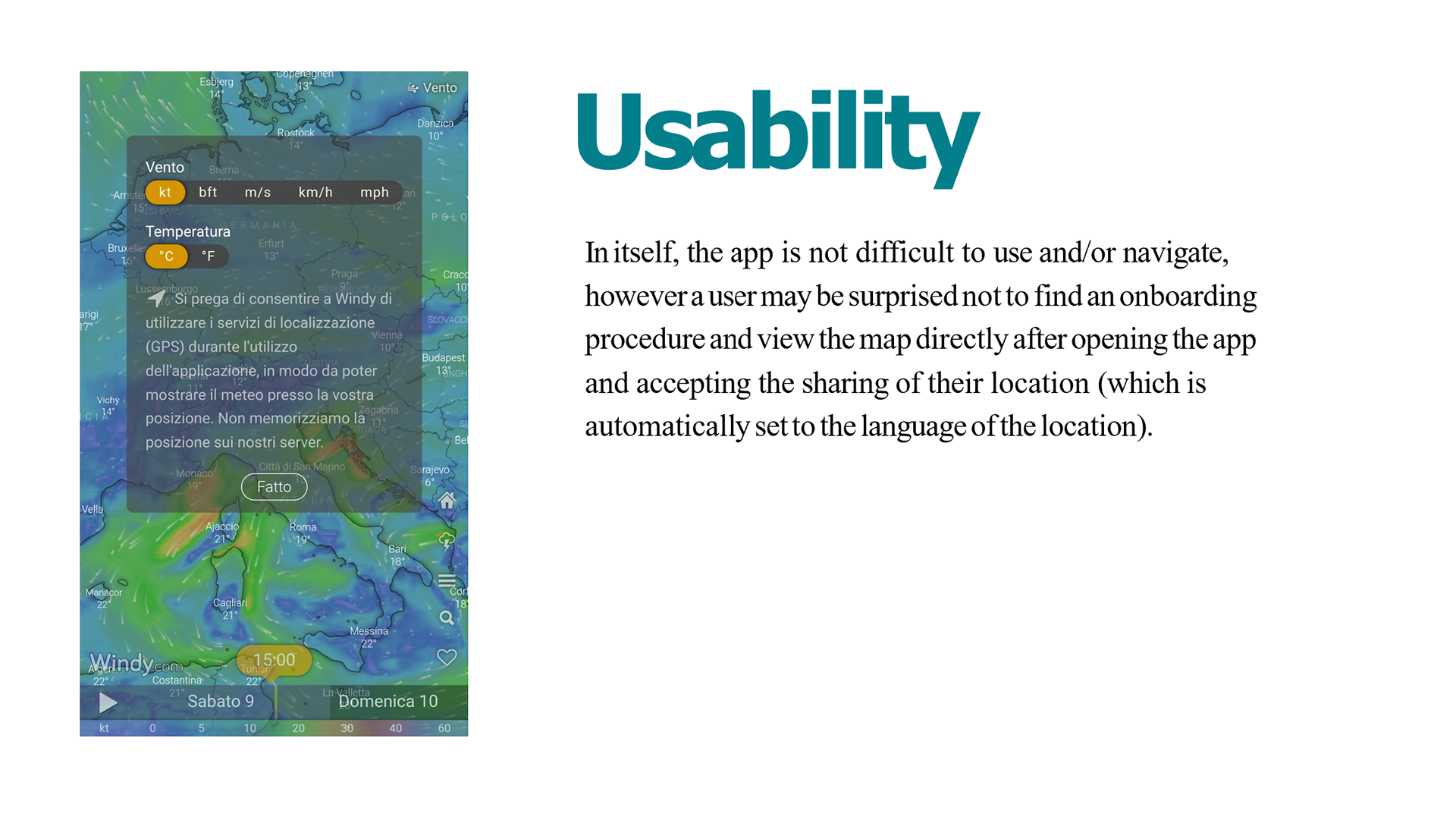
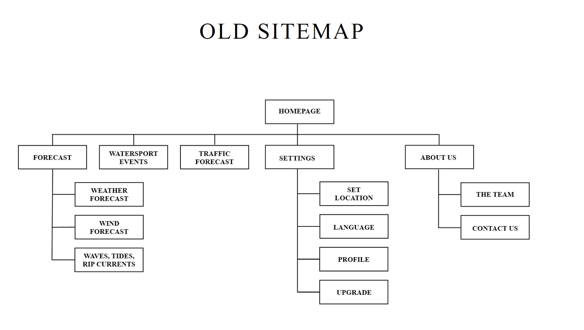
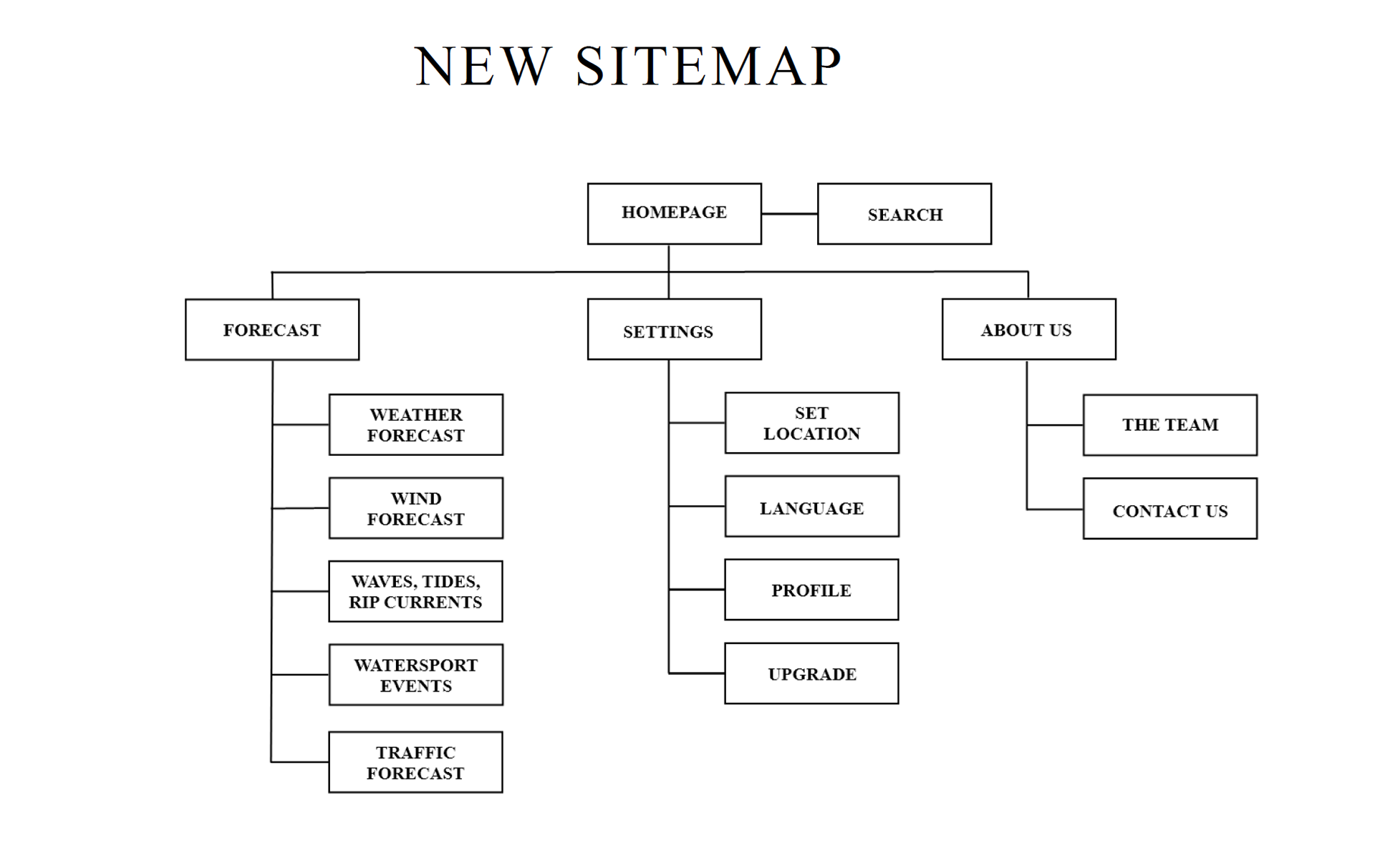
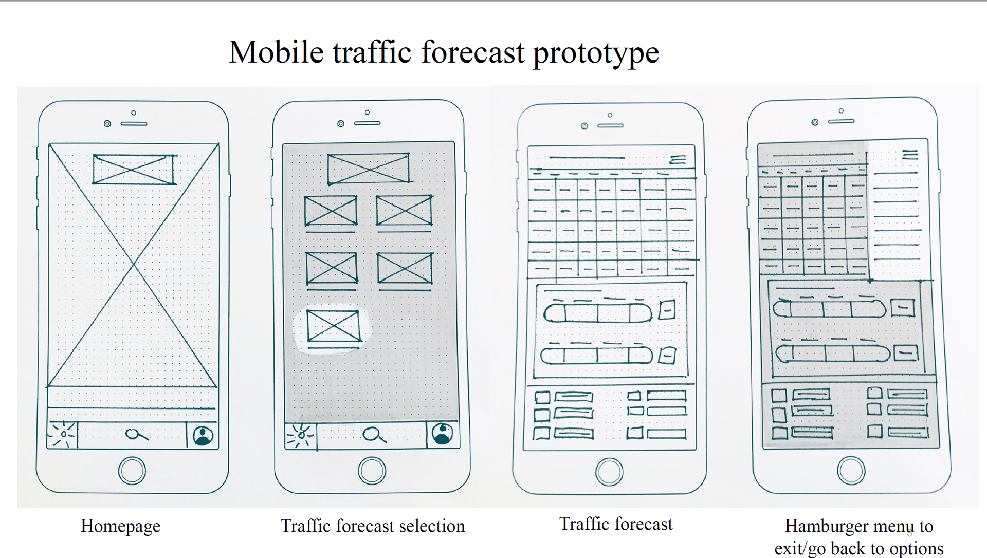
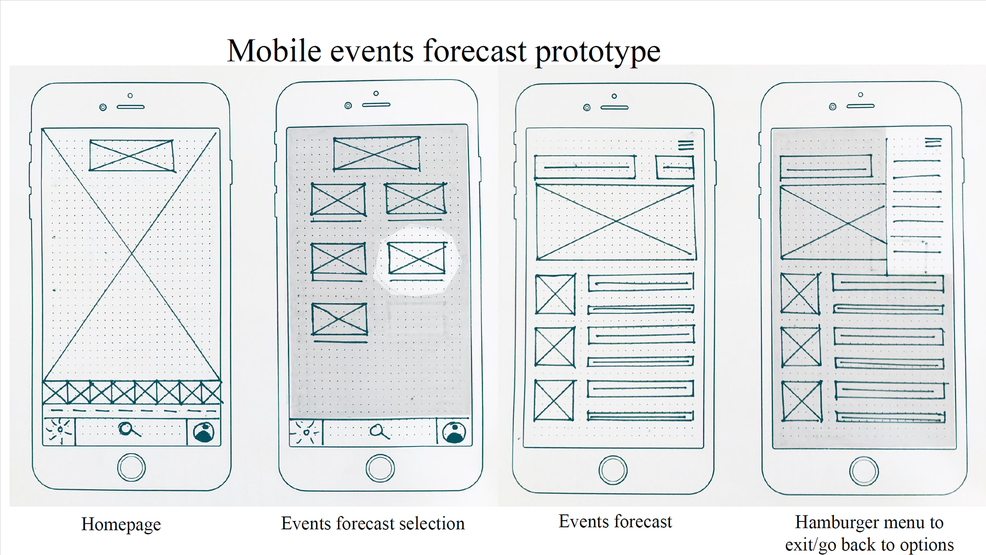
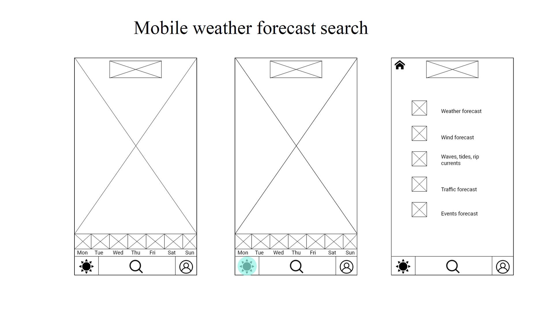
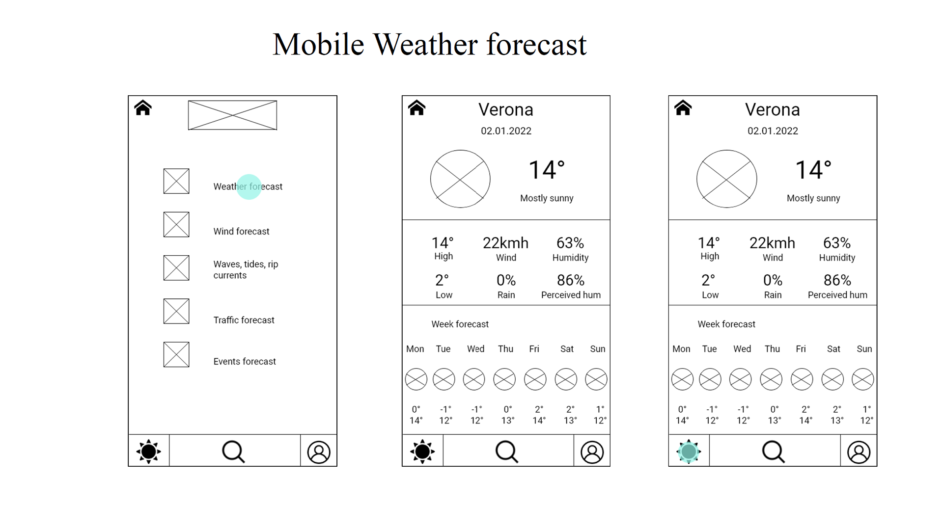
All the information gathered during the research phase allowed me to create user flows and a first sitemap version of using Adobe XD which was then tested with a digital card sorting test using OptimalSort. The results showed a correspondence between the labels and categories with the organisation of the pages in the first sitemap with reference to the "about us" and "settings" sections. As for event and traffic forecasts, they were all placed under the forecast category, so rather than treating them as separate pages, it seemed necessary to make them available via the "forecast" page. Finally, the search option was seen as part of the homepage.
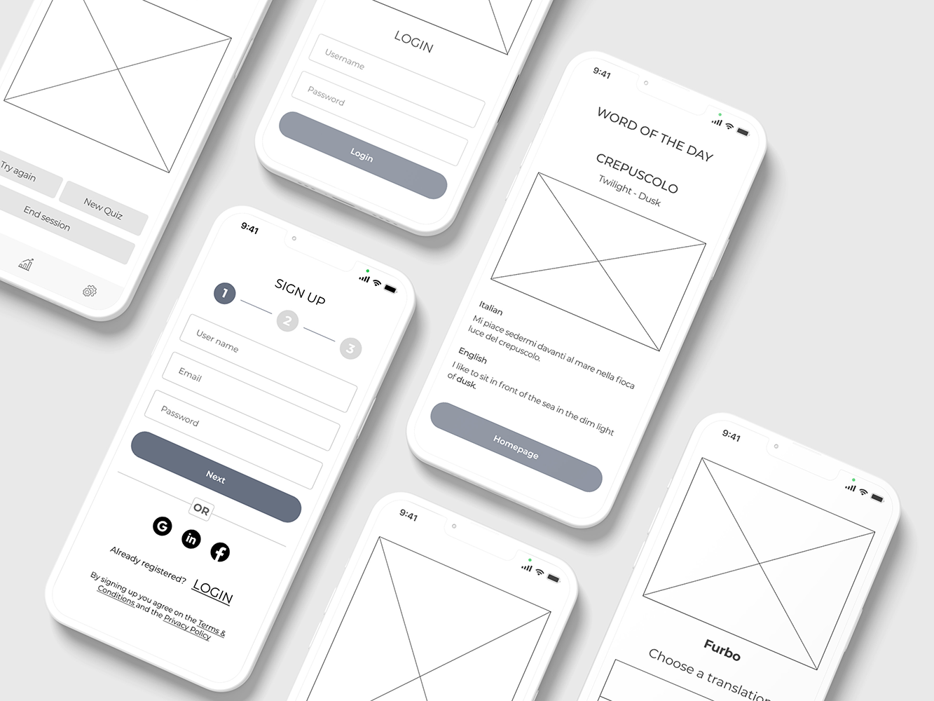
After redefining my sitemap I started working on wireframes that led me to develop first a low fidelity prototype.
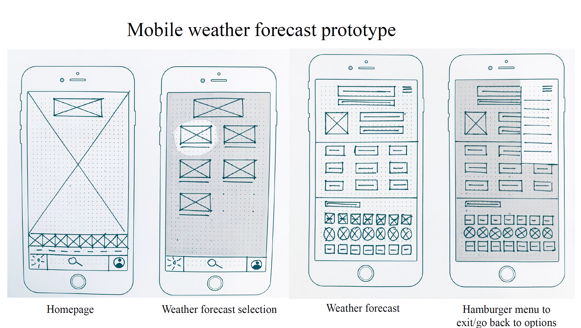
Then, I continued working on wireframes to get to the point of creating a mid fidelity prototype.
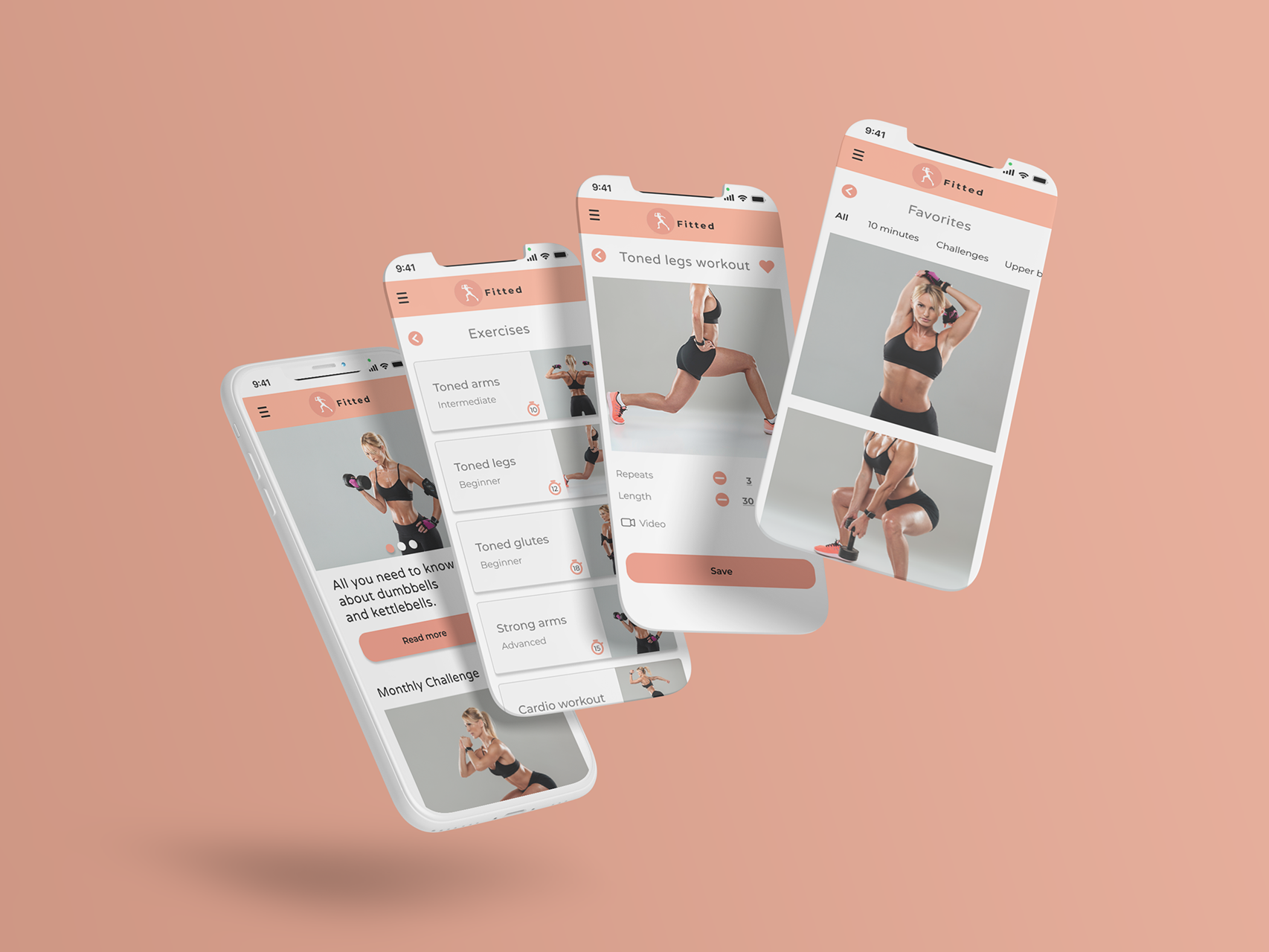
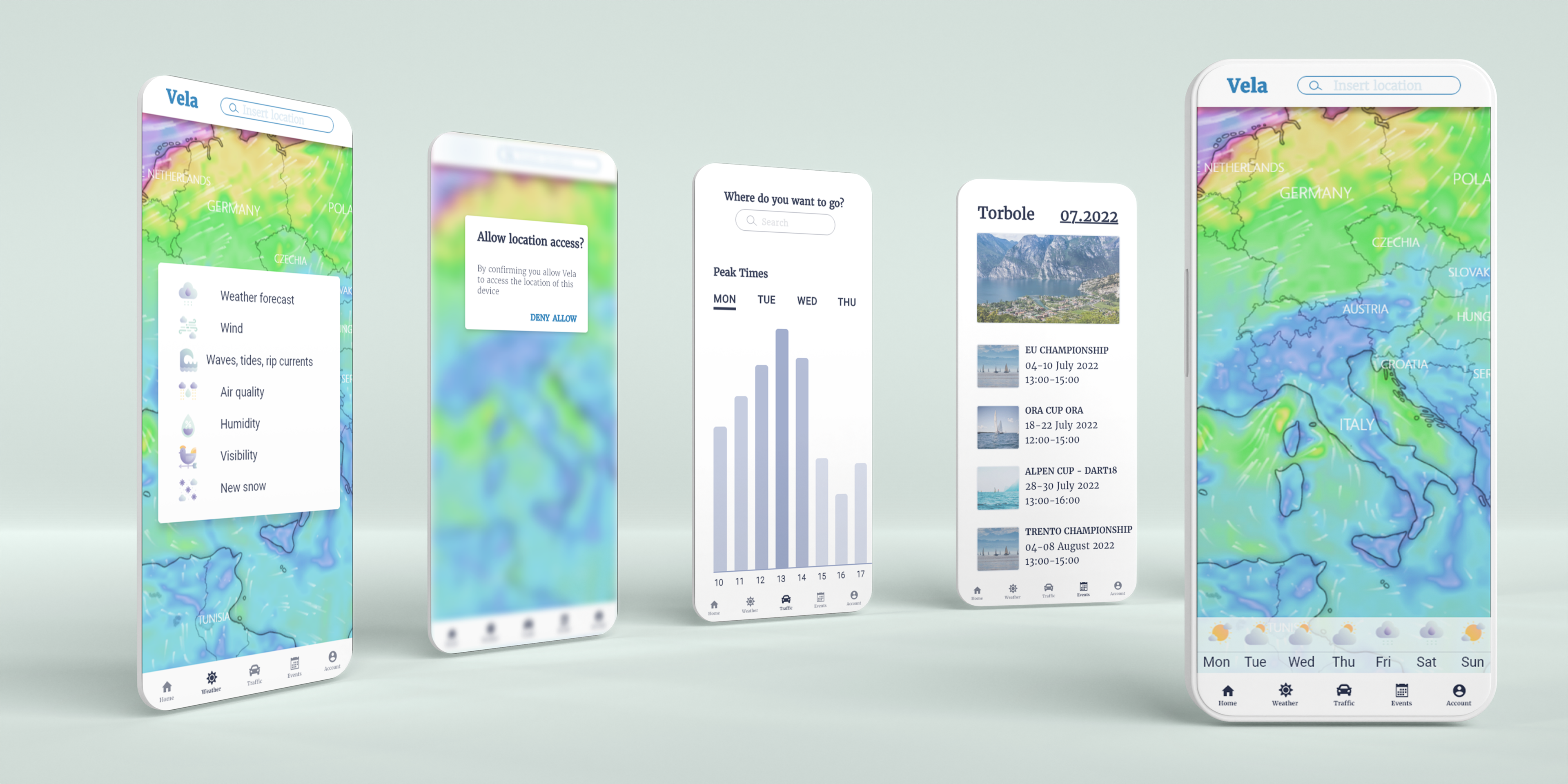
Finally, I developed a high fidelity prototype which formed the basis for the next phase of user testing. The original prototype can be seen clicking here.
USABILITY TESTING
After transforming the ideas and information I gathered in the research phase into an interactive prototype, it was crucial to have it tested by users in order to receive important feedback and improve the design and interactions based on the results. Before entering the actual testing phase I created a consent form, a test plan and a script.
I chose to carry out six moderated remote tests in which the users received three scenario tasks:
1) You'd like to have a nice outdoor trip/outing and don't want to risk ruining it because of bad weather. Thus, you decide to check the weather forecast.
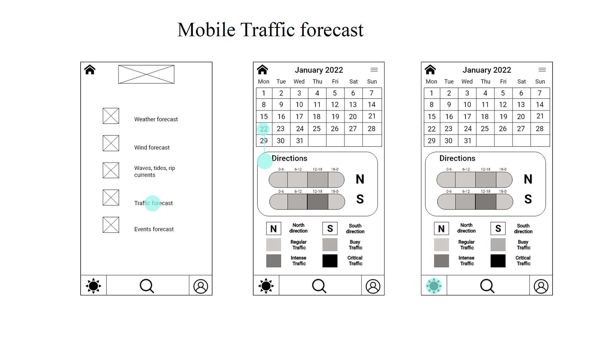
2) You've planned a day out and to enjoy it, you can't waste hours stuck in traffic. That's why you decide to check the highway traffic forecast.
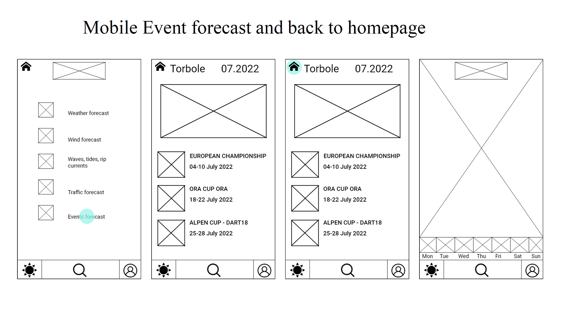
3) You've decided to go to Torbole to do some windusrf but you'd like to make sure you don't get stuck in some sporting competition. So you decide to see what events will be held in the period you want to go.
The objective of this test was to determine whether participants quickly and easily understand what the app is about and the value it provides. I also wanted to observe how users navigate and find information about weather, traffic and event forecasts.
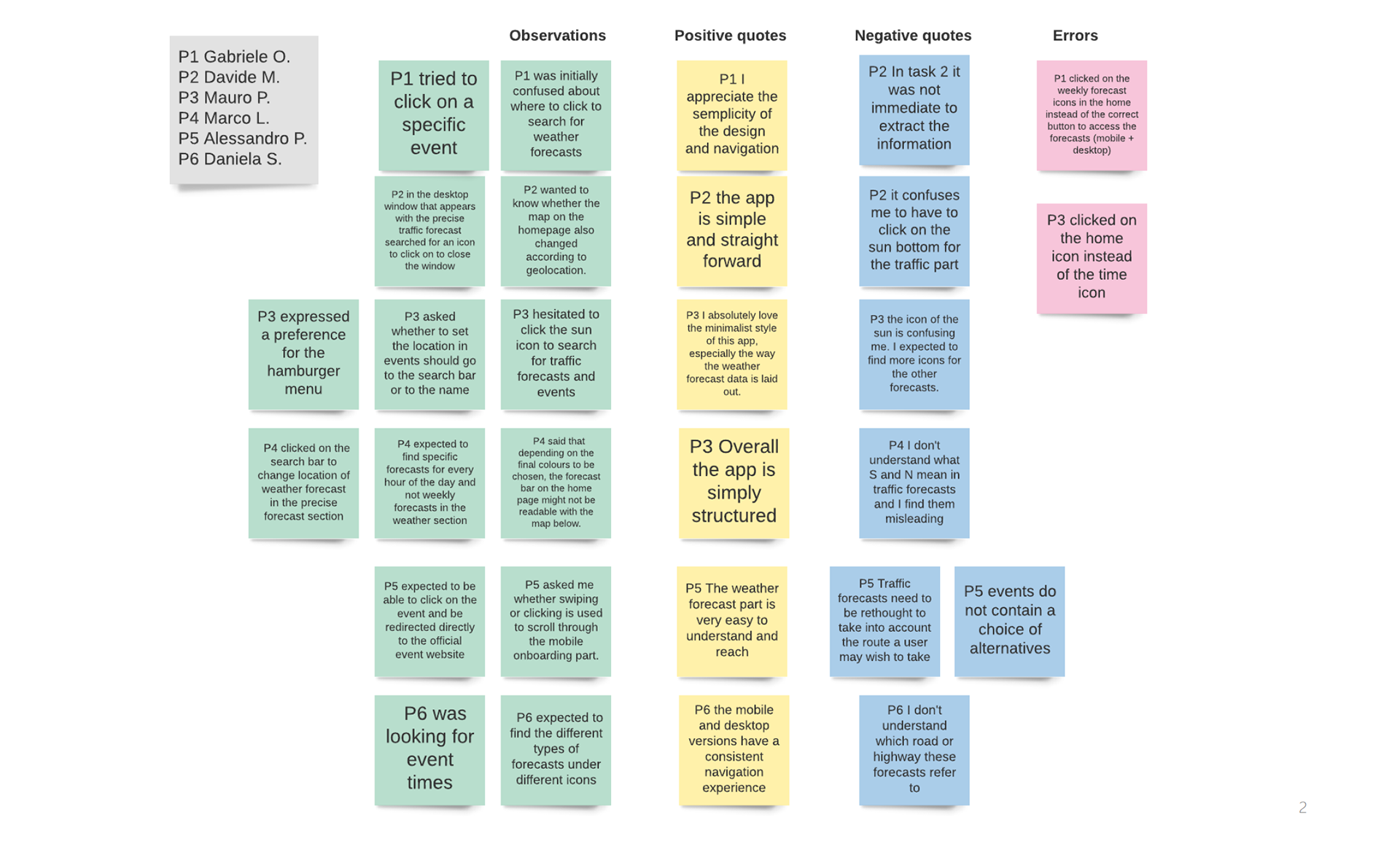
The errors were assessed according to the Jakob Nielsen scale and another metric applied was the Single Ease Question 7-point rating scale after each Task. I collected the test results in an affinity map and also in a detailed Rainbow Spreadsheet.
DESIGN EVOLUTION AND DESIGN DOCUMENTATION
Thanks to the test results, I identified five issues that needed to be resolved on the prototype:
1) Keeping traffic and event forecasts under the weather icon is counterintuitive (high severity)
Suggested Change: Choosing between adding additional traffic and event icons respectively or inserting a
hamburger menu with all the main options.
2) When the user arrives at the traffic section there is no specification of the road to which the
forecast refers (high severity)
Suggested Change: Finding a way to show the user the reference road, e.g. by giving them a choice
between different motorways.
3) S and N in traffic forecasts are misleading (medium severity)
Suggested Change: Given the difficulty of programming a compass rose system in relation to motorways, the
app could be simplified by removing the forecasts based on the direction of the carriageway and instead
inserting a single bar showing the general traffic forecast for that motorway on a given day.
4) Users prefer hourly rather than weekly weather forecasts (medium severity)
Suggested Change: Replace the weekly weather forecast section with an hour-by-hour forecast section with
vertical scroll.
5) Event times are missing (low severity)
Suggested Change: enter the times of the various events in addition to the date
Working on these five issues, I created a first version of a revised prototype after user testing.
However, the updated version of the prototype still lacked all the visuals, and the next job was to work on the aesthetics of the design while respecting the material design, grid and spacing fundamentals and visual design principles. At this stage I also found it very useful to have my design choices tested through Preference Tests and Design Collaboration. The latter allowed me to have my prototype tested by 3 other students leaving valuable feedback and observations, while I did the same on others' prototypes.
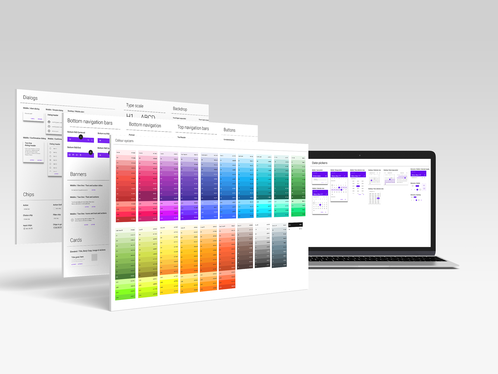
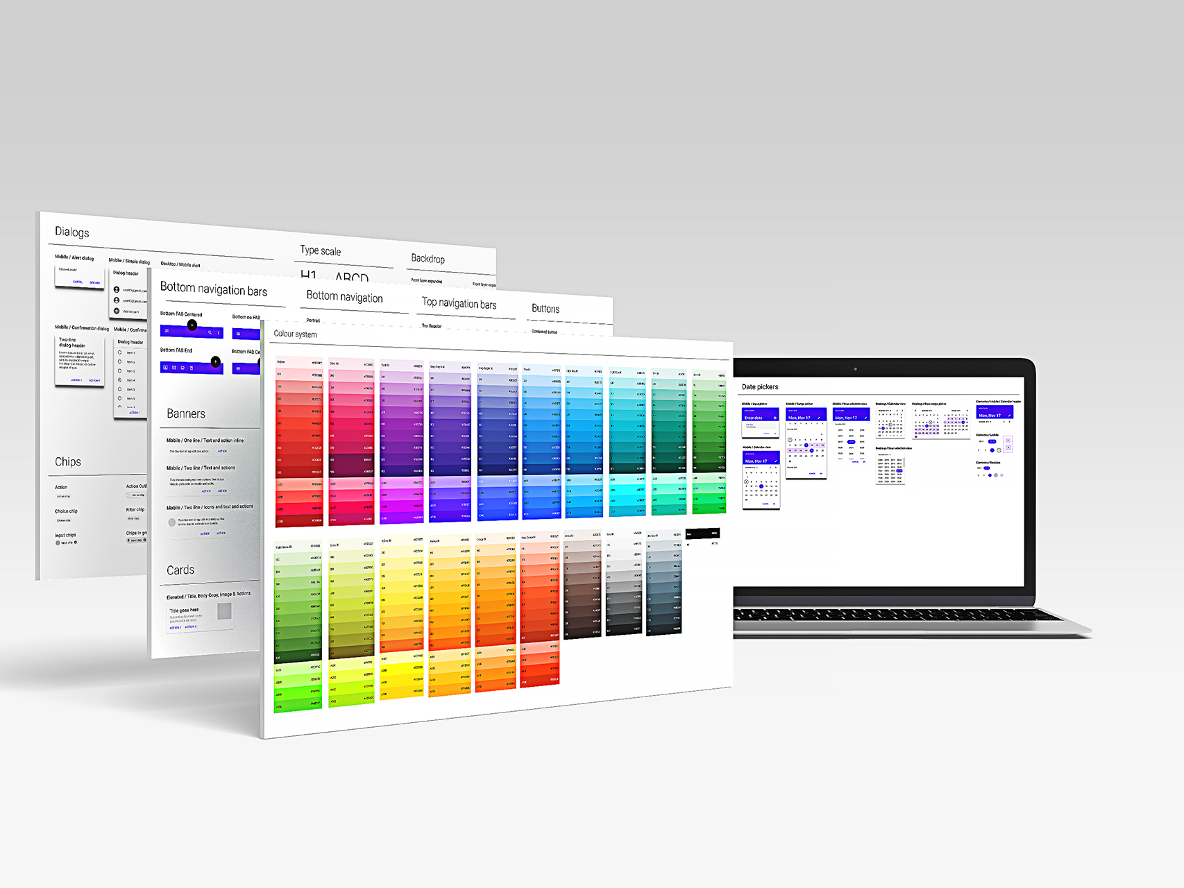
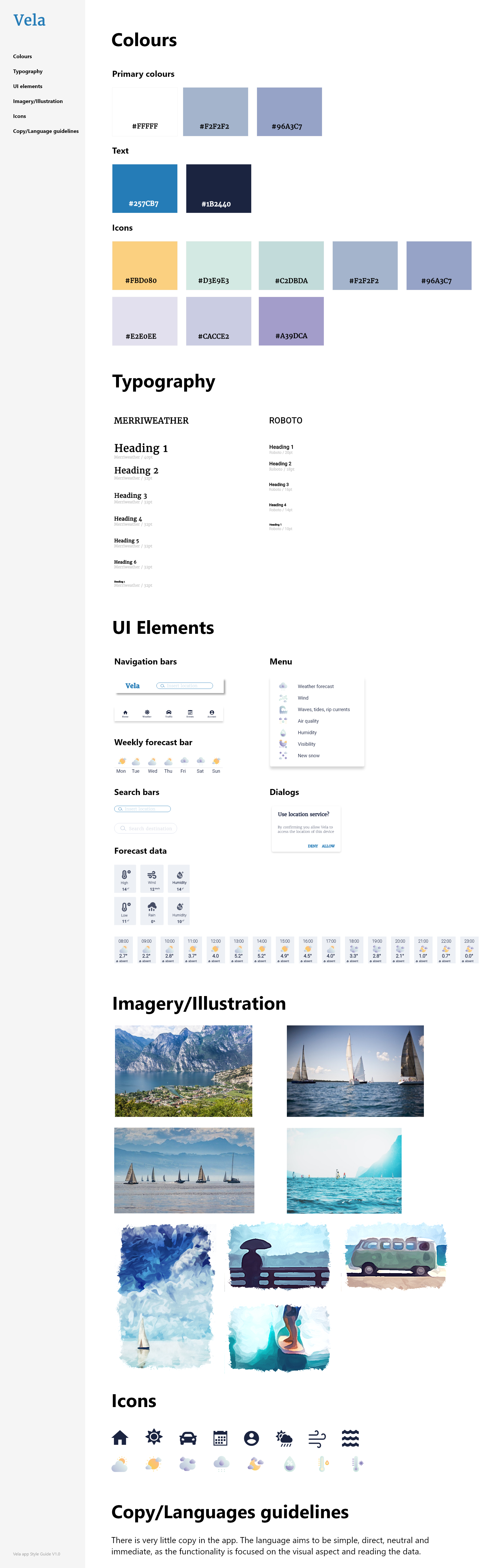
The work of redefining the visual appearance of the prototype was long and required many changes, which proved necessary to allow me to create a precise, clear and well-defined design. I felt it was crucial to have the design changes tested because the feedback also helped me to understand what kind of views different users might have when using Vela. I collected all the design data in two main documents: a Style Guide and a Design System.
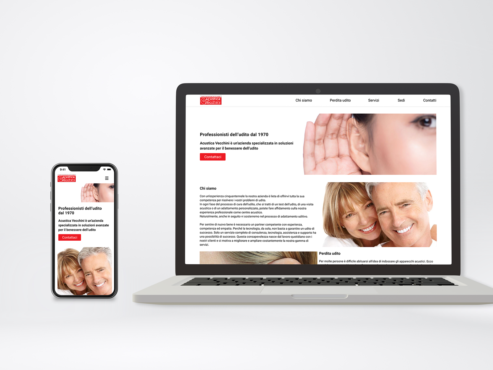
FINAL PROTOTYPE
The final result of my work on the Vela project can be viewed here.
FINAL CONSIDERATIONS
Through the development of the Vela project, I learned how essential both the research phase and the user testing phase are. The research phase allowed me to identify not only the problem I wanted to address in the project, but also how other UX designers approach solving problems related to weather applications and their landscape. Another fundamental step was to observe the users and thus try to understand their needs and objectives, as well as to empathise with them as much as possible by understanding their point of view.
User testing, applied at an early stage in the prototype development process, allowed me to gather very important feedback, enabling me to gain a better understanding of the friction points for users and make the necessary changes immediately, thus saving valuable time also with a view to hypothetically collaborating with a development team. The same applies to the various design review phases where I was able to significantly improve the visual side of the app as well, thanks to the observations of the users who tested it. Furthermore, an important aspect that has emerged in this project is that the simplicity of the app is appreciated above all other aspects.
For the future, I would like to develop further app features such as the settings and account creation. These development areas will be tested with preference testing, in person and remote moderated usability testing.