PROJECT OVERVIEW
With so many concepts and terms to study and remember, learning a new language can be intimidating. For this reason it is important to understand the experience a user has in memorising and understanding new words in order to work towards a positive user experience. The purpose of Sproutlan is to encourage people to learn new vocabulary.
Sproutlan is the first project I've worked on in CareerFoundry's Intro to UX Design course.
Following the Design Thinking Process allowed me to create a low-fidelity prototype that was then tested on potential users.
Following the Design Thinking Process allowed me to create a low-fidelity prototype that was then tested on potential users.
ROLE
UX Designer
DURATION
4 weeks
TOOLS
Pen and paper
Figma
Draw.io
Lucidchart

COMPETITIVE ANALYSIS
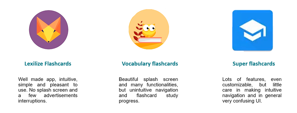
In order to start applying the Design Thinking Process to the project, it was necessary to first understand the problem space and the context in which vocabulary study apps operate.
An important step to this end was competitor analysis. This allowed me to see what problems and solutions other apps were responding to and also what functionalitiesy were being applied.
An important step to this end was competitor analysis. This allowed me to see what problems and solutions other apps were responding to and also what functionalitiesy were being applied.
To do this, I selected and downloaded three apps and registered myself so as to check the flow of all the stages, from onboarding to research and study of vocabulary. I used the functionality of the apps like a user who wants to learn new words in another language, paying attention to what I was comfortable with and what problems I encountered.
USER RESEARCH
User research was a crucial part of the process because it allowed me to test assumptions about the users, as well as to form my hypothesis statement and problem statement.
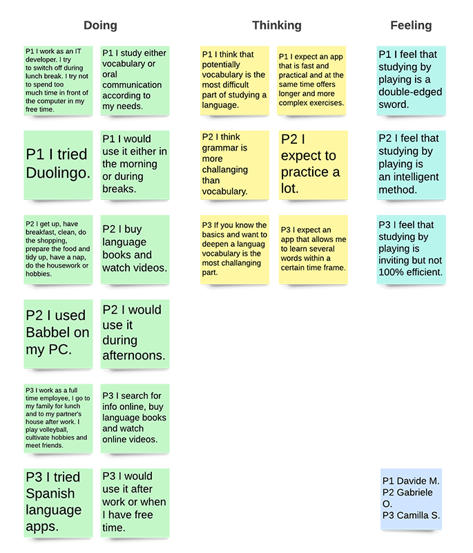
To do so I chose a qualitative method of user research: in-person user interviews. The goal was to understand what expectations people have both in approaching studying a new language and in using an app to do so. The following questions were asked:
To do so I chose a qualitative method of user research: in-person user interviews. The goal was to understand what expectations people have both in approaching studying a new language and in using an app to do so. The following questions were asked:
• How does your typical week day look like?
• What is your approach when learning a new language?
• Do you think vocabulary learning is the most difficult part in learning a new language?
• Have you ever used an app to learn about a language?
• What are your expectations when using an app to learn a new language
• How do you feel about learning words in a playful way?
• When would you use the app if you can use it during the day?
Thanks to the interviews, I obtained important information about the users and their way of approaching the study of languages and foreign words. The results were then divided into three categories: doing, feeling and thinking.
UNDERSTANDING THE PROBLEM
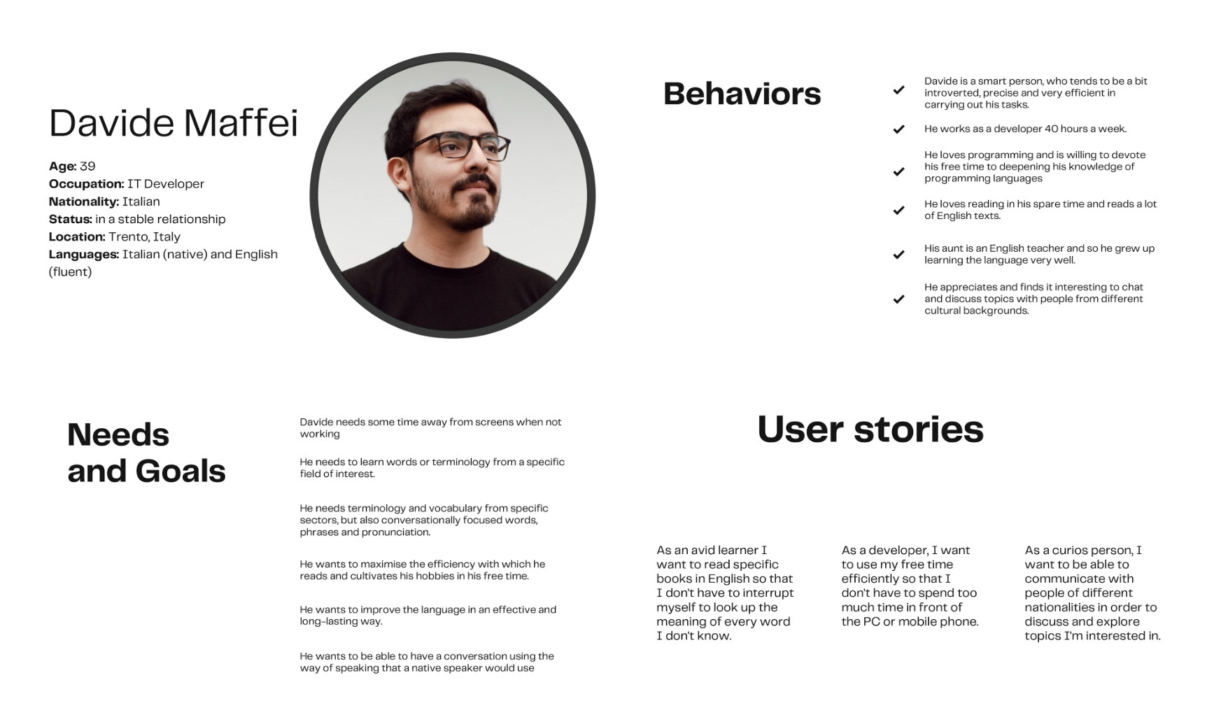
I collected and analysed data obtained from the previous competitor analysis and interviews to create user personas so that I could identify sensible problems and consequently also possible solutions that a user potentially faces when approaching the study of a new language.
This part was extremely important because it was the basis for all the processes that were applied later: task analysis, user flow creation, wireframing, prototype creation and user testing.
This part was extremely important because it was the basis for all the processes that were applied later: task analysis, user flow creation, wireframing, prototype creation and user testing.
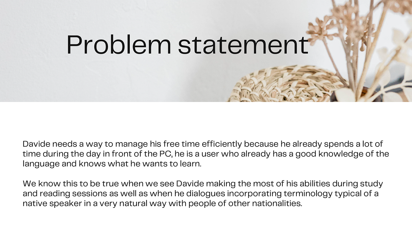
The problem statement that resulted from my research and analysis is the following:
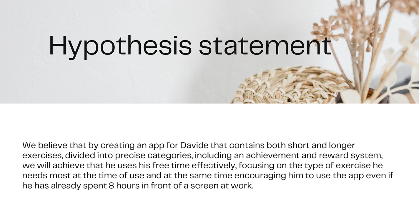
The identified solution is:
USER PERSONA
INFORMATION ARCHITECTURE
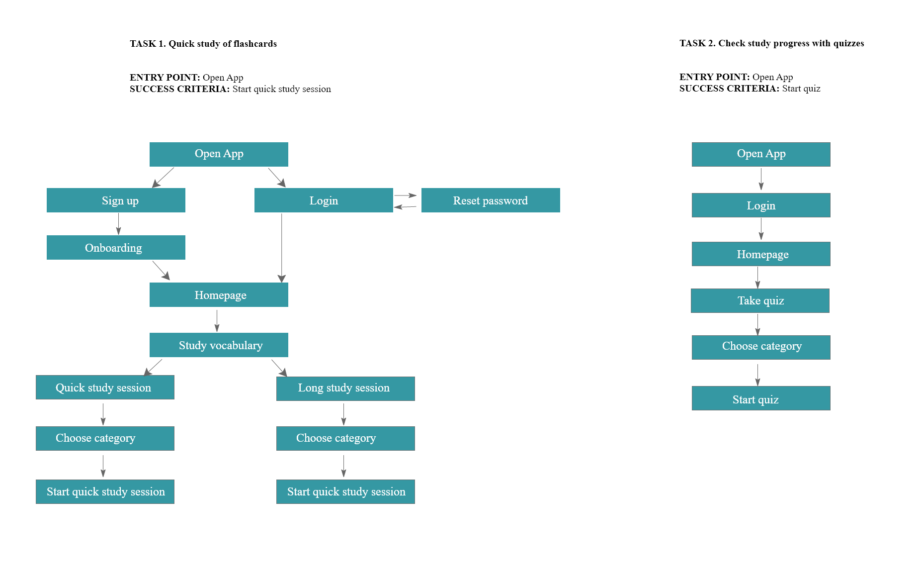
After identifying the main problem to be addressed for the creation of Sproutlan and also identifying a solution to solve it, I focused on "how" potential users will interact with the app and use its content. To work on these aspects, I applied two principles of Information Architecture: task analysis and user flows.
The task analysis required me to identify the common steps a user takes to perform a certain action. Once a task was chosen, I identified an entry point and a success criterion for each task.
The tasks are:
1) Quick study of flashcards
2) Check study progress with quizzes
After identifying the tasks, I created the following two userflows using Adobe XD:
The tasks are:
1) Quick study of flashcards
2) Check study progress with quizzes
After identifying the tasks, I created the following two userflows using Adobe XD:
WIREFRAMING TESTING
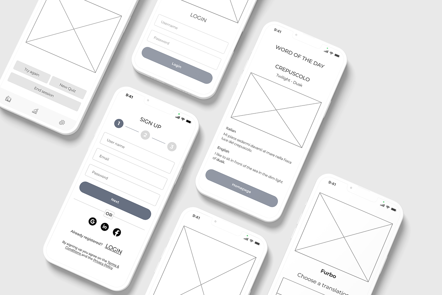
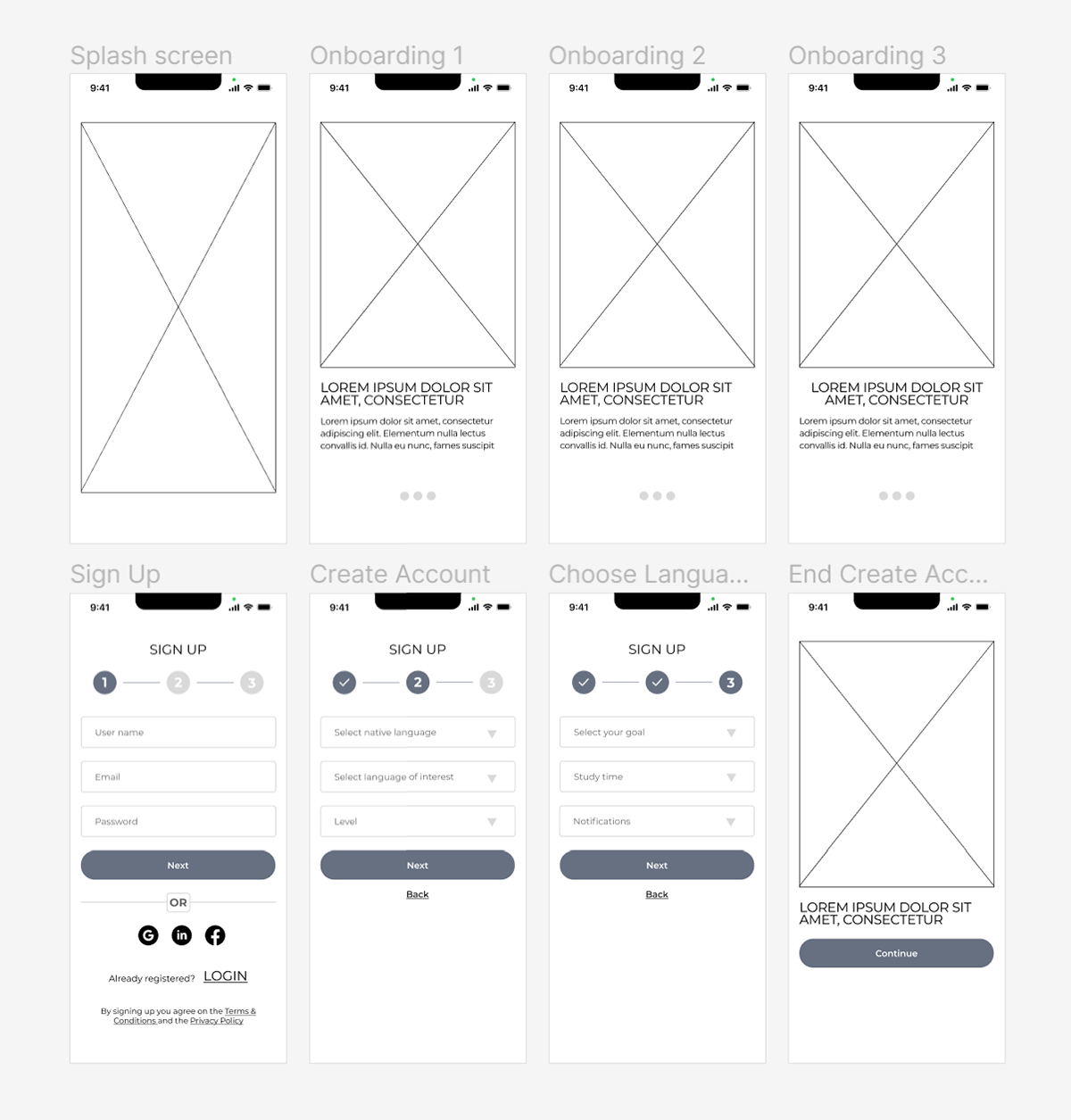
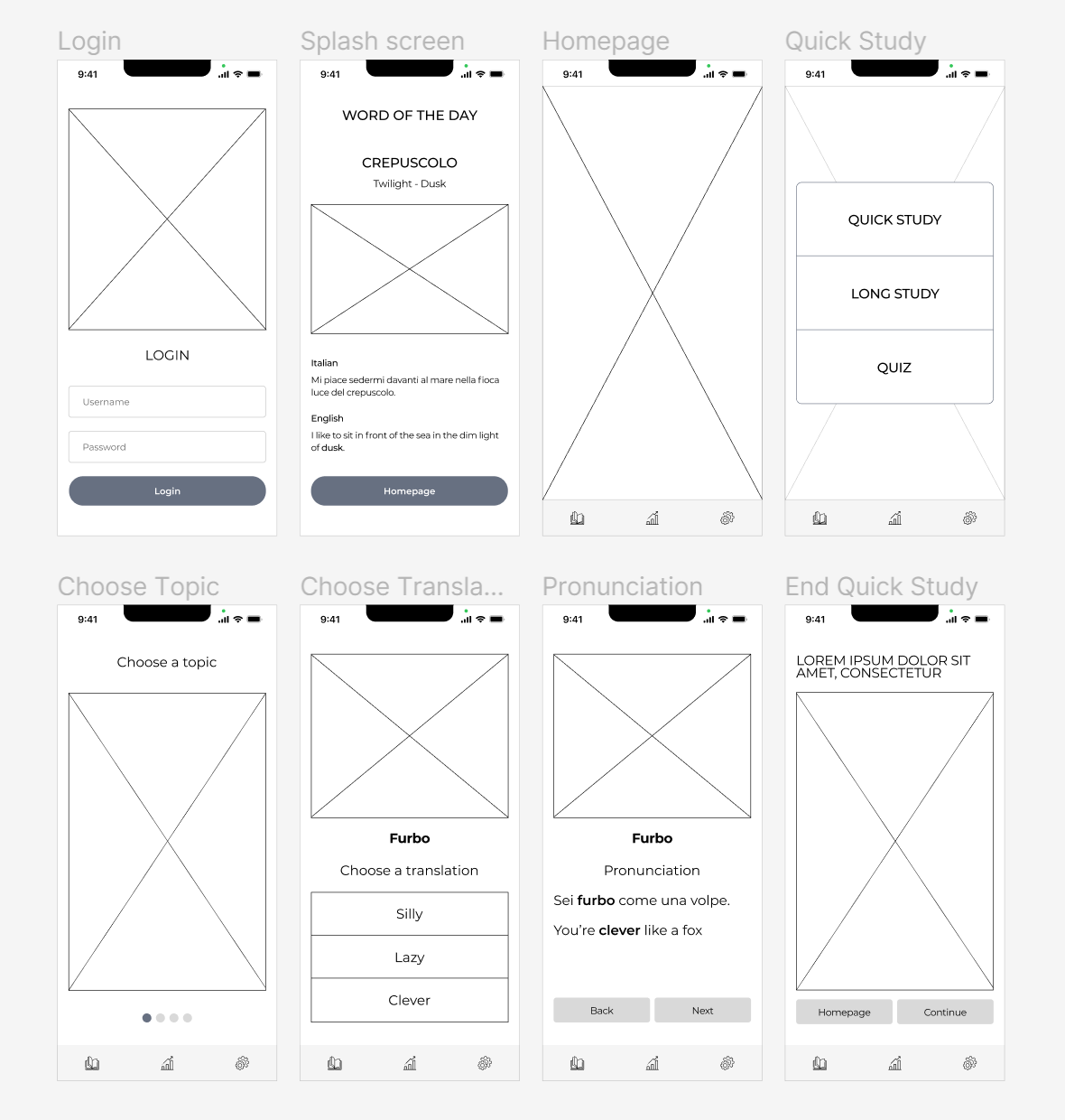
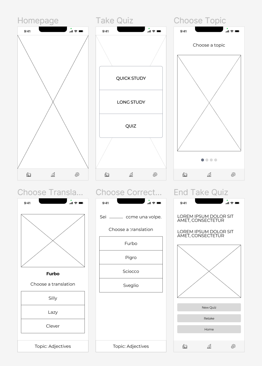
This phase was devoted to sketching low fidelity wireframes and creating a first prototype. This is a process that requires getting deeply into the heads of potential users and representing positive navigation for them. I initially created the wireframes using Draw.io (now Diagrams.net) to present them more clearly and neatly. First, I represented the two identified user flows and then I added a global navigation and content related to the study of words in another language.
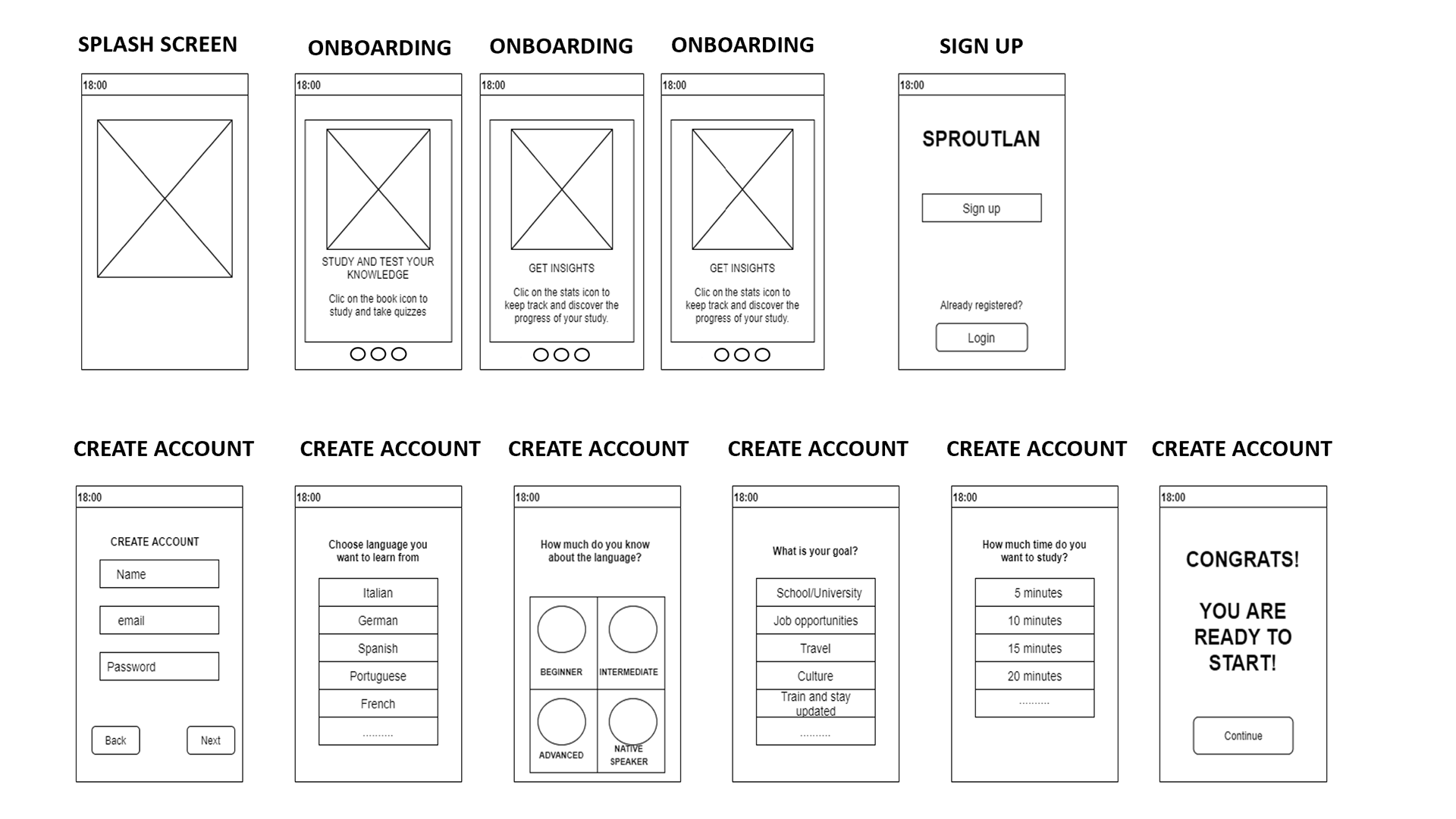
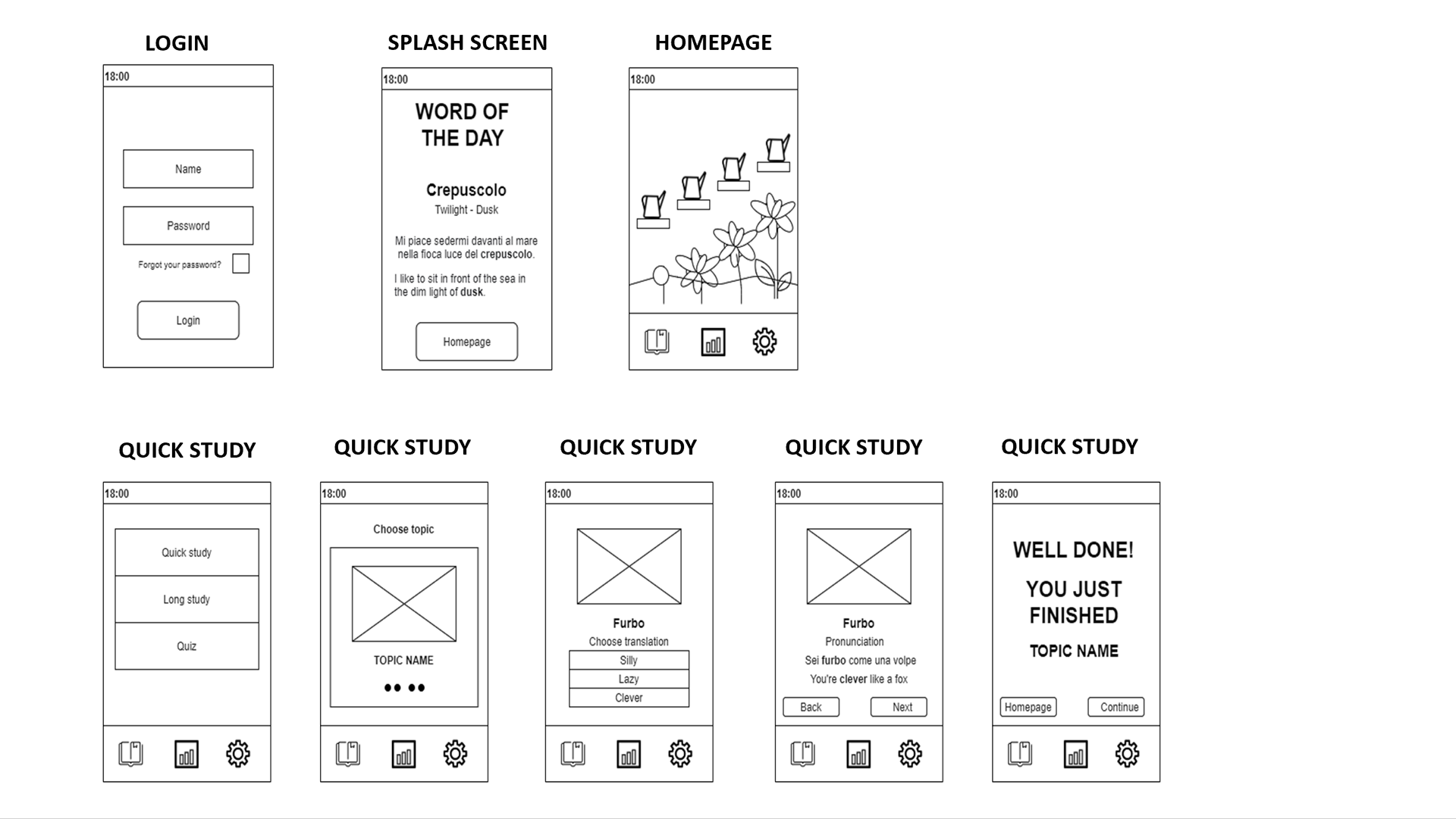
I then wanted to create a more realistic representation, so I switched to creating mid fidelity wireframes using Figma and created a mid fidelity prototype here as well.
USABILITY TESTING
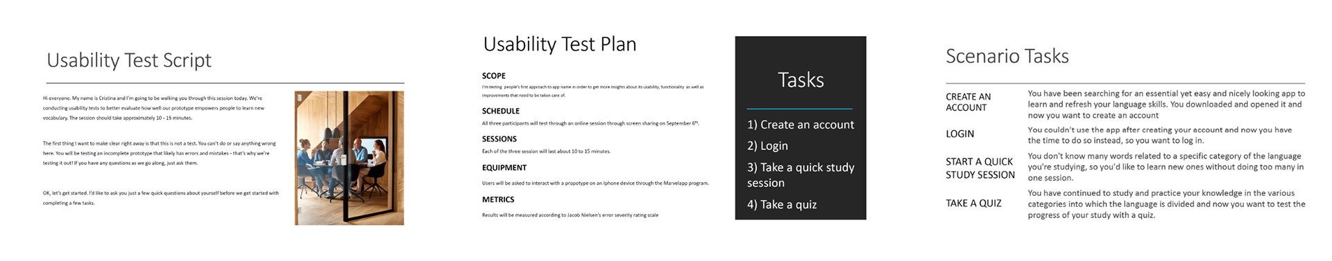
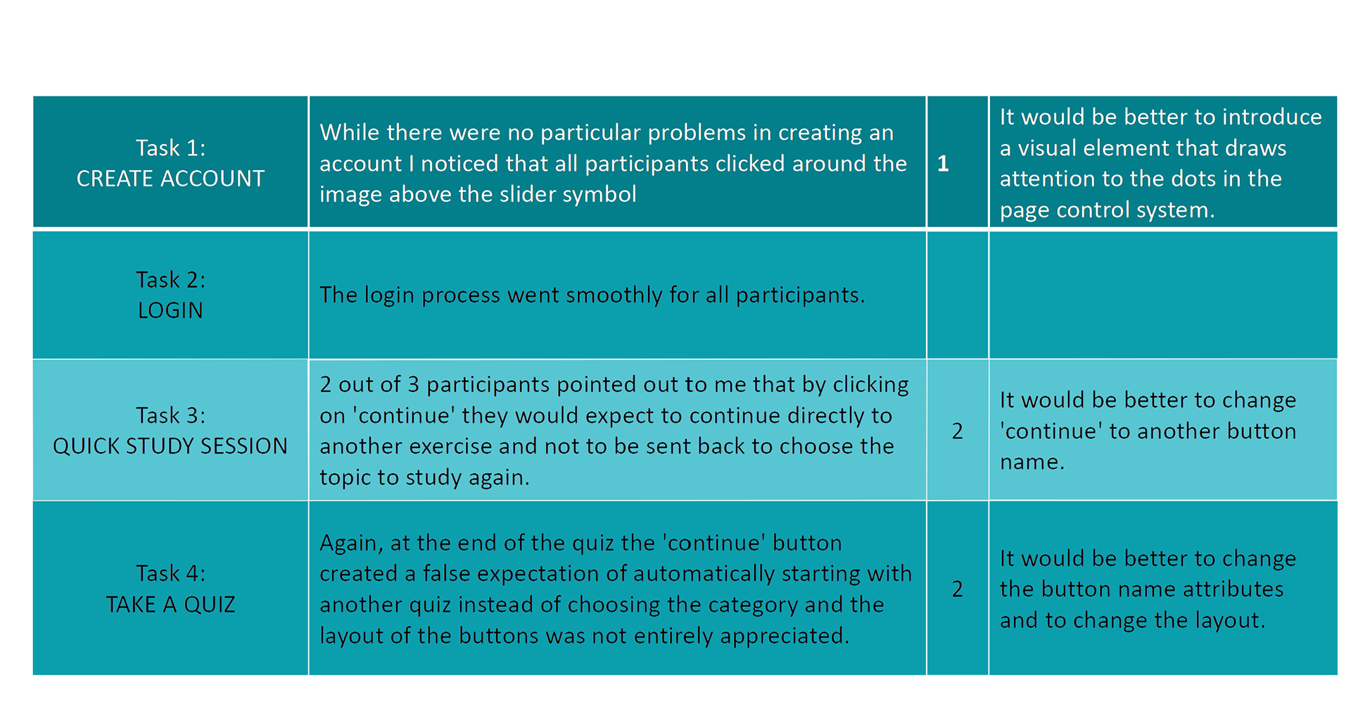
In order to verify the validity of the low-fidelity prototype, I carried out usability tests. In this phase, I wanted to check whether and how the people interviewed actually manage to complete the two tasks created.
The first step was to create a script and a usability test plan. In the usability test plan I incorporated 4 scenario tasks based on followin actions:
The first step was to create a script and a usability test plan. In the usability test plan I incorporated 4 scenario tasks based on followin actions:
1) Login
2) Create an account
3) Take a quick study session
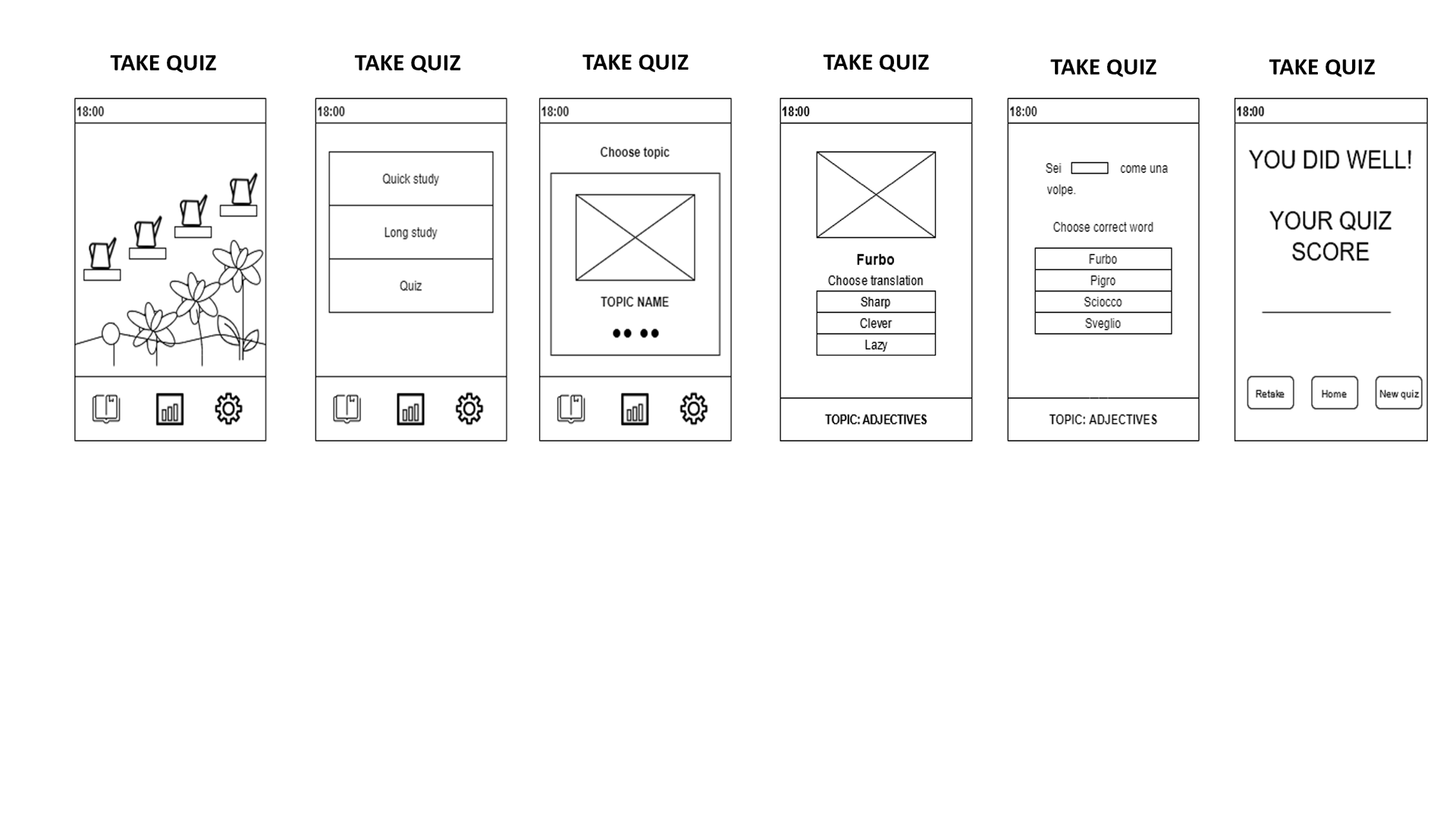
4) Take a quiz
2) Create an account
3) Take a quick study session
4) Take a quiz
To evaluate any errors and their severity, I applied Jakob Nielsen's rating scale:
0 = I don’t agree that this is a usability problem at all
1 = Cosmetic problem only: need not be fixed unless extra time is available on project
2 = Minor usability problem: fixing this should be given low priority
3 = Major usability problem: important to fix and should be given high priority
4 = Usability catastrophe: imperative to fix before product can be released
I looked for participants with whom I conducted moderated in-person tests. Thanks to precise structuring before the tests the sessions ran smoothly and actually lasted as estimated (10-15 minutes each).
The results led me to identify 3 points on which further work was needed to improve the prototype:
The results led me to identify 3 points on which further work was needed to improve the prototype:
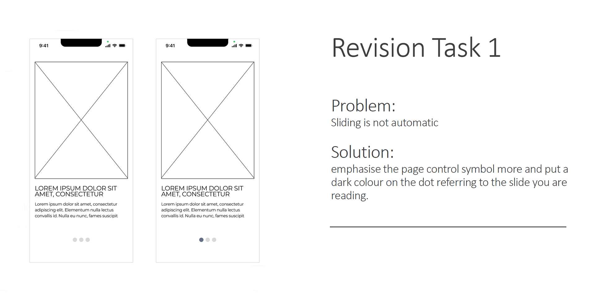
1) Create an account: instead of clicking on the slider to continue with onboarding, all users tended to click on the area where an image was to be inserted.
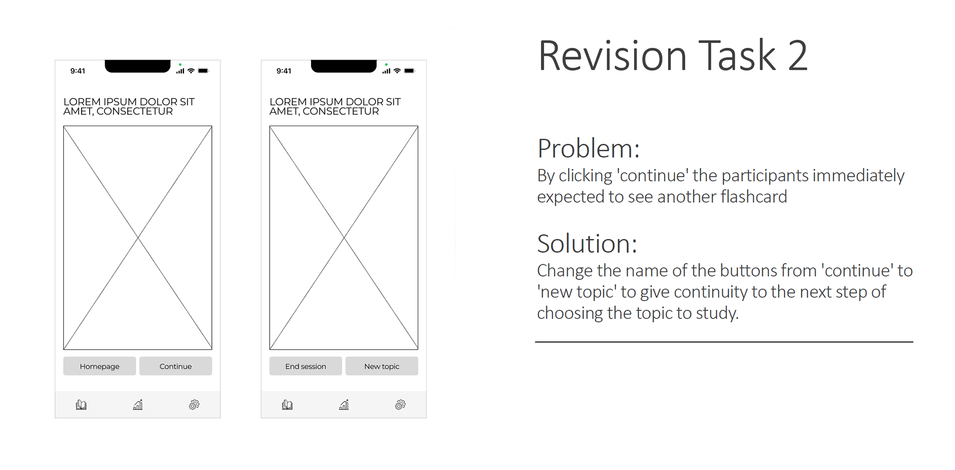
2) Quick study session: two out of three users specified that after studying a word by clicking on "continue" they expected to do another exercise instead of being sent back to the choice of a topic to do the exercises.
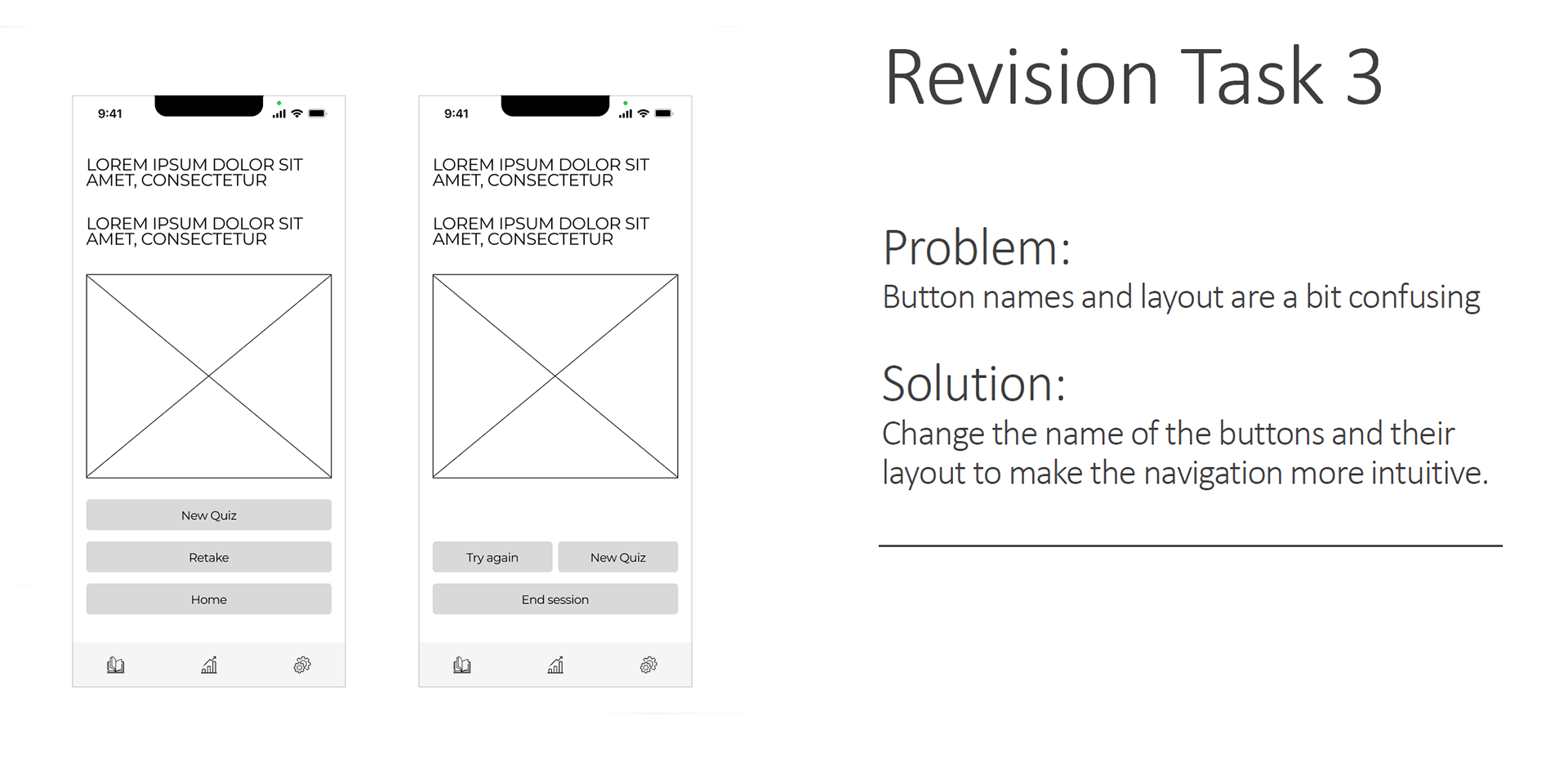
3) Take a quiz: again, two out of three users pointed out that after taking a quiz by clicking on "continue" they expected to take another one instead of being sent back to the choice of a category to take the quizzes.
2) Quick study session: two out of three users specified that after studying a word by clicking on "continue" they expected to do another exercise instead of being sent back to the choice of a topic to do the exercises.
3) Take a quiz: again, two out of three users pointed out that after taking a quiz by clicking on "continue" they expected to take another one instead of being sent back to the choice of a category to take the quizzes.
After analysing and evaluating the results of the usability tests, I decided to make the following changes to the mid fideliry prototype wireframes:
1) Create an account: I decided to give more emphasis to the swipe symbols by colouring the dot so that it is clear which side that onboarding screen is aimed at.
2) Quick study session: I renamed the "continue" button to "new topic" to give continuity to the flow of this task.
3) Take a quiz: I have renamed all the buttons to make the navigation more understandable and intuitive.
2) Quick study session: I renamed the "continue" button to "new topic" to give continuity to the flow of this task.
3) Take a quiz: I have renamed all the buttons to make the navigation more understandable and intuitive.
The fully updated mid fidelity prototype can be seen here.
FINAL CONSIDERATIONS
The whole process and especially the interaction with people during the initial interviews and in the subsequent testing phase helped me to understand several aspects:
1) People from different generations have a different idea of what is most important in learning a language and this impacts on the choice of how to design an app. It is therefore important to define a precise target group at the beginning, also with an eye on age.
2) What you think is automatic and intuitive is not necessarily so for other people. Testing your hypotheses becomes essential in order to actually validate them and create a project that truly has a positive user experience.
3) Translating the idea of an app into a prototype is a very demanding job that shows you new possible improvements each time. Here again, the testing phase (A/B testing, preference testing, usability testing) becomes essential.
4) Do not underestimate older user testers. Surprisingly in this project it was the older users who demanded fewer steps and more immediacy to perform the actions defined on the prototype.
In a second iteration I would like to work different aspects of Sproutlan. The app needs a splash screen as well as a reward system to encourage people to use it. At the moment I have created a low and mid fidelity prototype, so this part also needs to be developed. In particular I would like to create a high fidelity prototype complete also on the UI side. The latter is expected to include a settings part so that users can set up the app according to their preferences and also a feature that allows users to upload and review vocabulary for a complete study experience.
All these improvements to the app will of course have to be tested and validated, so that improvements to the app can really be worked on.
All these improvements to the app will of course have to be tested and validated, so that improvements to the app can really be worked on.