PROJECT OVERVIEW
Starting exercising is not easy, especially if you are a beginner. Things get even more complicated if your work takes up a lot of your time and it becomes difficult to organise yourself.
This is where Fitted comes in, a web responsive app aiming to help women get into an exercise of their choice by holding their hand a bit and providing routines, guides, interactive examples, and info.
The ultimate aim of Fitted is to encourage women to an exercise routine that suits their level, schedule and interests.
ROLE
UI Designer
DURATION
2 months
TOOLS
Figma
Adobe XD
Adobe Photoshop
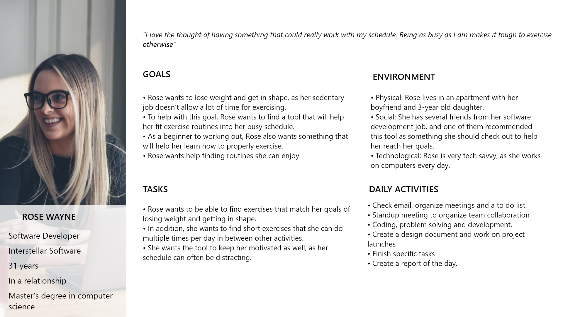
USER PERSONA
The target audience for this project are women like Rose, who have a busy lifestyle and are eager to incorporate physical activity so that they can balance their busy schedules with something that makes them feel good and helps them stay fit.
USER STORIES
User story 1
As a new user I want to create an individual profile so that I can be directed to the workouts that are most appropriate for me.
As a new user I want to create an individual profile so that I can be directed to the workouts that are most appropriate for me.
User story 2
As a frequent user, I want to track progression and record what I’ve done, so that I can see my progress over time.
As a frequent user, I want to track progression and record what I’ve done, so that I can see my progress over time.
User story 3
As a frequent user I want to create a personalised playlist of workouts, so I can better achieve my fitness goals.
As a frequent user I want to create a personalised playlist of workouts, so I can better achieve my fitness goals.
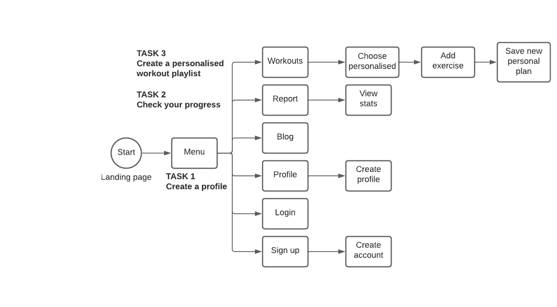
SITEMAP
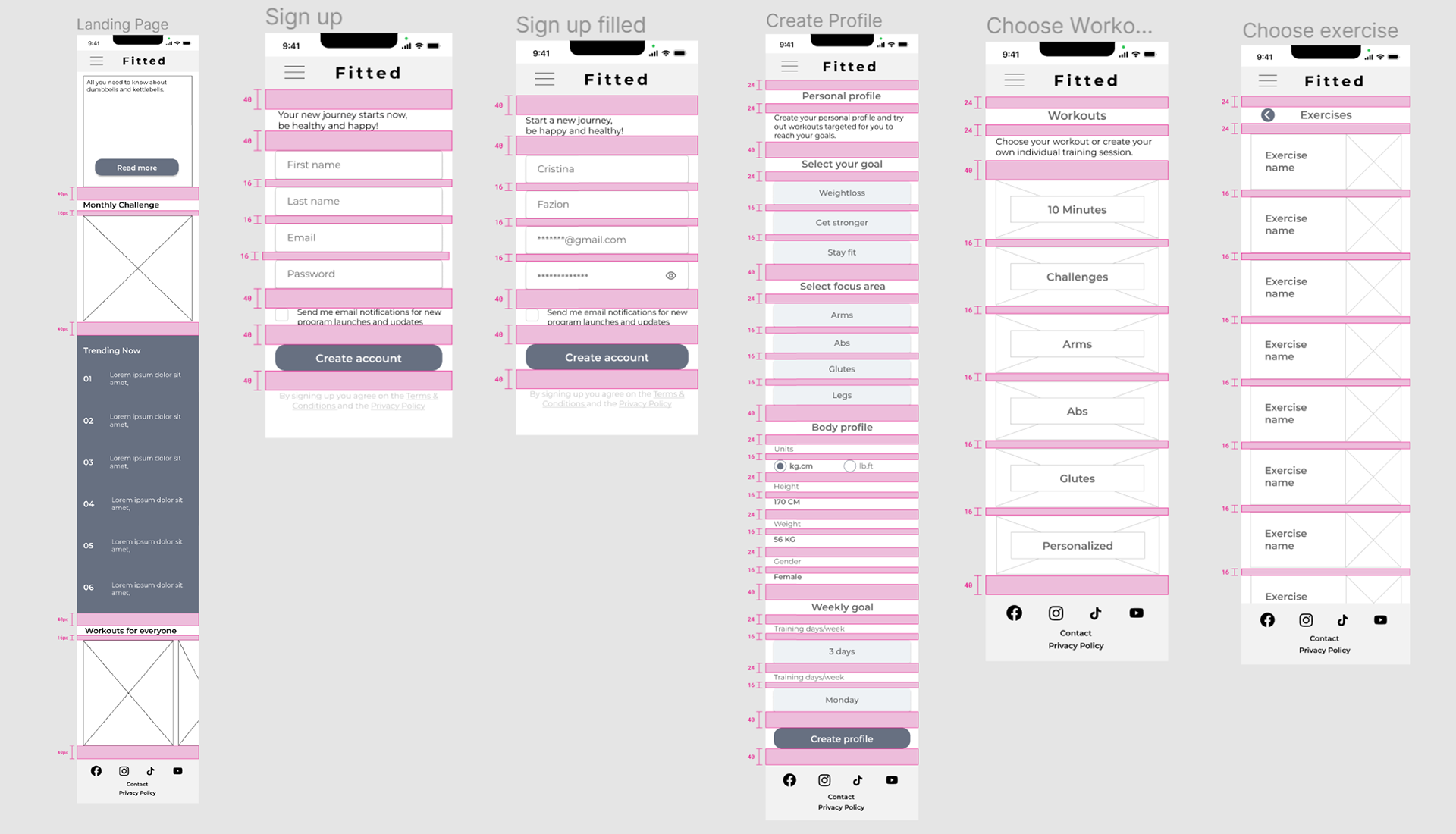
MID FIDELITY WIREFRAMES
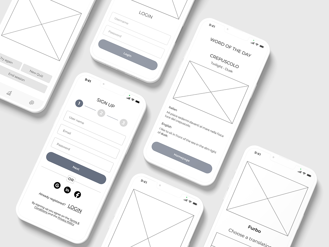
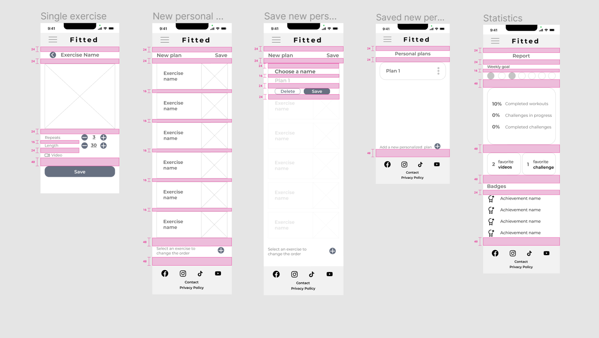
The wireframing phase began based on the assigned project brief and user stories, as well as the identified sitemap. Since it was a responsive web app, I started with the development of the mobile version and then later also created wireframes for the desktop and tablet version. The wireframes were created by implementing the following layout grid: a 4 column grid with 8px gutters and 20px margins.
The wireframing phase began based on the assigned project brief and user stories, as well as the identified sitemap. Since it was a responsive web app, I started with the development of the mobile version and then later also created wireframes for the desktop and tablet version. The wireframes were created by implementing the following layout grid: a 4 column grid with 8px gutters and 20px margins.
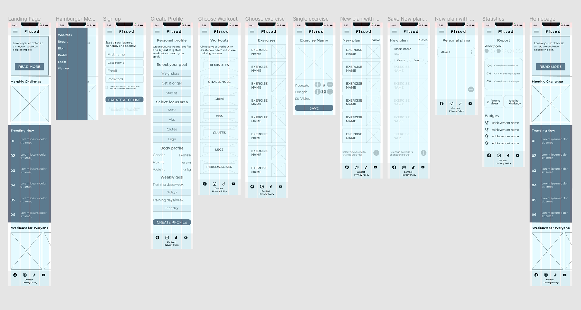
I used the principles of good spacing and visual hierarchy to create a design that could be consistent from the beginning until the end.
MOODBOARDS
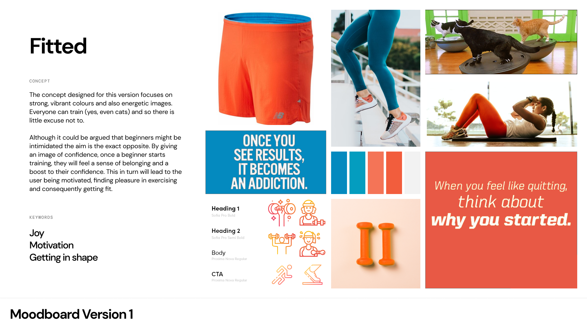
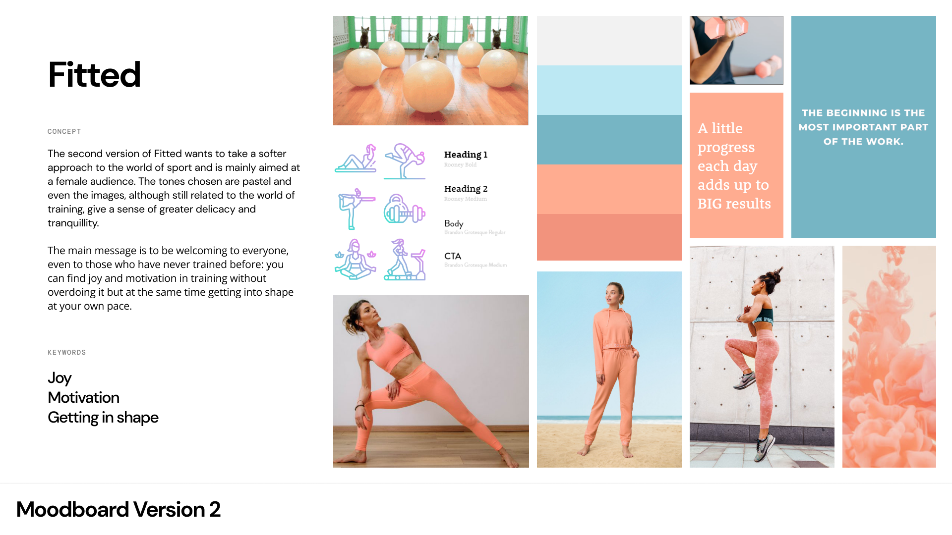
Once solid mid fidelity wireframes were created, I moved on to work on the actual visual design phase which included elements such as typography, colours, images, shapes, icons, interactions and gestures. To choose a Fitted style, I sought inspiration by creating different Moodboards.
Once solid mid fidelity wireframes were created, I moved on to work on the actual visual design phase which included elements such as typography, colours, images, shapes, icons, interactions and gestures. To choose a Fitted style, I sought inspiration by creating different Moodboards.
VISUAL DESIGN
Typography
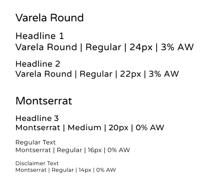
I’ve chosen two Sans Serif fonts for this project: Varela Round and Montserrat.
Varela’s soft feel fits well with the concept of a welcoming and delicate approach to the fitness world, especially if you are a beginner. As it is very rounded I decided to use it only for Headlines 1 and 2.
Montserrat is a clean and elegant font that goes well with Varela. I decided to use Montserrat for Headlines 3 and all remaining text elements (regular and disclaimer).
Typography
I’ve chosen two Sans Serif fonts for this project: Varela Round and Montserrat.
Varela’s soft feel fits well with the concept of a welcoming and delicate approach to the fitness world, especially if you are a beginner. As it is very rounded I decided to use it only for Headlines 1 and 2.
Montserrat is a clean and elegant font that goes well with Varela. I decided to use Montserrat for Headlines 3 and all remaining text elements (regular and disclaimer).
Colour
Considering that my target users are busy women, whose work involves a certain sedentariness and who are approaching the world of fitness for the first time, I chose a colour palette that followed the concept of being welcoming and encouraging, pleasant and inviting.
Considering that my target users are busy women, whose work involves a certain sedentariness and who are approaching the world of fitness for the first time, I chose a colour palette that followed the concept of being welcoming and encouraging, pleasant and inviting.
Salmon orange: is a color that transmits energy, health, happiness and it is also an encouraging color, perfect for the keywords joy, motivation and getting in shape.
Pink: as a calming color that conveyis warmth it is perfect to address a female audience.
White: conveys a sense of serenity, wholeness and encouragement that goes well with the other colours.
Gray: This light shade conveys balance, compromise and has a calming effect
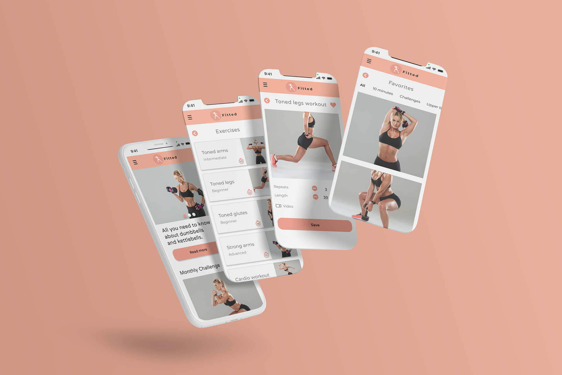
Imagery
As for the images chosen for the project, they all represent the same person. There is continuity in the representation of the exercises as well as in the colour tones and the colour tones go well with the chosen palette. The subject depicted is a fit, healthy and confident person.
I avoided images in which the women portrayed as well as the exercises and backgrounds are too different from each other and that weren't offering a sense of continuity in the exercises and in the colour tones.
Icons
All icons except the social icons (Flaticon) were created with Figma
Icon size: 24px
Colors: Dark Salmon Pink (#F2937E), White (# FFFFFF) and Black (#000000)
Line width: 3px (for plus, minus, back, forward, checkmark, hamburger menu, up and down symbols)
Rounded edges: for plus, minus, back, forward, checkmark, hamburger menu, up and down symbols
Padding: 10px for up and down arrows
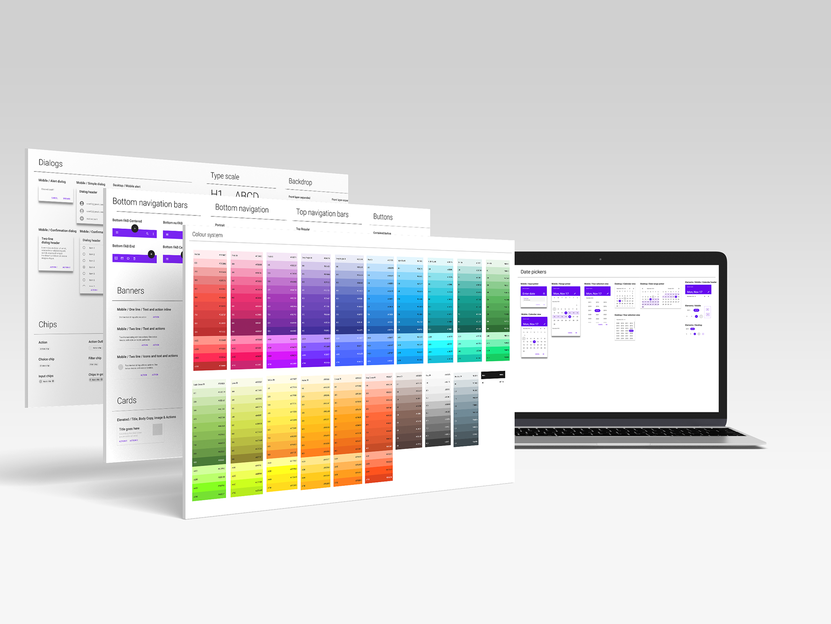
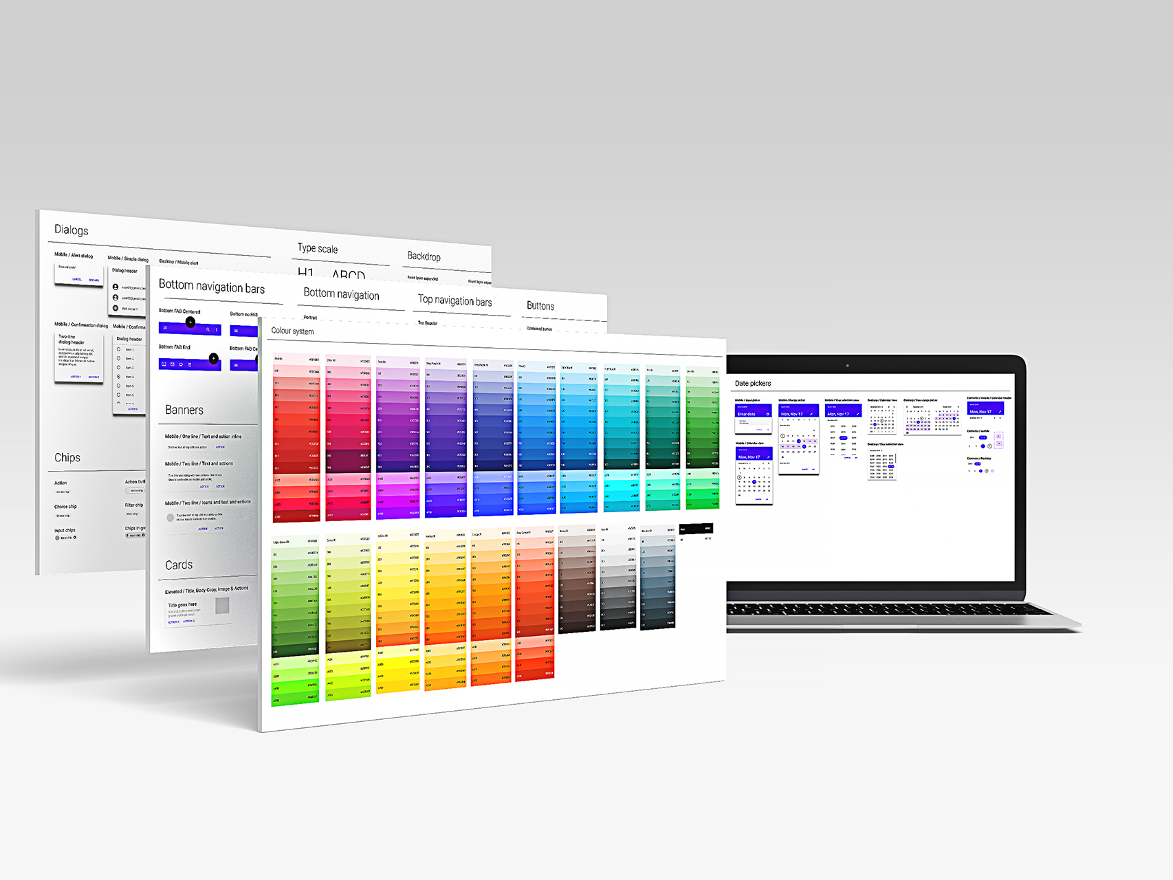
STYLE GUIDE
Once the work on the visual design part was completed, I collected all the elements created in a style guide, so that I would have a reference point for the project.
Once the work on the visual design part was completed, I collected all the elements created in a style guide, so that I would have a reference point for the project.
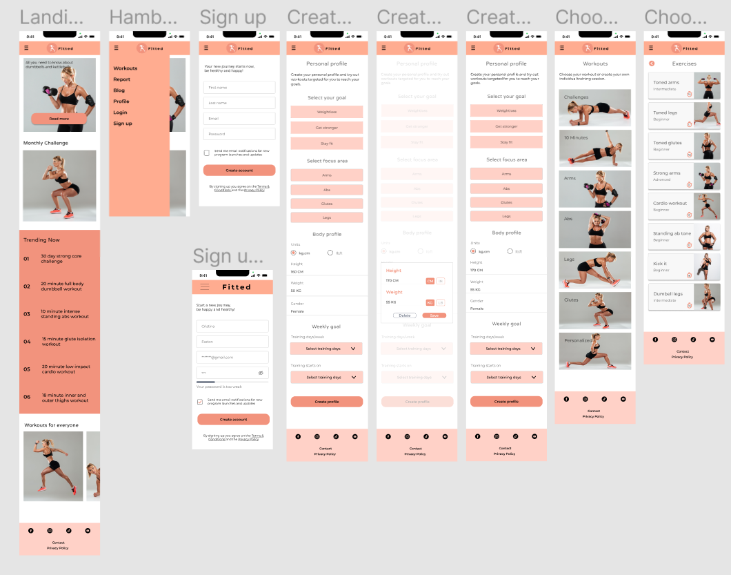
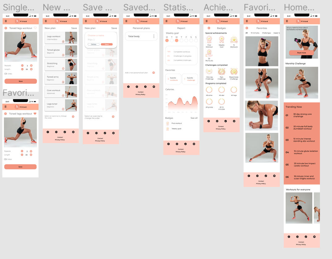
HIGH FIDELITY PROTOTYPE
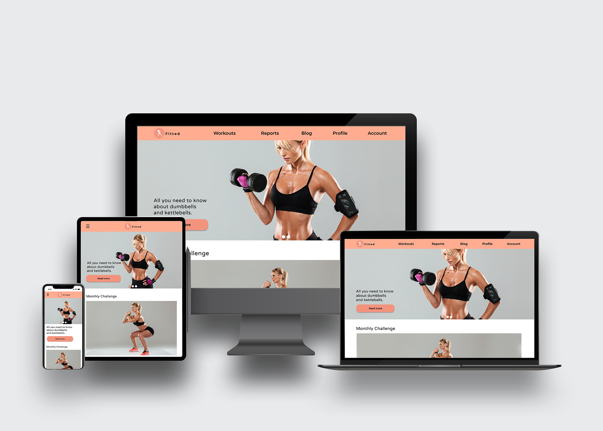
Having completed the style guide, I revised the mid fidelity prototype by applying all the visual principles identified earlier. The end result is an inviting app with a consistent style that entices the target audience to take care of themselves through fitness, encouraging even beginners to do so.
Having completed the style guide, I revised the mid fidelity prototype by applying all the visual principles identified earlier. The end result is an inviting app with a consistent style that entices the target audience to take care of themselves through fitness, encouraging even beginners to do so.
Click here to interact with the prototype.
RESPONSIVE DESIGN
The project is about a responsive web app, so I revised the design to fit different breakpoints. This process allowed me to create three different breakpoints: one for mobile, one for tablet and finally for desktop. Although the content remains the same, the layout of the various elements changes, especially when comparing the mobile version with the desktop version.
The project is about a responsive web app, so I revised the design to fit different breakpoints. This process allowed me to create three different breakpoints: one for mobile, one for tablet and finally for desktop. Although the content remains the same, the layout of the various elements changes, especially when comparing the mobile version with the desktop version.