PROJECT OVERVIEW
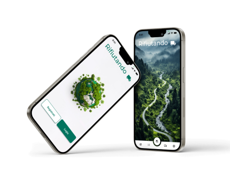
Rifiutando, a waste management company, acts as a solution provider for the disposal of bulky waste generated by various companies. Recently established, the company aims to improve operational efficiency and facilitate waste disposal processes.
The client wanted to launch an innovative mobile application for waste transport operators. The application aimed to empower operators by allowing them to easily locate the nearest collection centres based on their geographical location and specific waste code.
As a UX/UI designer, my role covered the entire pre-development phase, diligently realising user-centred design solutions to lay a solid foundation for the subsequent development efforts led by the development team.
CLIENT
Rifiutando
ROLE
UX/UI Designer for DevInterface S.r.l.
TOOLS
Figjam
Figma
Photoshop
CHALLENGES
During the development of the project, I was faced with several significant challenges, each of which required in-depth analysis:
1) Varied technological proficiency and language barriers
One of the main challenges I encountered was the diverse and often limited technological proficiency among end-users. The target audience, primarily waste operators, exhibited a wide spectrum of technological knowledge, with many possessing only basic skills. Additionally, considering that operators could originate from different countries, language barriers further complicated the usability of the interface, particularly for those not fluent in Italian.
2) Large amount of data management
The application entailed handling a substantial volume of data pertaining to different waste types, necessitating robust strategies for organization and visualization. Ensuring that operators could easily access and comprehend relevant data amidst the complexity presented a formidable challenge.
3) Specificity of the sector
Waste disposal being an inherently specialized sector further compounded the challenges faced. The unique intricacies and technicalities inherent to waste management demanded an interface design that struck a delicate balance between simplicity and comprehensiveness. Moreover, considering the diverse end-user demographic and the voluminous data involved, crafting an interface that resonated with the sector's nuances while remaining user-friendly was pivotal.
SOLUTIONS
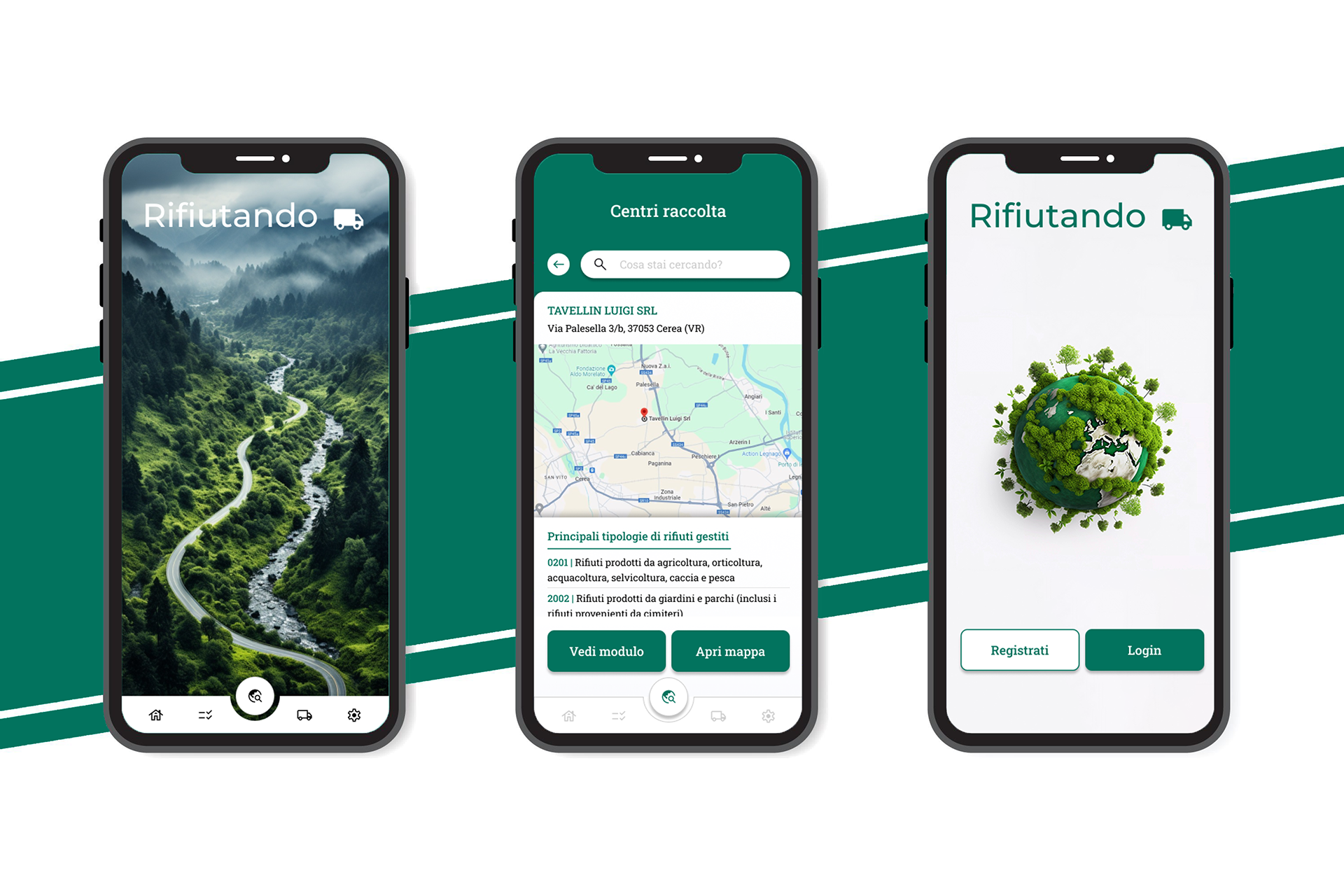
SIMPLIFIED AND INTUITIVE INTERFACE
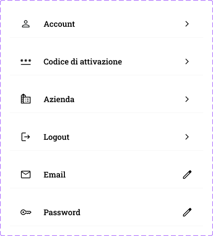
I adopted a user-centred design approach to make the interface intuitive and accessible, especially considering the variety of technical knowledge among users. In order to overcome language barriers, I tried to simplify the app as much as possible, paying special attention to the icons and UI elements used, thus also meeting the client's need for a monolingual app. This approach made the app understandable and usable for a wide range of users, regardless of their native language or level of technological expertise.
Material design component
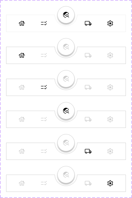
Main navigation menu
ADVANCED DATA VISUALISATION
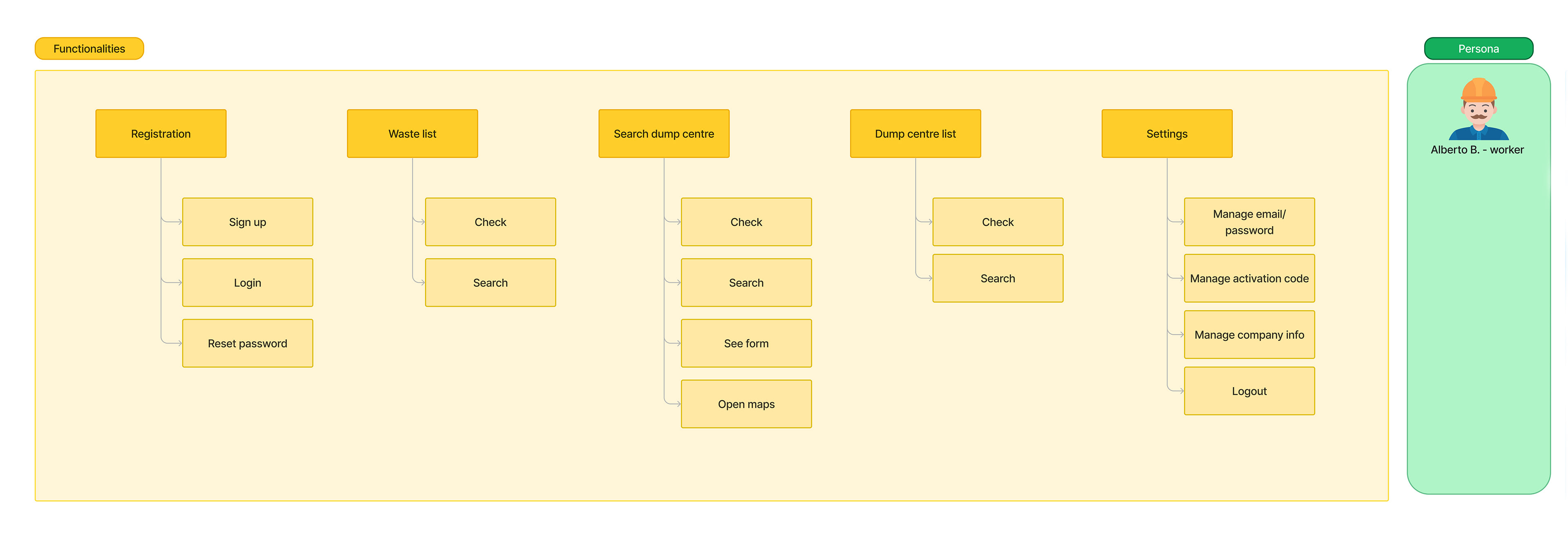
To manage the large amount of data within the app, I implemented a tree structure for data visualisation. This organisational structure allows users to navigate through the data in a hierarchical and intuitive manner, enabling them to explore the data more efficiently and easily locate relevant information.
The use of a tree structure allows users to view data at different levels of detail, starting with a general overview and moving to more specific and detailed levels. For example, a user starts by viewing data at the general category level and can then expand the view to examine subcategories and related information.
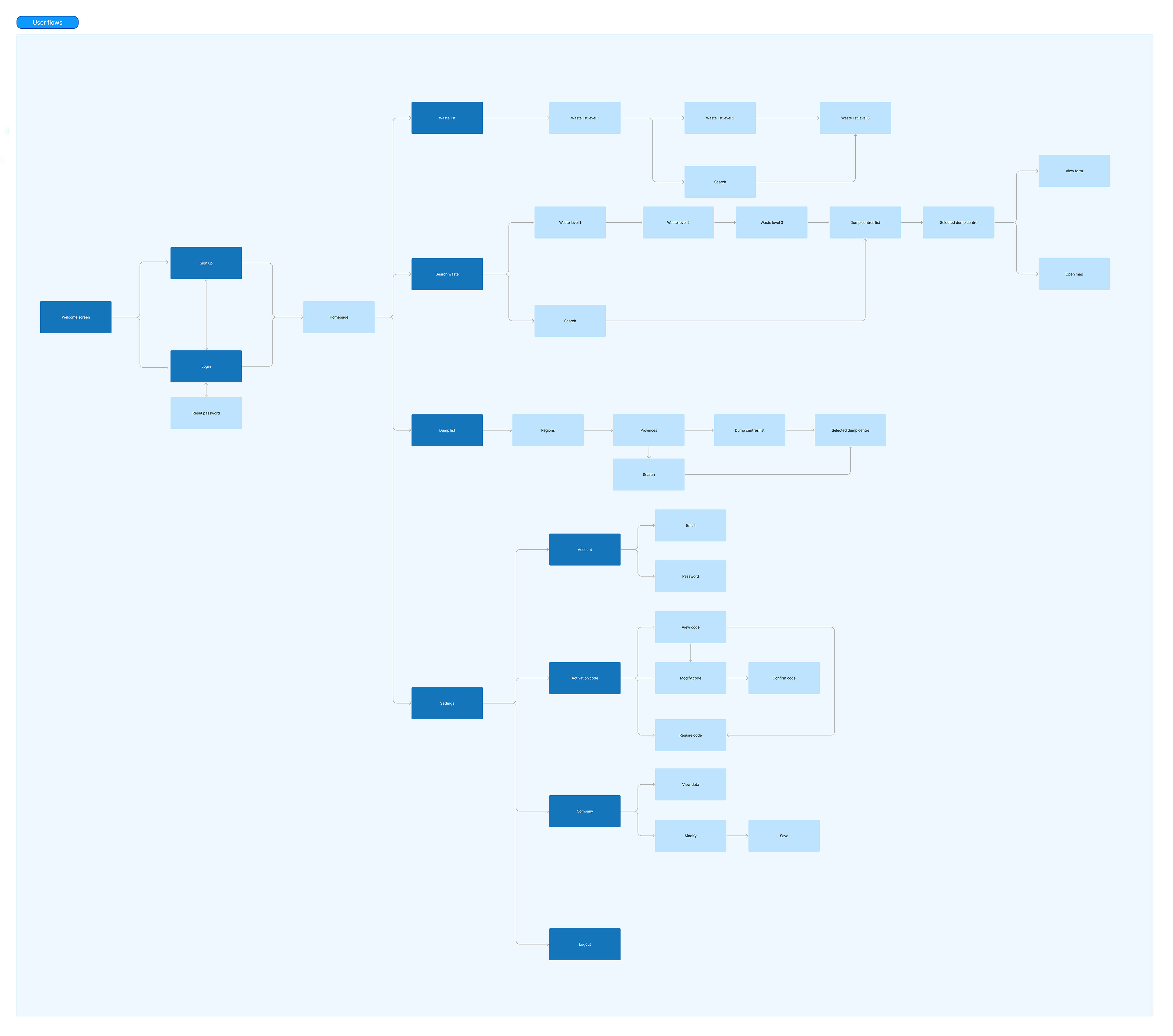
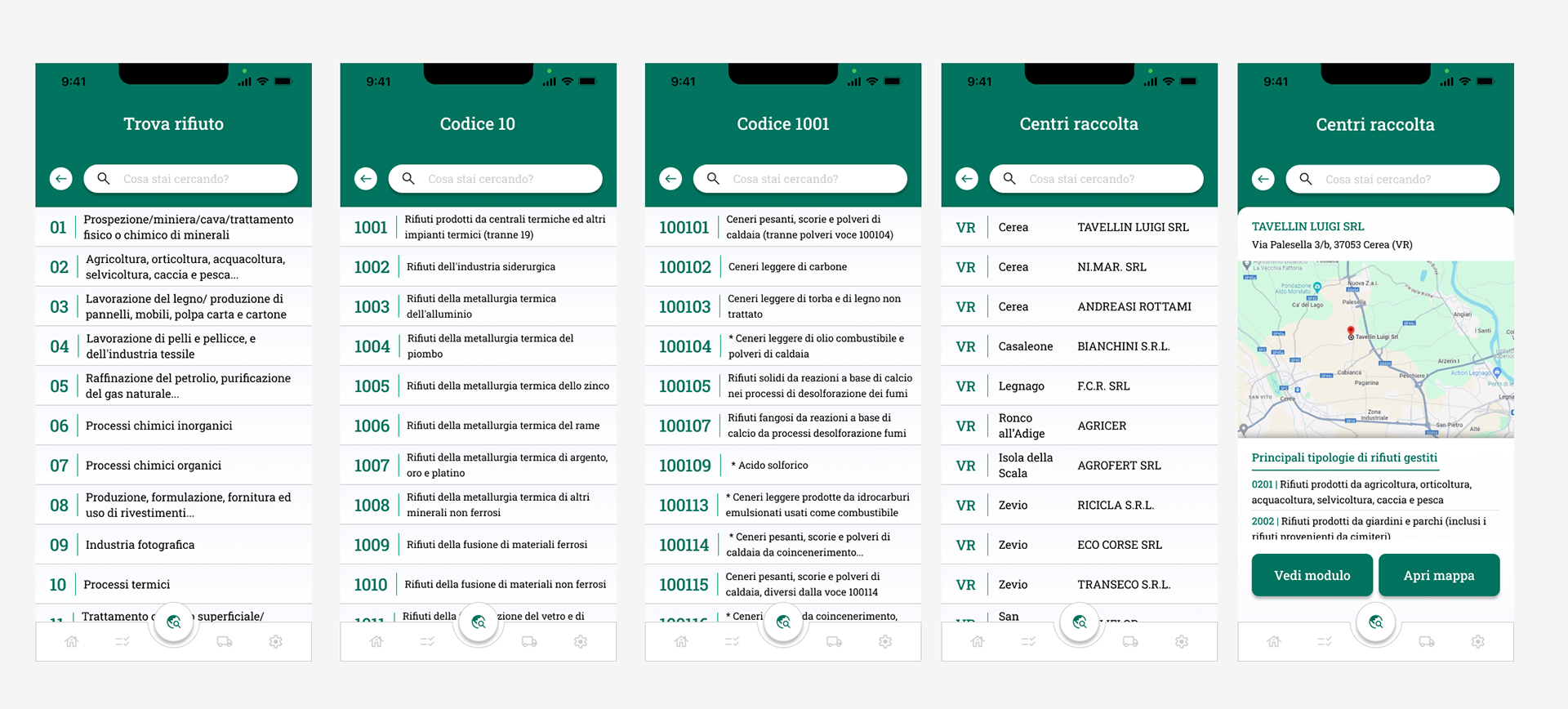
App main flow: find landfill for specific waste code
UNIVERSAL AND SPECIALISED DESIGN
To address the specificity of the waste disposal industry, I first conducted in-depth research on the sector to understand the current design trends in the field. Subsequently, I proposed two different moodboards to the client, each with a unique aesthetic and visual style, but both carefully designed to reflect the company's identity and values, as well as to meet the specific needs of the sector.
The client chose the second moodboard, characterised by a colour palette revolving around green, with graphic elements that recall the theme of the environment and sustainability. This choice was guided by the desire to convey a message of innovation and dynamism, while maintaining a user-friendly and accessible interface for those in the sector.
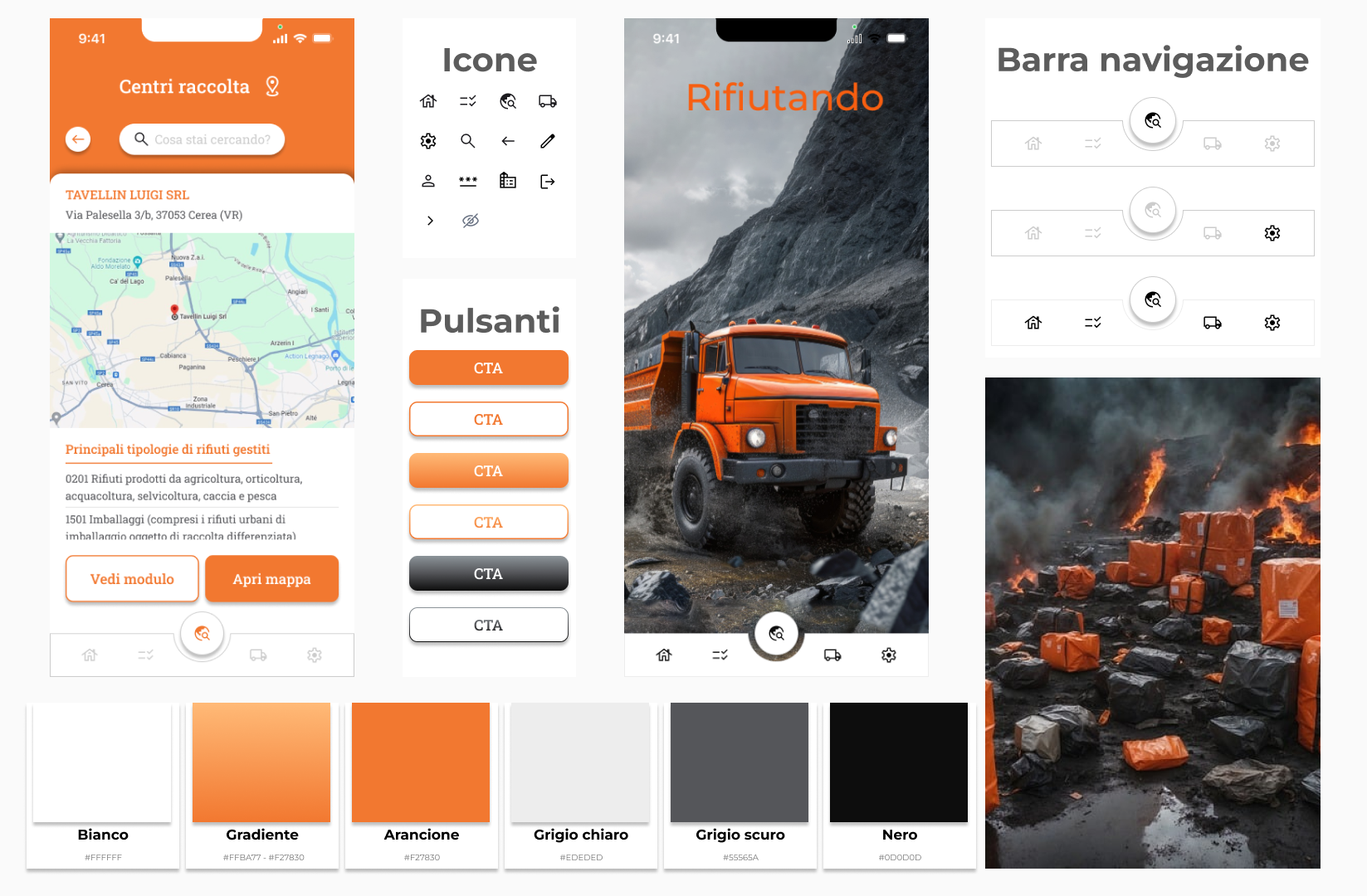
Primary orange moodboard
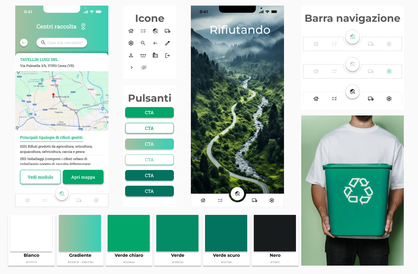
Primary green moodboard
RESULTS AND FUTURE DEVELOPMENTS
The client, Rifiutando, was extremely satisfied with the work done on the waste disposal application development project. The implementation of a user-centred design approach and the adoption of innovative solutions led to significant results, improving the user experience and optimising operational efficiency.
Looking to the future, the client has expressed interest in continuing to develop and improve the application. In particular, there are plans to integrate the application with two existing software packages used by the company to further optimise waste management processes. These integrations aim to improve data synchronisation and provide users with a more complete and integrated solution.