PROJECT OVERVIEW
DAApp targets patients with atopic dermatitis, offering a simplified yet comprehensive solution for managing their condition. These users are looking for an easy-to-use platform that not only helps them keep track of their dermatitis through testing, but also provides a holistic overview of their therapy and treatment plans. For these people, navigating the complexities of skin health is an everyday reality, which makes the need for an accessible and informative tool crucial.
The project was initiated in response to the growing need to improve the management of atopic dermatitis for patients at the Policlinico di Milano.
The in-depth collaboration between the dermatology department, the DevInterface team of developers, UX/UI designer and two project managers resulted in an innovative application, responding to the specific needs of patients and significantly improving access to medical care through state-of-the-art digital technologies.
This multidisciplinary synergy has created a tailor-made solution that revolutionises the way patients deal with their condition, giving them greater autonomy and awareness in the daily management of atopic dermatitis.
CLIENT
Fondazione IRCCS CA' Granda Ospedale Maggiore Policlinico Milano
ROLE
UX/UI Designer for DevInterface S.r.l.
TOOLS
TOOLS
Figjam
Lucidchart
Figma
THE CHALLENGES
In the development journey of DAApp, as the UX designer, I encountered several intricate challenges that demanded thoughtful solutions.
1) Understanding atopic dermatitis
Understanding the different manifestations of atopic dermatitis as a complex skin condition and, consequently, the potential user who would make use of the app, was a compulsory step in order to start working on the project.
2) Simplifying complex information
A big challenge lied in presenting a wealth of information in a way that would not only be aesthetically pleasing but, more importantly, would align with the principles of user-centred design, ensuring a positive and empowering experience for the patients.
3) Refining the registration flow
DAApp users require an intuitive registration process that captures essential details efficiently. The app serves as a central hub for them to access and comprehend their test results, treatment regimens, and prescribed medications.
4) Navigation between app sections
Navigating users from the home screen to critical sections, such as test results, treatment plans, and medication details, presented a design challenge. The aim was to strike a balance between simplicity and depth, providing users with an intuitive journey through their health data without compromising clarity.
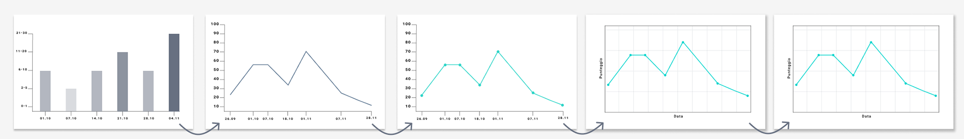
5) Implementation of graphs
Additionally, the implementation of graphs within the test results section required close collaboration with the development team to ensure both visual appeal and functionality as well as easier programming as the frontend would be developed in Flutter.
THE SOLUTIONS
In response to the multifaceted challenge of simplifying the understanding of scientific language for our end users, I took a hands-on approach rooted in user-centric principles. Working closely with a medical expert and two project managers, I tried to turn scientific data into information that's easy for everyone to understand. Leveraging simple flows, few but well-structured sections, and a user interface suitable for patients of all age groups, I tried to break down the business requirements into user flows that are easy to navigate and understand.
This approach not only successfully tackled the challenge of communicating nuanced medical details but also laid the groundwork for a user-friendly health education experience within the app. By prioritizing clarity and accessibility, I ensured that users could navigate the complexities of atopic dermatitis with confidence and ease, aligning with the overarching objective of making health information both informative and approachable.
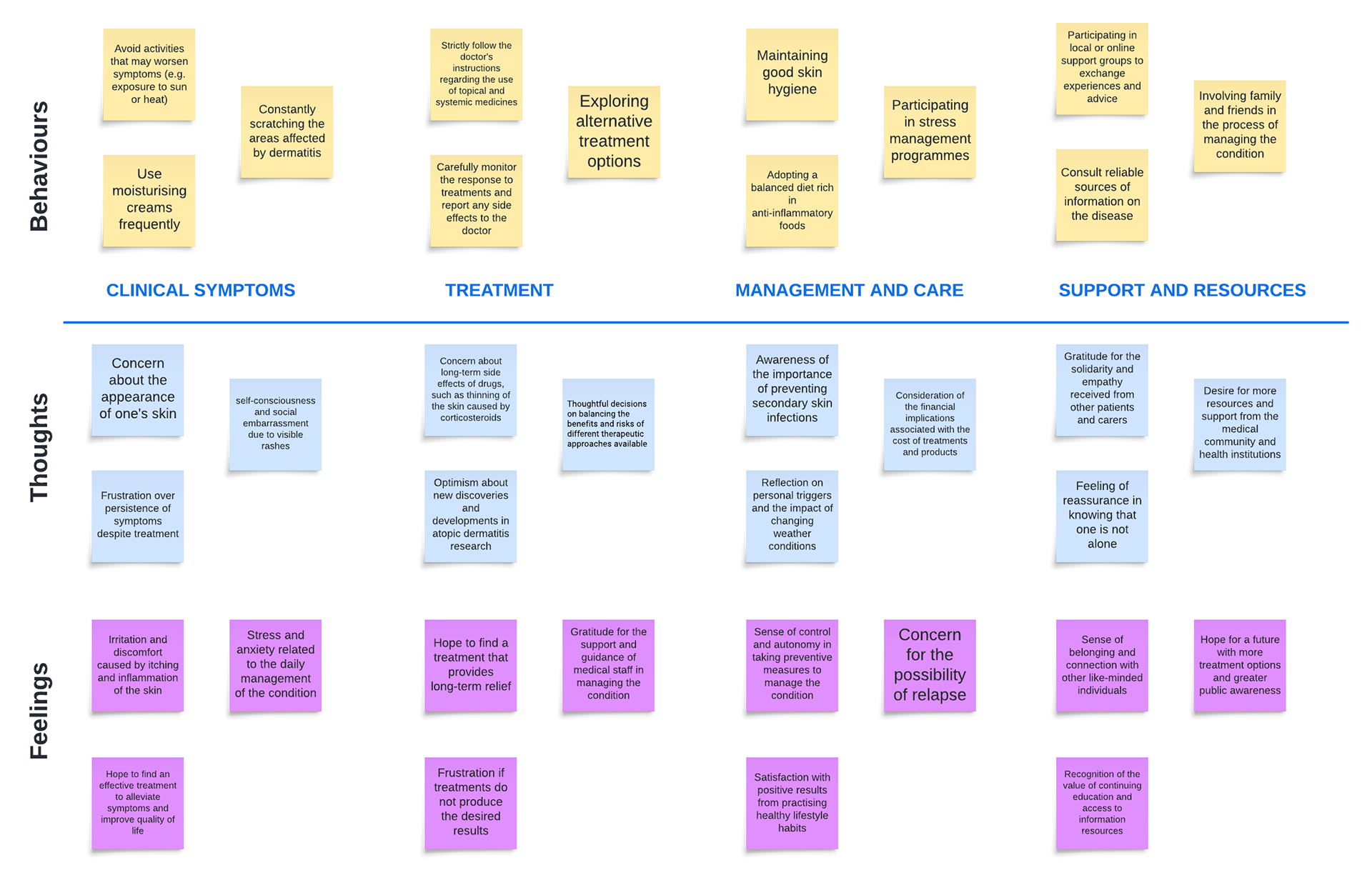
1) INSIGHT INTO ATOPIC DERMATITIS
To develop the project, it was important to understand atopic dermatitis in depth in order to be able to provide effective support to users. Through extensive research and consultations with medical experts, the different manifestations of the disease and the patients' thoughts and feelings were identified. These points were then combined into the following mental modelmap
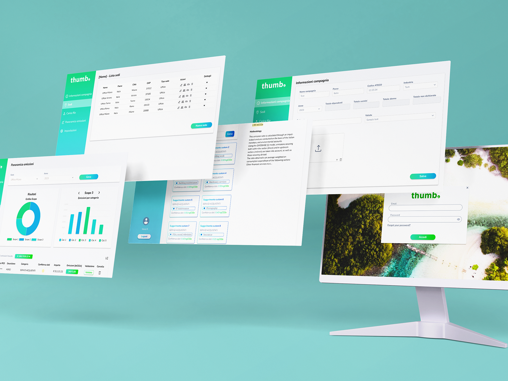
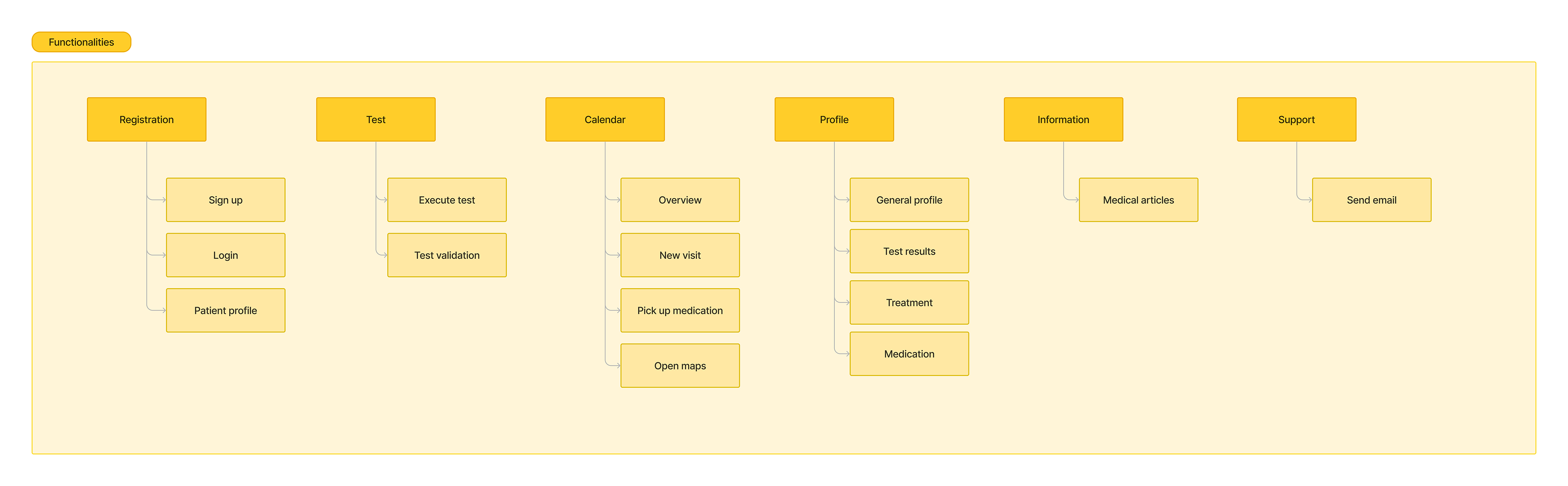
2) CLEAR AND ACCESSIBLE MEDICAL INFORMATION
The user interface was developed to be intuitive and well-organised, allowing users to easily access medical information related to their atopic dermatitis. By summarising complex information in understandable formats and clearly structuring the data, users can quickly locate and understand the information they need to manage their condition effectively.
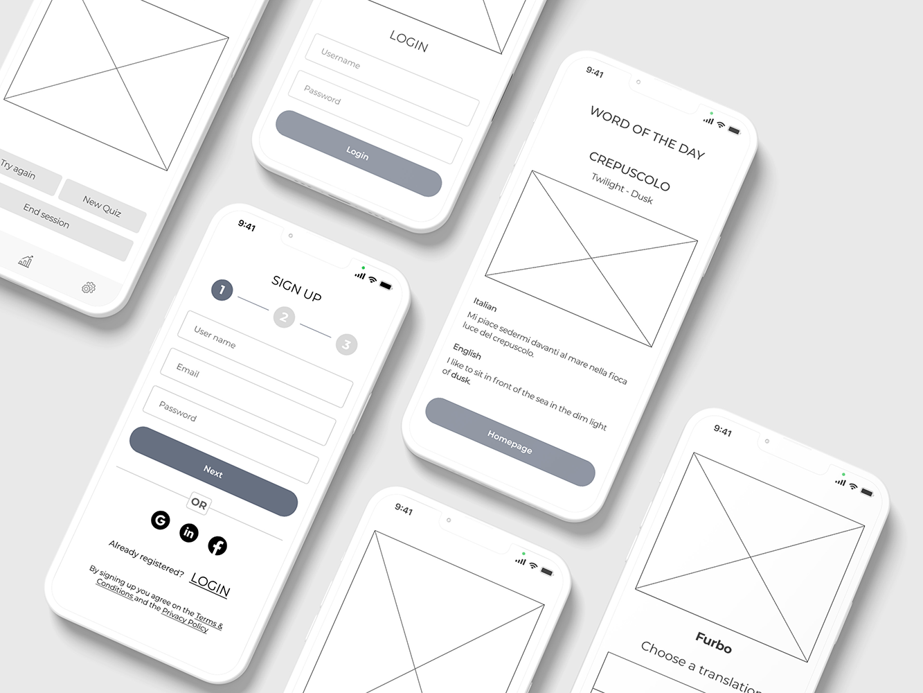
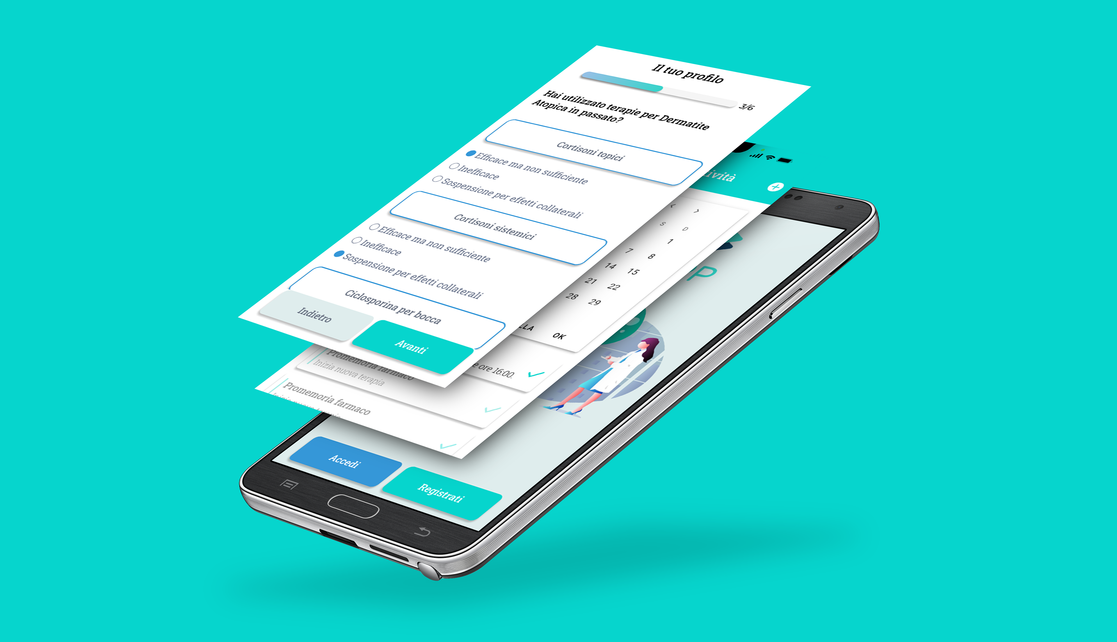
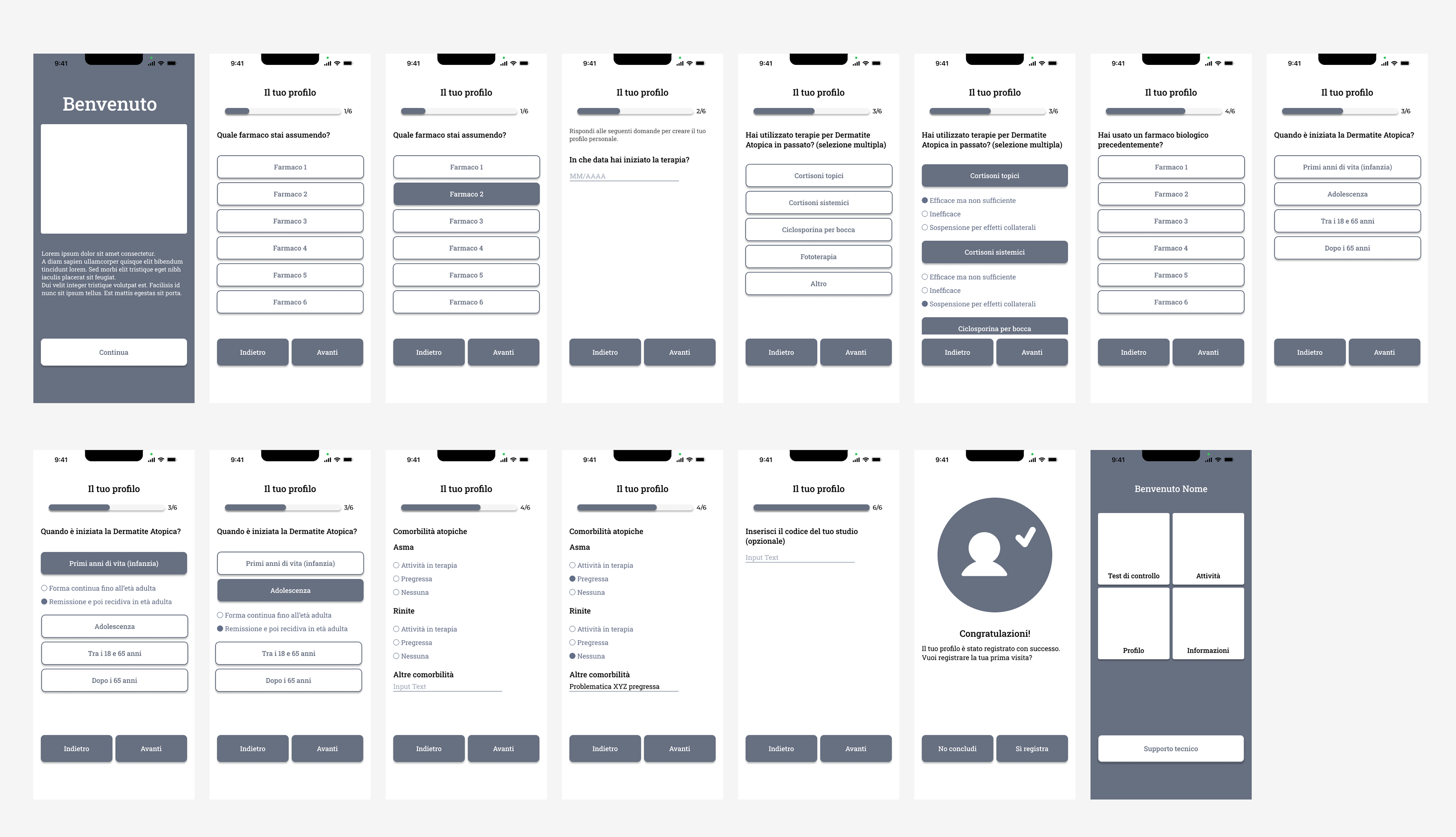
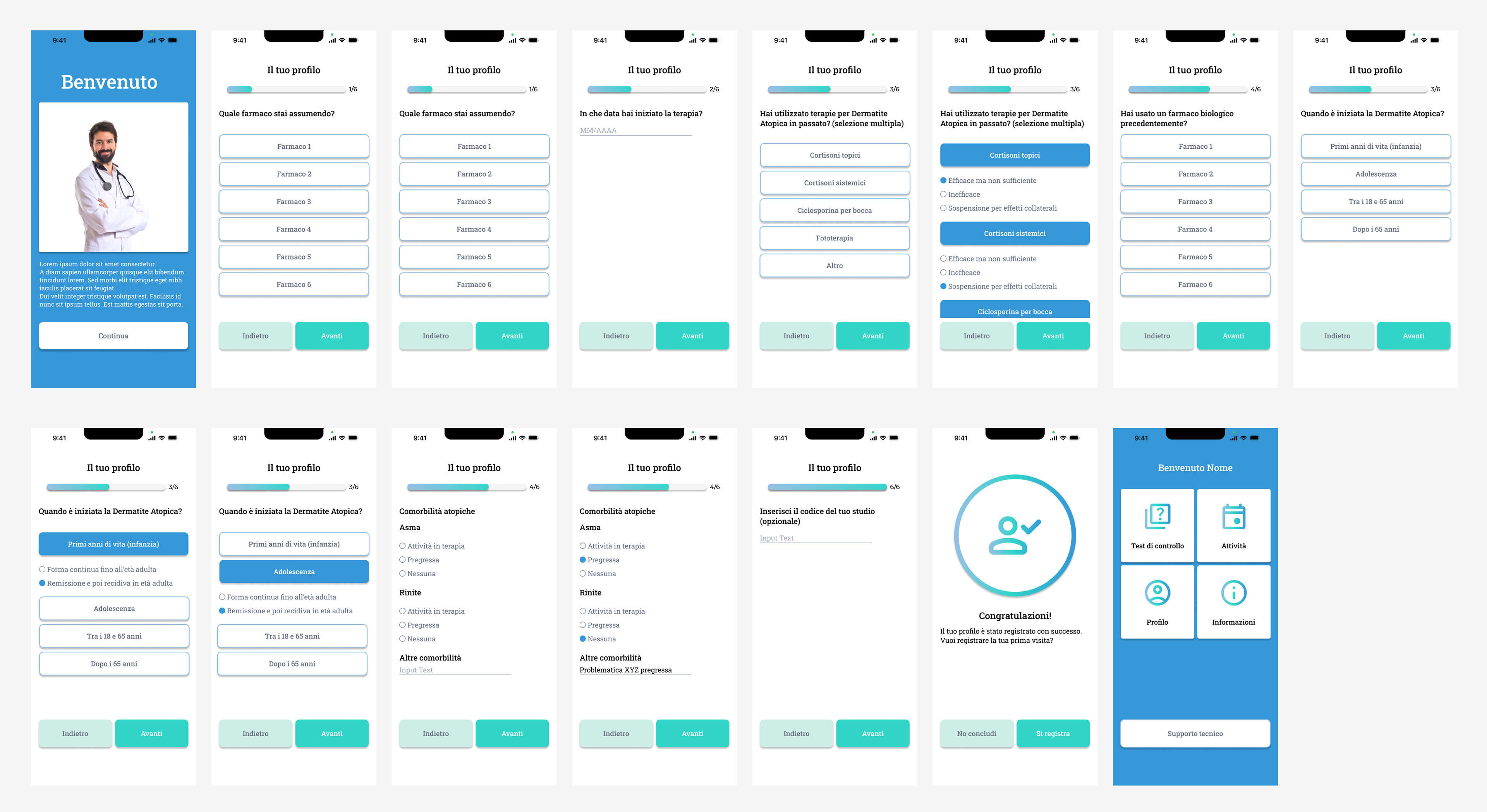
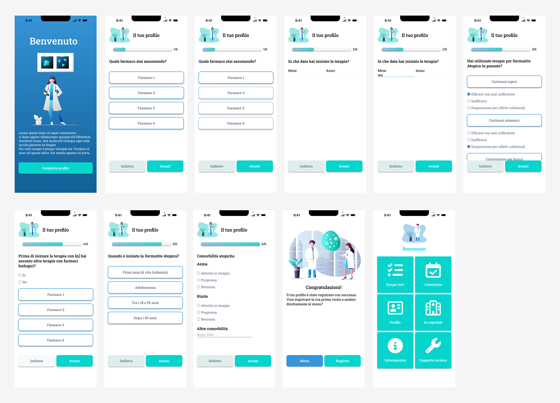
3) PATIENT PROFILE REGISTRATION
I improved the patient profile registration flow by adopting an iterative approach that allowed for the smooth integration of additional questions and crucial information that emerged later. This approach ensured that the registration process was intuitive and seamless, allowing users to create accurate and complete profiles with ease
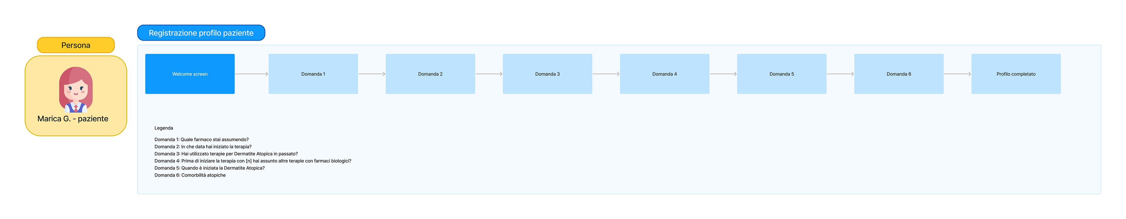
Patient profile registration user flow
4) NAVIGATION
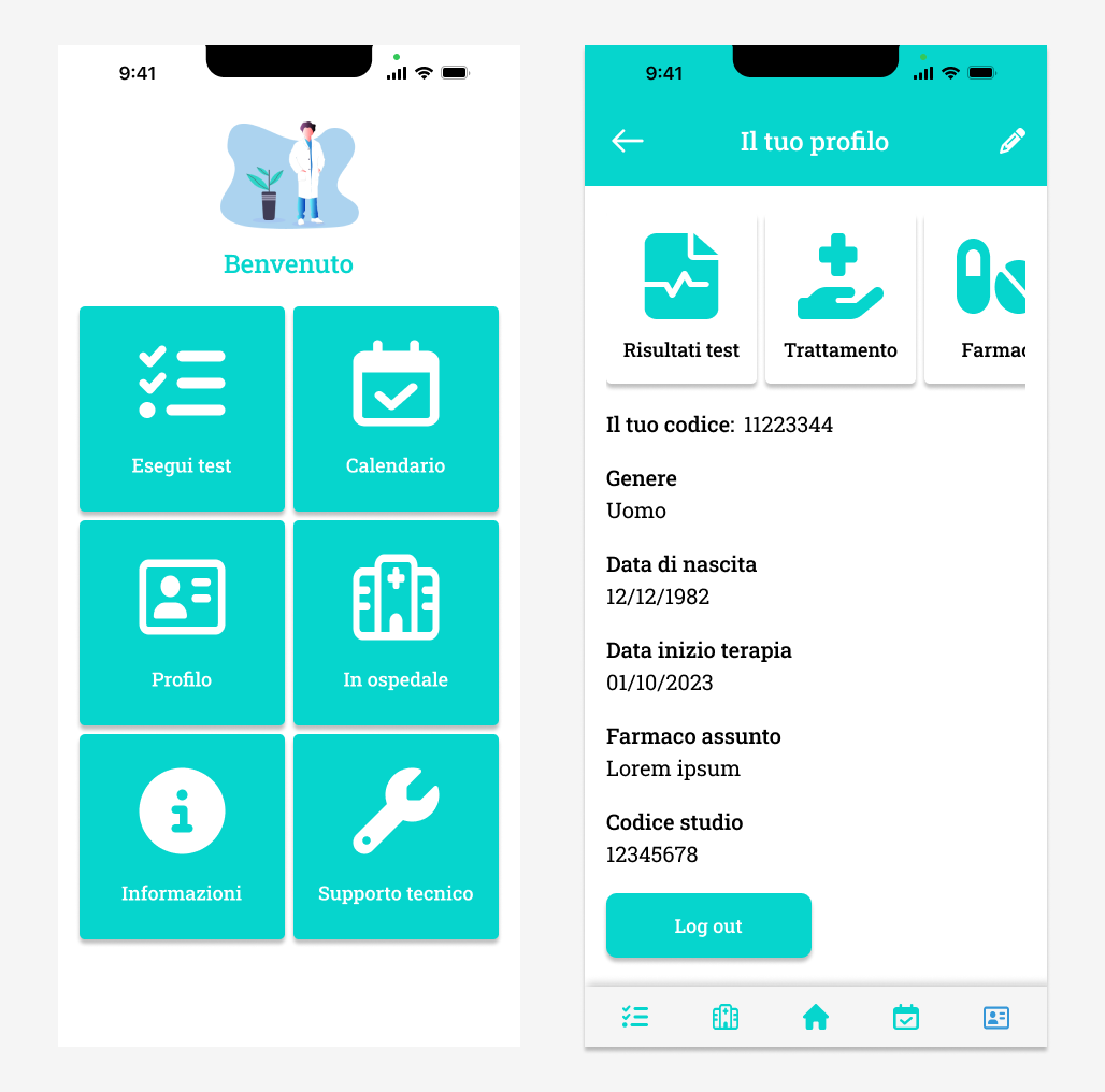
The navigation challenge from the home screen to critical sections was addressed through a careful balance of aesthetics and functionality.
A card-based design approach provided an immediate and organized presentation of information, ensuring users could effortlessly move from viewing test results to exploring treatment plans and medication details. The seamless transition was achieved through an intuitive menu structure and clear visual cues, aligning with the app's objective of providing users with both simplicity and depth in their health journey.
A card-based design approach provided an immediate and organized presentation of information, ensuring users could effortlessly move from viewing test results to exploring treatment plans and medication details. The seamless transition was achieved through an intuitive menu structure and clear visual cues, aligning with the app's objective of providing users with both simplicity and depth in their health journey.
5) GRAPHS
Concerning the implementation of graphs, a thorough evaluation of available charting libraries for Flutter was conducted with the development team. The selection process focused on identifying graph types that not only met the visual requirements but also integrated smoothly into Flutter's framework. Making this choice before implementing the design helped us all to align with the app's aesthetic goals while ensuring a straightforward integration process. This decision also facilitated a faster and more efficient development cycle.
In essence, the solutions applied were deeply rooted in a user-centric, iterative, and collaborative approach. Whether addressing the translation of medical complexities, refining user flows, or optimizing graph implementations, each solution was designed to enhance the user experience by seamlessly integrating functionality, clarity, and aesthetic appeal.
RESULTS AND FUTURE DEVELOPMENTS
User registration low fidelity flow
User registration high fidelity flow
User registration high fidelity flow finale
Reflecting on the DAApp project, the outcomes are a testament to the collaborative effort invested in overcoming challenges and delivering a user-centric solution. The iterative design process, especially in refining the patient profile registration flow and implementing Flutter-compatible graphs, not only streamlined development but also demonstrated great adaptability. Lessons learned include the importance of ongoing collaboration with both stakeholders and development teams, the value of user feedback in refining features, and the need for a flexible design approach . As we move forward, the focus remains on enhancing the user experience, incorporating emerging insights, and further refining DAApp as a valuable tool in the management of atopic dermatitis. Additional features such as the ability to contact the treating dermatologist directly within the app will be planned for the future.