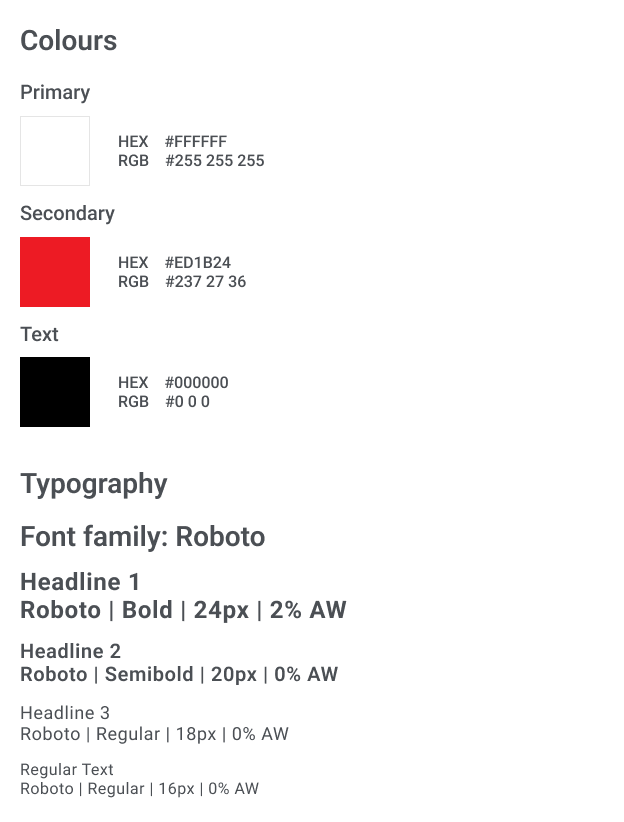
PROJECT OVERVIEW
The customer wanted to start an online advertising campaign with the aim of increasing shop visits and enquiries via calls and emails.
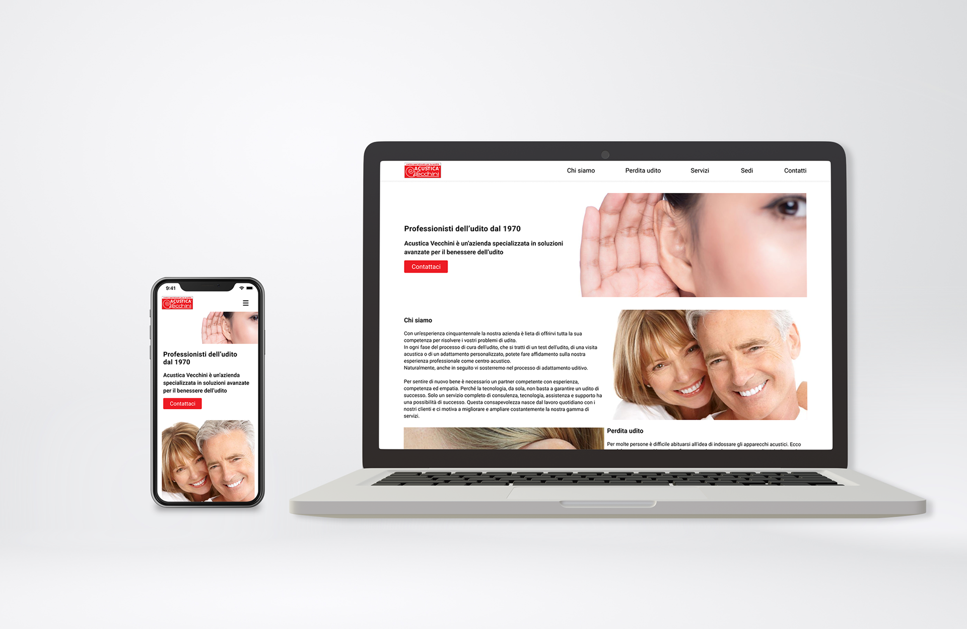
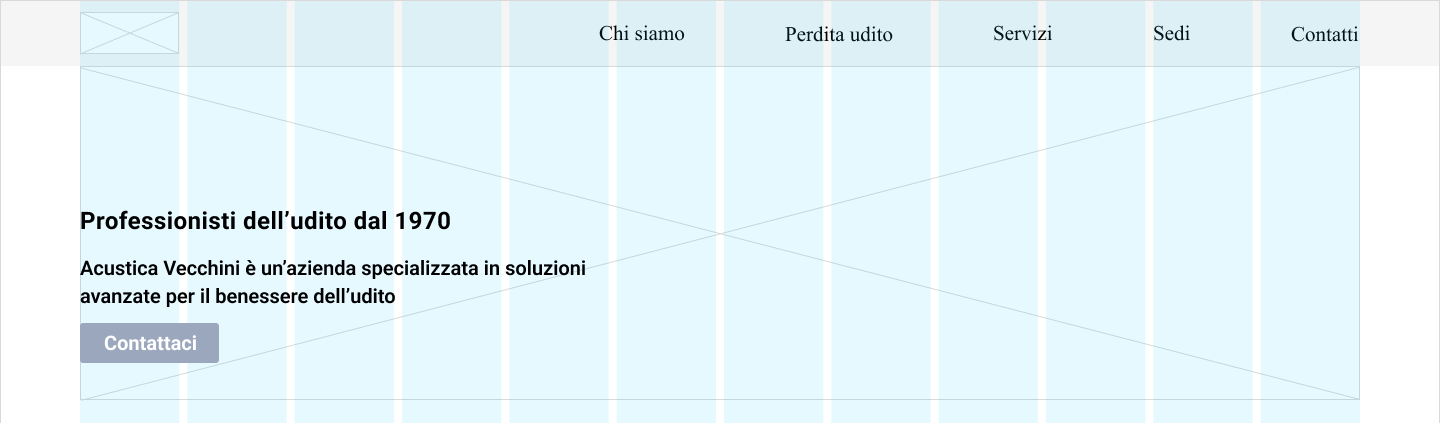
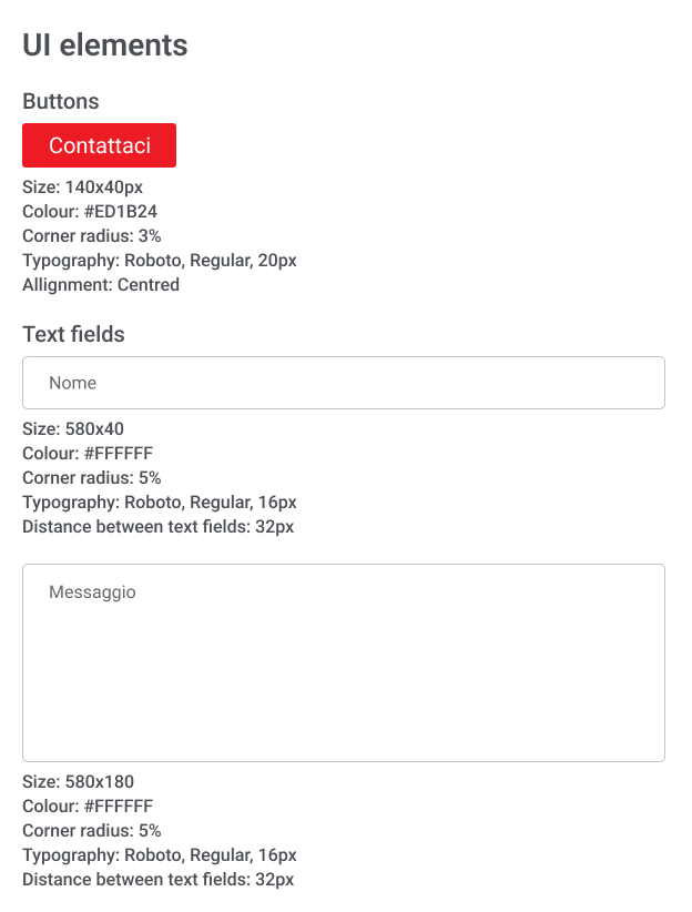
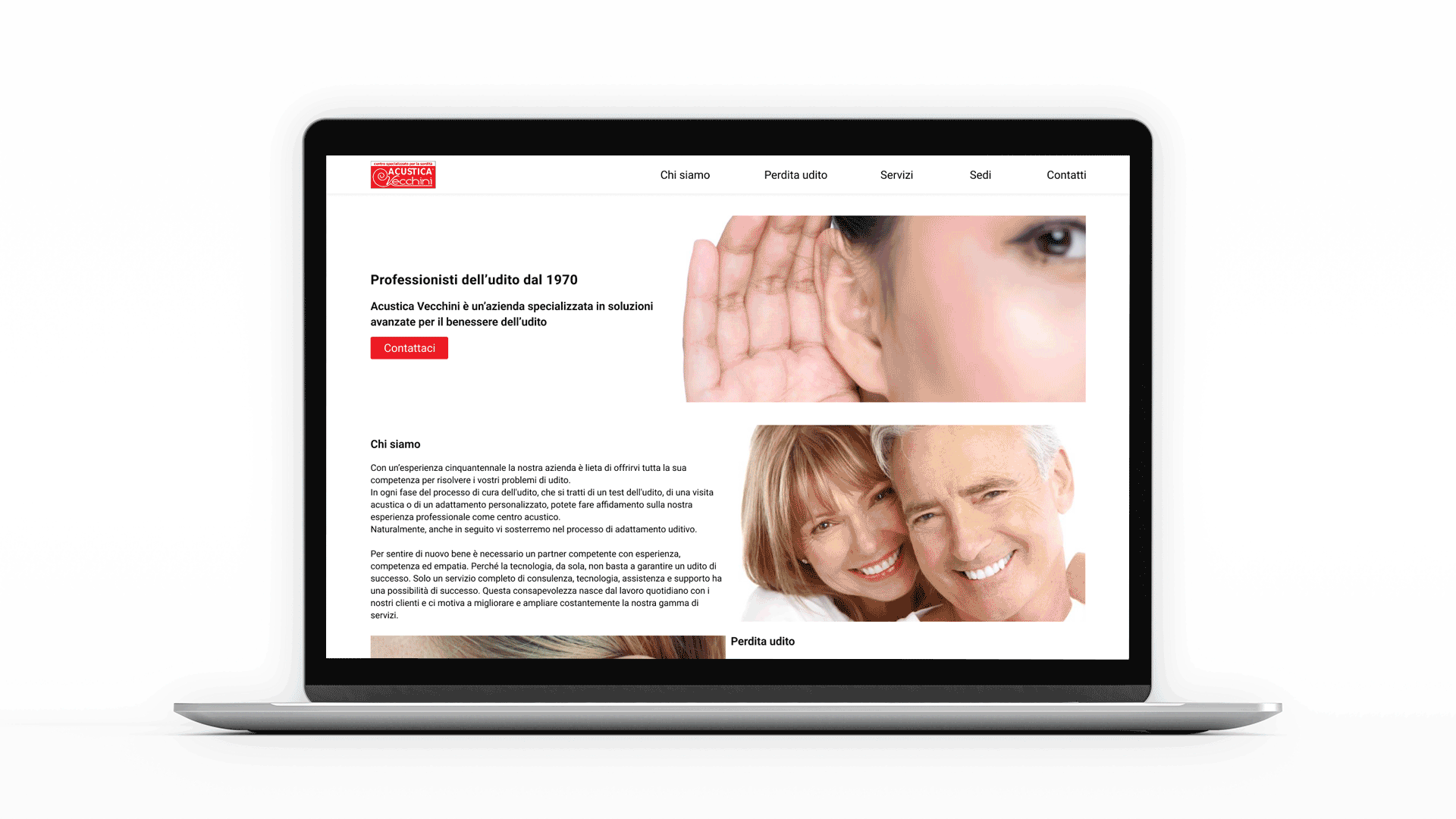
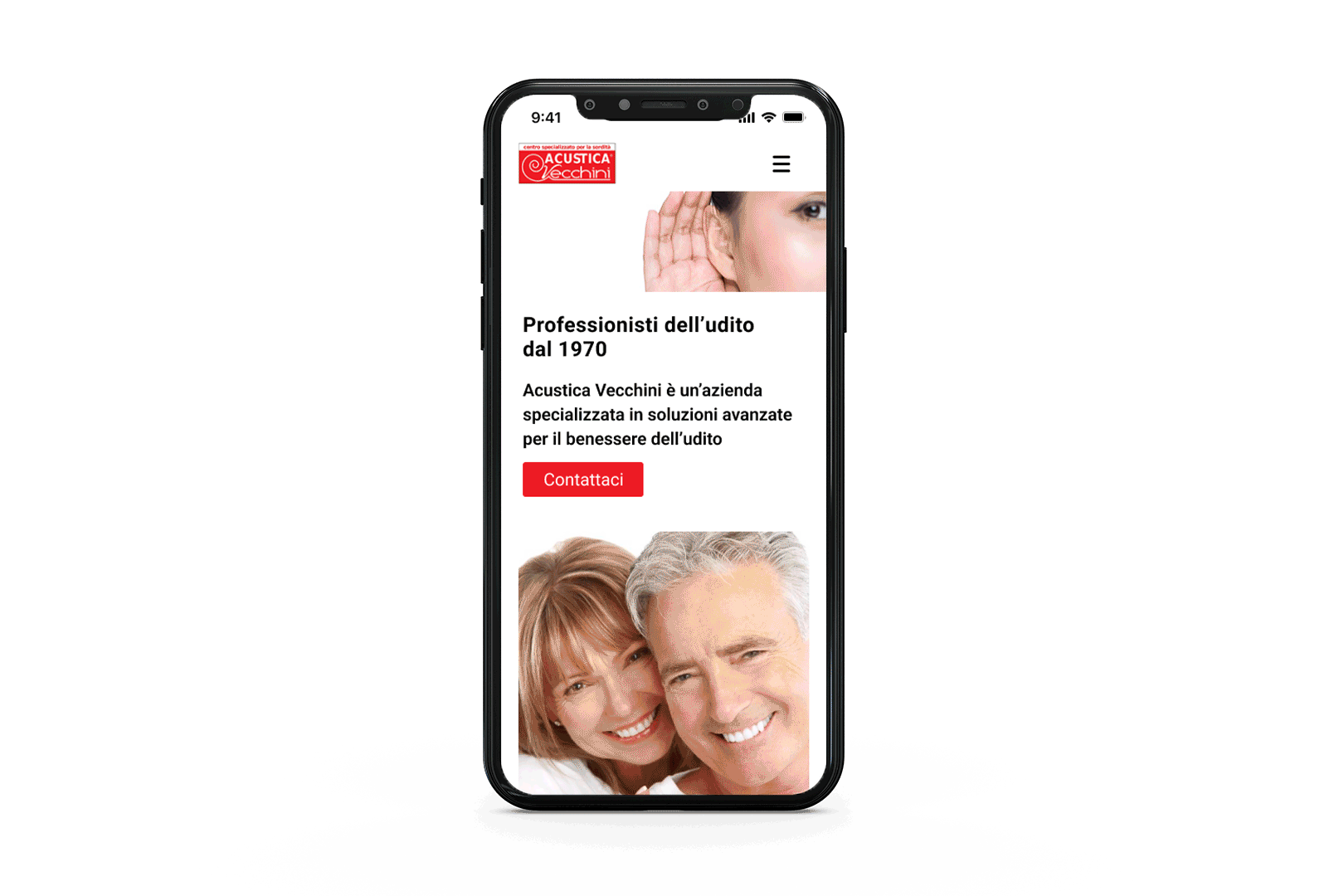
Before creating the Google Ads campaign, I took care of preparing a landing page on which customers could land directly to request information and call for appointments.
Before creating the Google Ads campaign, I took care of preparing a landing page on which customers could land directly to request information and call for appointments.
Precisely because the client's target audience are people who don't hear well, the landing page had to be designed to be very simple, minimalist but effective in conveying both the information Vecchini wished to share.
It was also important to convey an image of security, trust and the possibility of regaining a full relationship with loved ones through hearing care.
It was also important to convey an image of security, trust and the possibility of regaining a full relationship with loved ones through hearing care.
I designed the landing page following the client's brand identity and developed text incorporating a series of keywords designed with SEO traffic research.
ROLE
UI Designer for Devinterface
WEBSITE
TOOLS
Figma
Photoshop
UNDERSTANDING THE PROBLEM
From Acustica Vecchini's perspective:
The problems to be addressed are mainly three: Managing to increase visits to the various local shop locations, increasing requests for information and appointments via email or call and increasing bookings (via email/call) of hearing tests.
From the users' perspective:
Potential users landing on the landing page suffer from hearing problems or are family members of people who suffer from hearing problems and wish to address these problems. Once on the landing page, they want to receive the right information easily and without wasting too much time, which at the same time promotes potential contact between user and customer, making them prospects.
THE SOLUTION
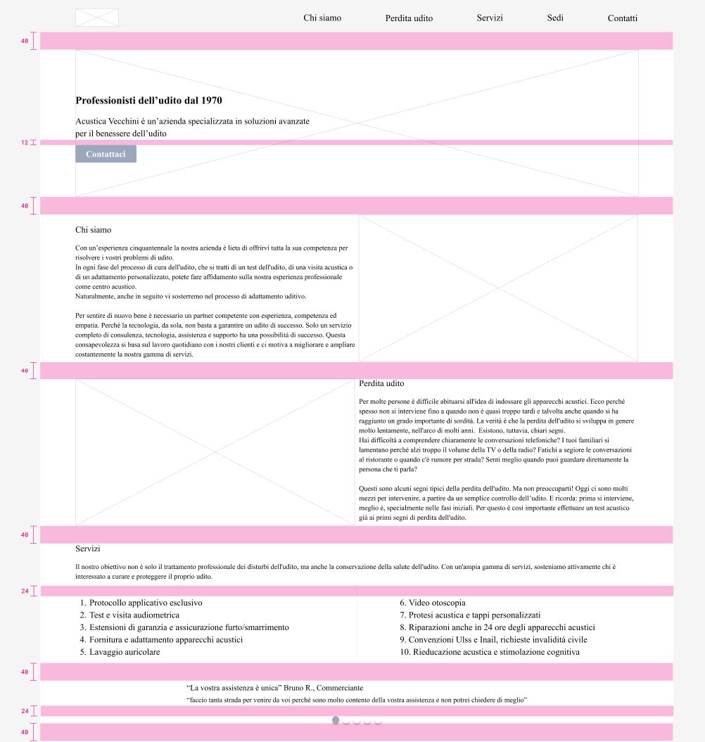
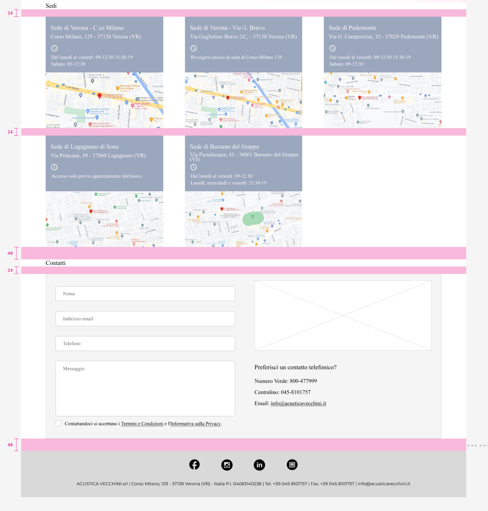
Considering the need to provide the right information in a simple and fast manner, I believe that the landing page should not contain an excessive amount of information and should show the following information: data on local sites in the province of Verona, a contact form and telephone numbers.
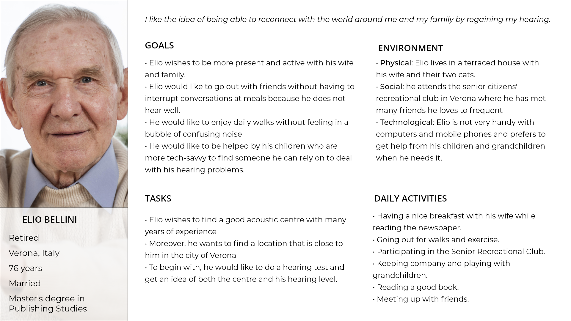
BUYER PERSONA
The customer wanted to address all those people who have hearing problems. Being for the most part senior citizens, I represented Elio, a 65-year-old man whose hearing loss is also creating problems in relating to his family and the world around him.
USER STORIES
User story 1
As a new user, I want to find information on my nearest local Vecchini acoustic centre.
As a new user, I want to find information on my nearest local Vecchini acoustic centre.
User story 2
As a new user I want to contact Acustica Vecchini by e-mail so that my questions can be answered in writing.
User story 3
As a new user, I want to contact Acustica Vecchini by phone to book an appointment for a hearing test.
As a new user I want to contact Acustica Vecchini by e-mail so that my questions can be answered in writing.
User story 3
As a new user, I want to contact Acustica Vecchini by phone to book an appointment for a hearing test.
MID FIDELITY WIREFRAME
I started working on the landing page once I had clearly identified the objectives of both the client and his ideal target group. With the results of the selected keywords in hand, I first created a desktop version and afterwards a mobile version. The wireframes were implemented according to the following layout grid: 12 columns with 8px gutter and 80px margin.
Hero section with layout grid
I used the principles of good spacing and visual hierarchy to create a design that could be consistent from the beginning until the end.
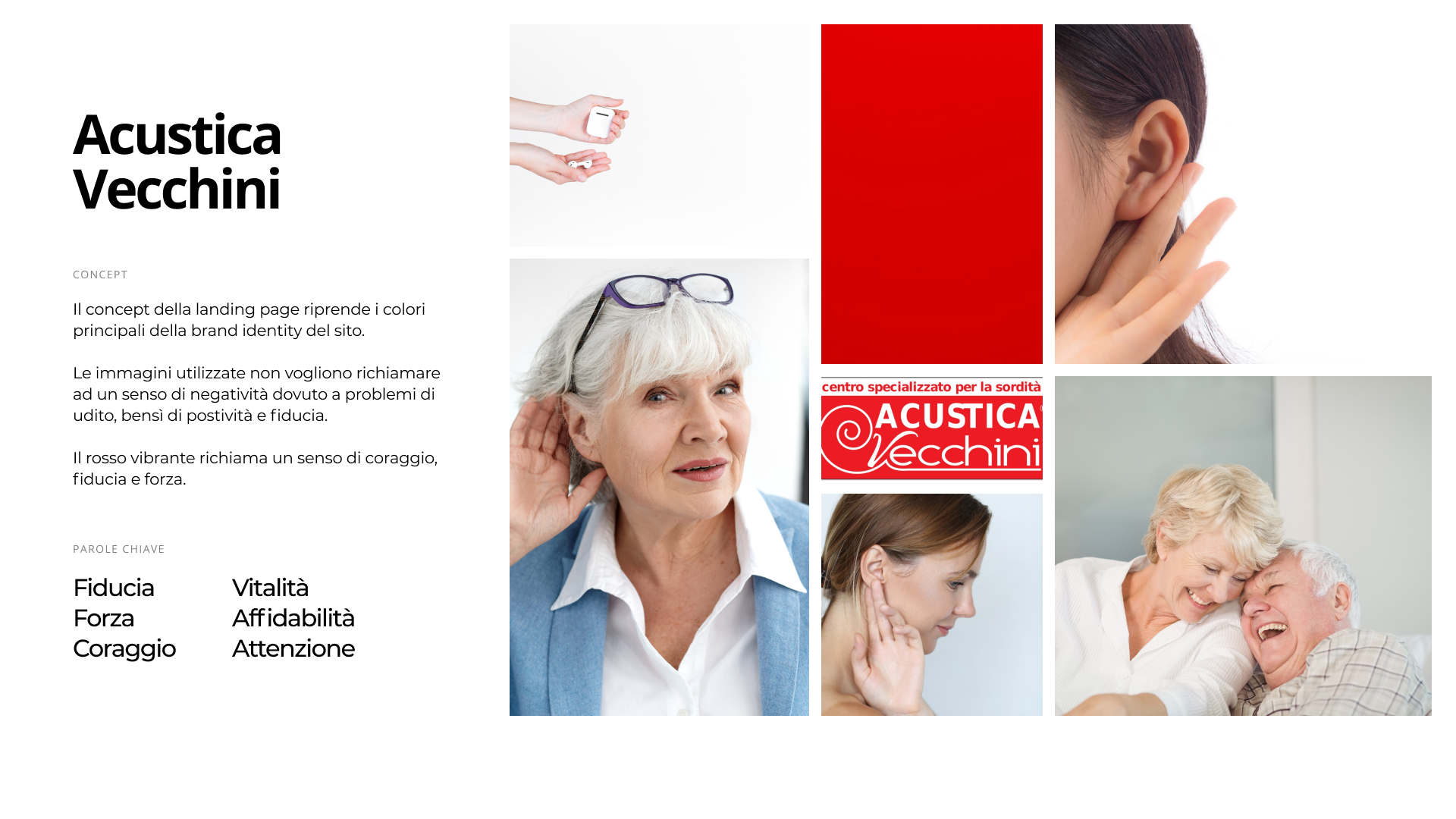
MOODBOARD
I created a moodboard so that users landing on the landing page would immediately perceive the representative message of the Acustica Vecchini brand. The key words are: trust, strength, courage, vitality, reliability and care.
VISUAL DESIGN
HIGH FIDELITY AND RESPONSIVE DESIGN
TAKEAWAYS
The final landing page is very simple and essential in its graphic appearance and this was a deliberate choice to focus on the information that was to be conveyed in the texts through the use of ad hoc keywords and images that evoke tranquillity and serenity.
Although the user who arrives on the landing page may be a family member looking for information instead of the target person, it was important to succeed in displaying the information in the most direct and simple way while conveying trust in the brand and the idea that relying on Acustica Vecchini means regaining a part of one's life that is essential in relationships with loved ones.
One aspect I am considering is the inclusion of a pop-up contact window so that the user is already invited to contact the customer at the beginning without having to scroll to the bottom of the contact form.