PROJECT OVERVIEW
For this case study, I wanted to take a deep dive into the design of coherent and scalable visual systems. The focus of this case study is the redesign of the Material Design System in Figma, allowing me to thoroughly explore design methodologies, hone technical skills and pursue excellence in building a complete and functional design system.
COLOUR SYSTEM
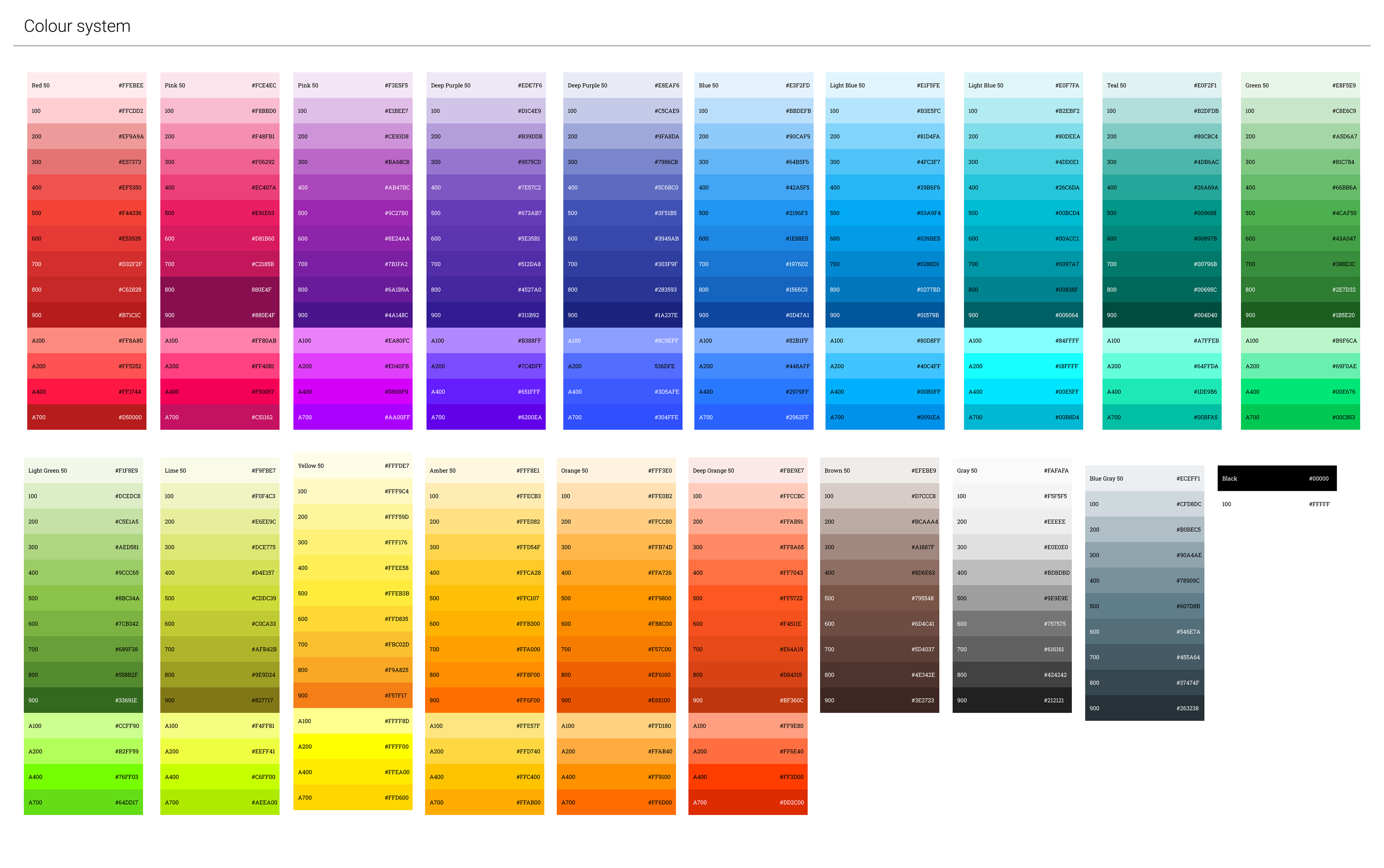
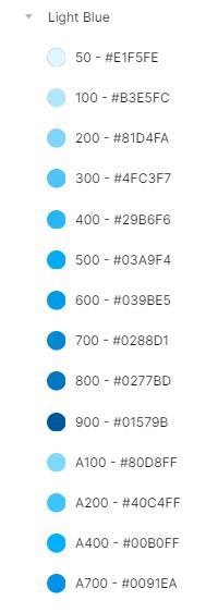
The colour system is the visual basis of any design project and I paid particular attention to the accurate recreation of the Material Design System's official colour palette. The creation of this colour library was a crucial step as it involved a detailed approach to categorisation and labelling to ensure intuitive and functional colour management.
Each colour in the library has been carefully recreated to meet the standards of the Material Design System and has been associated with a descriptive and meaningful label, facilitating its identification and use within Figma. The colour library has been organised following a logical and consistent structure, simplifying the selection and application of colours during design.
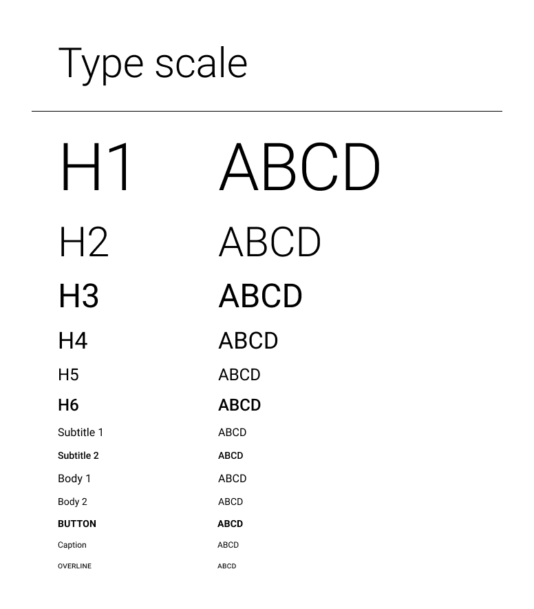
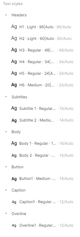
TYPE SYSTEM
In this section, I have created a type scale based on the Roboto font, strictly adhering to the standards of the Material Design System.
The type scale was developed considering the readability and adaptability of the Roboto font in different sizes and contexts. A key part of this process was detailed labelling to simplify the identification and application of different type styles during the design process.
The type scale was organised into a logical and consistent structure. From the main heading to paragraphs, from headings to quotations, each typographic style was categorised clearly and neatly and successfully integrated within Figma.
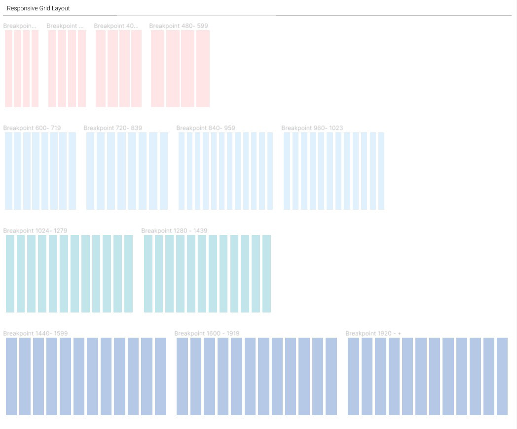
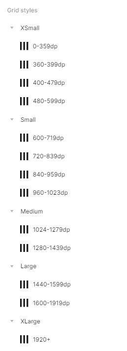
RESPONSIVE GRID LAYOUT
The responsive grid layout represents the basic structure on which the organisation and arrangement of elements within user interfaces is based. I have paid particular attention to the creation of different layouts, adapted to the breakpoint system indicated by the Material Design System. Each layout was designed with the display requirements for desktop, tablet and mobile devices in mind and was carefully labelled and documented to ensure easy identification and use.
The meticulous approach to labelling allows for quick recognition of the various layouts available within the library, simplifying selection and application during the design process.
The responsive layout library offers a variety of options for the arrangement of elements, facilitating the creation of consistent, well-structured interfaces
The responsive layout library offers a variety of options for the arrangement of elements, facilitating the creation of consistent, well-structured interfaces
BUTTONS, CARDS, DIALOGS
In this part I paid particular attention to creating components in accordance with the official Material Design standards, paying scrupulous attention to dimensions, spacing and types of use. Another important aspect was the application of the styles I worked on, which not only concerned typography, but also the application of backdrops and colours according to the surface of interest and the states of the elements.
Each element has in fact been created and sized to comply with the official specifications, ensuring a balanced visual layout and an optimal user experience.
Each element has in fact been created and sized to comply with the official specifications, ensuring a balanced visual layout and an optimal user experience.
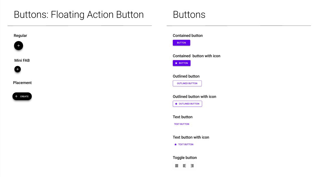
BUTTONS
Buttons have been developed in various types following the official Material Design System specifications. From floating action buttons to contained buttons, from outlined buttons to text buttons and toggle buttons, each variant has been precisely crafted, ensuring uniformity of style and size consistent with the guidelines provided.
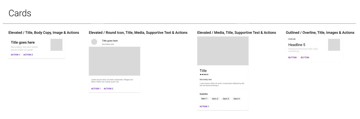
CARDS
Cards have been created to suit different use cases. Each card presents a balanced combination of elements such as icons, placeholder images, text and buttons, following guidelines to ensure a harmonious and functional arrangement of elements within each card.
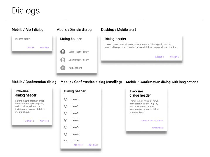
DIALOGS
Dialogs have been designed with attention to different usage scenarios on both mobile and desktop devices. Each dialogue presents various versions with text, icons, lists and buttons, considering the user experience in different contexts and ensuring a clear and consistent presentation of content.
BOTTOM AND TOP NAVIGATION BAR
Since the bottom and top navigation bars represent the main navigation structures within the interfaces, each component was created with meticulous precision, taking various elements into consideration and focusing on the requirements of usability and visual consistency.
BOTTOM NAVIGATION BAR
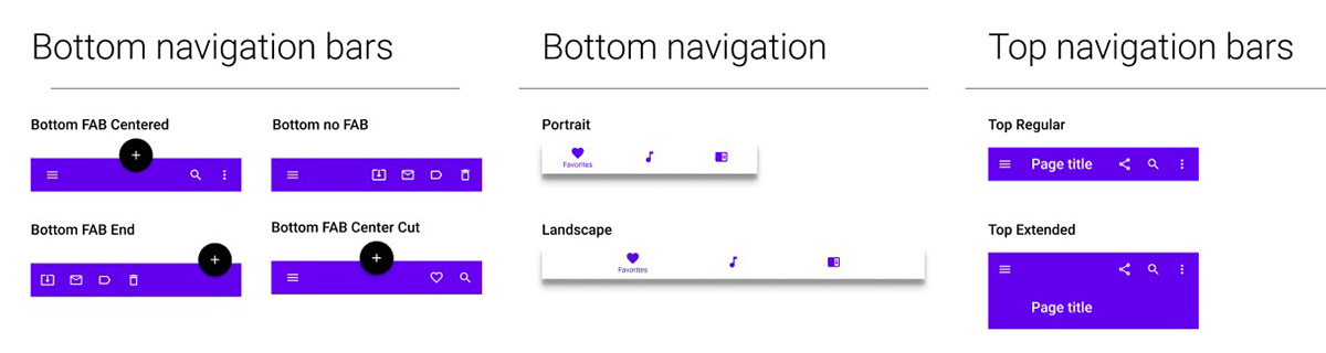
The bottom navigation bar was developed in various versions to suit different contexts of use. Using Floating Action Buttons (FABs), I created variants for portrait and landscape modes, integrating icons and functionality to provide intuitive and accessible navigation for users.
The bottom navigation bar was developed in various versions to suit different contexts of use. Using Floating Action Buttons (FABs), I created variants for portrait and landscape modes, integrating icons and functionality to provide intuitive and accessible navigation for users.
TOP NAVIGATION BAR
The top navigation bar was designed in two main versions: a regular and an extended version. Each version has been created in accordance with the official Material Design specifications, ensuring optimal layout and presentation of navigation elements and extended functionality when required.
The top navigation bar was designed in two main versions: a regular and an extended version. Each version has been created in accordance with the official Material Design specifications, ensuring optimal layout and presentation of navigation elements and extended functionality when required.
BANNERS, CHIPS AND DATE PICKERS
Also when designing these components, the focus was on scrupulously adhering to Material Design specifications, ensuring the creation of components that fit perfectly into their intended contexts of use.
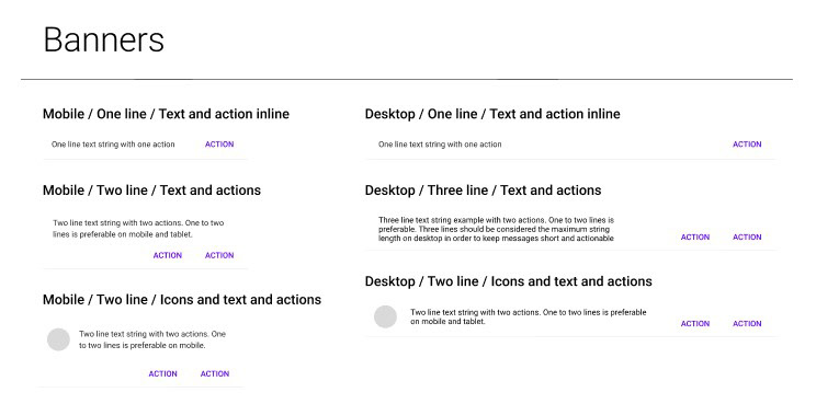
BANNERS
Banners have been developed in different versions to suit mobile and desktop, integrating various types of elements according to the specific use case. Each version has been designed according to Material Design specifications, ensuring effective visual communication in situations such as notifications, alerts or important messages.
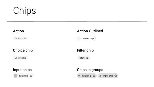
CHIPS
Chips were created to meet different usage needs, such as actions, choices and filters. Their design has been guided by the official Material Design guidelines, ensuring a variety of consistent and functional styles to suit different contexts of use within interfaces.
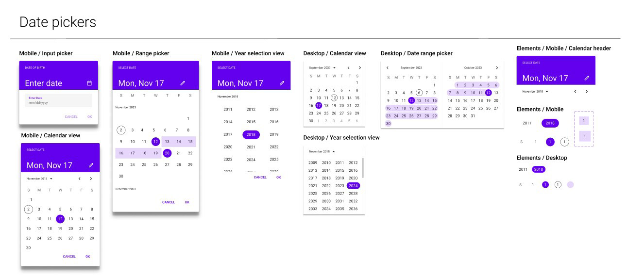
DATE PICKERS
The creation of the date pickers was a complex challenge that required the construction of basic elements for the mobile and desktop versions. Using the previously created style libraries, I greatly simplified the process of creating the individual components, ensuring uniformity and consistency with the Material Design guidelines.
CONCLUSION
This case study not only represents a reconstruction project of a Material Design System, but also a personal learning journey, a challenge faced individually to improve design skills and gain an in-depth understanding of best practices within the design system, focusing on the most relevant components, representative of the detailed and methodical approach taken.
The creation of a complete and integrated library involved the design of multiple elements, from colours to typography, from navigation bars to banners and date pickers. Attention to Material Design specifications ensured visual and functional consistency between the various components, providing a uniform and intuitive user experience.
While this study focuses on a selection of relevant components, it is only one part of a larger and more comprehensive design system. It is a starting point for a continuous process of optimisation and improvement, providing a solid basis for the development of further elements.